
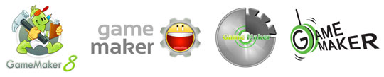
I'm really disappointed with the new Game Maker 8 logo.
Let me preface this entire post by saying up front that I am not mad that I lost, since I had a logo in the running. I'm really just dismayed over the logo that did win, which I felt was one of the worst of the four runners up.
I also want to say that as a runner-up, I will be receiving a free copy of Game Maker 8, and I am grateful for that. I am glad that since YoYo Games has taken over the Game Maker project, they have kept the community involved as much as possible. I think that hearkens back to the days when it was still only Mark Overmars working on the project, and if you'll pardon the pun, it keeps a friendly face on the company.
Since YYG's inception, I've been a supporter of theirs. When questionable decisions have been made, I've tried to see things from their side of the aisle, and most of the time, I've ended up agreeing with what they have done. I've defended them many, many times on the GMC, in some cases above and beyond what I would consider what is "required" of the forum staff.
But this time, for the new Game Maker 8 logo, I strongly disagree with their choice. As both a professional graphic designer and a Game Maker user.
When I was brainstorming for my own logo ideas, I considered using a gear or cog in the image. In the beginning, it seemed a fitting and iconic thing to use in a new logo for game construction software, but as I played around with various other ideas, I began to feel that the gear was too cliched. I also felt that too many other users would enter graphics with gears in them, so I was not surprised to see that half of the runners-up had done so.

Not only does the winning logo contain the over-used cog, but it also makes use of a giant smiley face - which is, at best, a rip-off of other iconic images (Yahoo Messenger's logo, the 4chan C&H smiley), and at worst, a childish and shallow attempt to bring in a young crowd of indie game developers.
Also, it looks like it's crying.
The designer in me cringes every time I see it; every part of the logo is covered with gradients. This ensures that reproducing the logo in print will be difficult, and it makes the design look unprofessional. Not that Game Maker is a professional program, but this point doesn't have to be hammered home at every facet.
And that's the other problem I have with this decision - I understand that Game Maker isn't a professional tool by any means, and I know that YYG wants to convey this to potential users. And maybe they want the program to appeal to a younger demographic as well. But the bottom line is that nobody, new and old users alike, wants to feel like they're using a program that is gimpy or for children. And that's the vibe this logo emanates.
I suppose it's oddly appropriate that a tool for amateur game developers employs a logo that looks like it was created by an amateur designer. I just really feel that YYG took this idea and ran a bit too far with it.
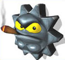
Carl the Cog, from Conker's Bad Fur Day.
I've always said the power in a tool lies in the hands of the person who wields it, and not solely in the tool itself. And while I still believe this to be true, I also think it's important that the tool isn't made to look completely stupid by its manufacturer. Perhaps the many people who claim to be leaving the GM scene over this are over-reacting, but when a decision is made that so negatively affects the nature of this tool in the eyes of others, I can't blame people for being upset about it.
Ultimately, this logo was a piss-poor choice, and that's all there is to it. I leave you with this quote from the logo's creator, Albert Zak (courtesy of Game Maker Blog):
I’m however still kind of puzzled why only 8% picked this as their favorite, but I’m glad Sandy and a few others realized what’s really behind this logo.
Is this what's behind the logo? Maybe that's why the big face is laughing so hard.