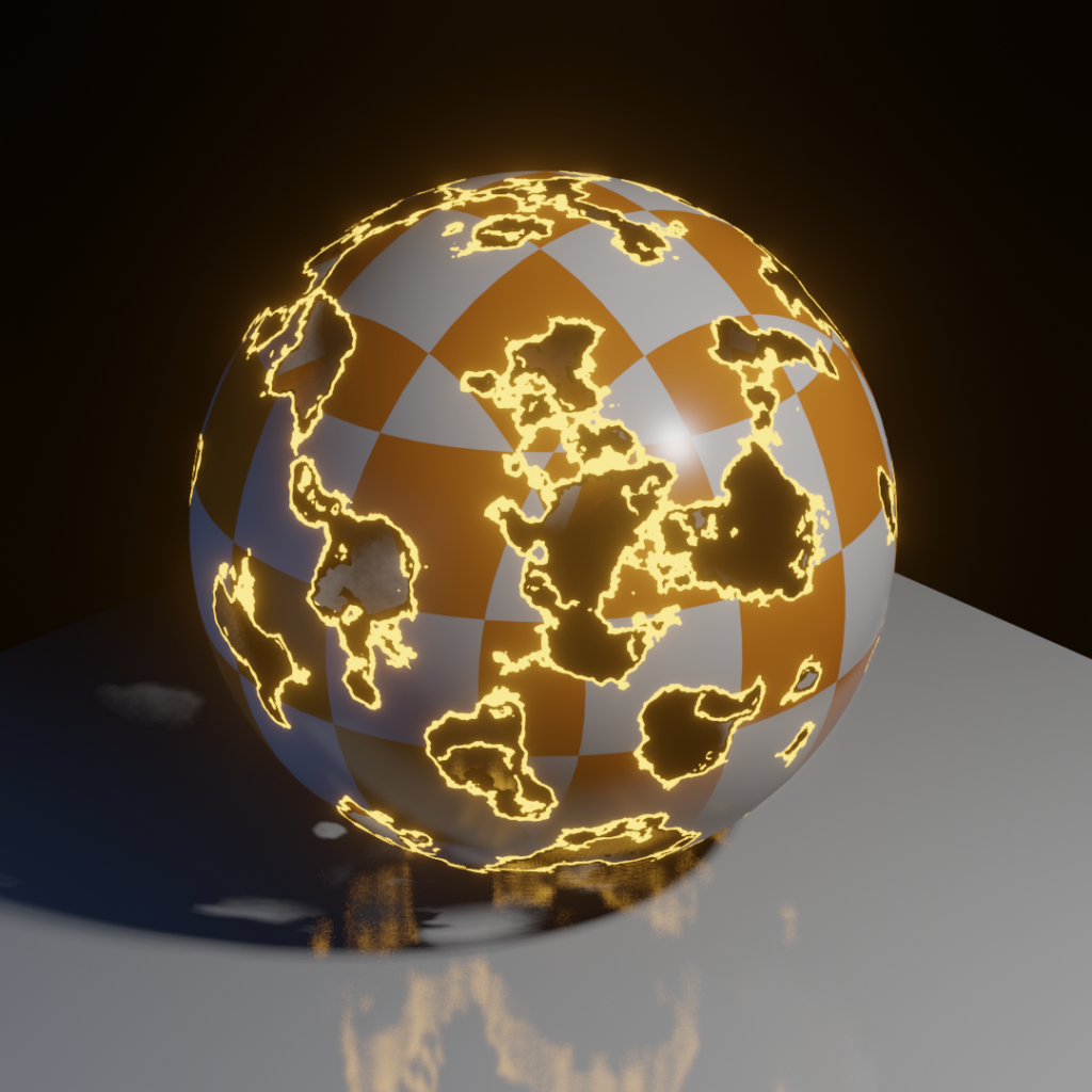
A simple Blender shader I created to simulate a burn-away effect. The entire setup is in an easy-to-use group, and adjusting the phase value allows you to change how much of the burn is applied to the underlying material.

A simple Blender shader I created to simulate a burn-away effect. The entire setup is in an easy-to-use group, and adjusting the phase value allows you to change how much of the burn is applied to the underlying material.
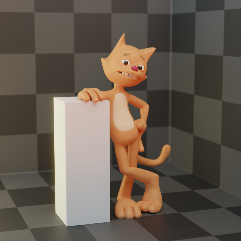
This cat character was meant to be used for an animation I was thinking about working on, but never got around to finishing. It's almost fully rigged - it only needs more face controls - and the materials I used to shade it were meant to make it look like a posed claymation figure.
It's meant to look a little retro, and a little goofy. The idea was that it would undergo the typical slapstick antics a cartoon from the older days of animation might (think mallets, anvils, etc.). And he'd have kind of a bad attitude about it, so you wouldn't mind watching him get clobbered.
Maybe someday I'll pick it up and start working on it again!
As of this post, Blender 2.8 has been in development for quite some time, and it brings a lot of interface changes to the program (among other things). I'd been meaning to download one of the preview builds for a while now, and finally got the kick in the pants I needed when I started working on a new project with my Divide colleagues from Exploding Tuba, and we decided we'd use 2.8 moving forward. So as I explore the new interface, I've begun various projects and tests to make sure I understand how it all works.
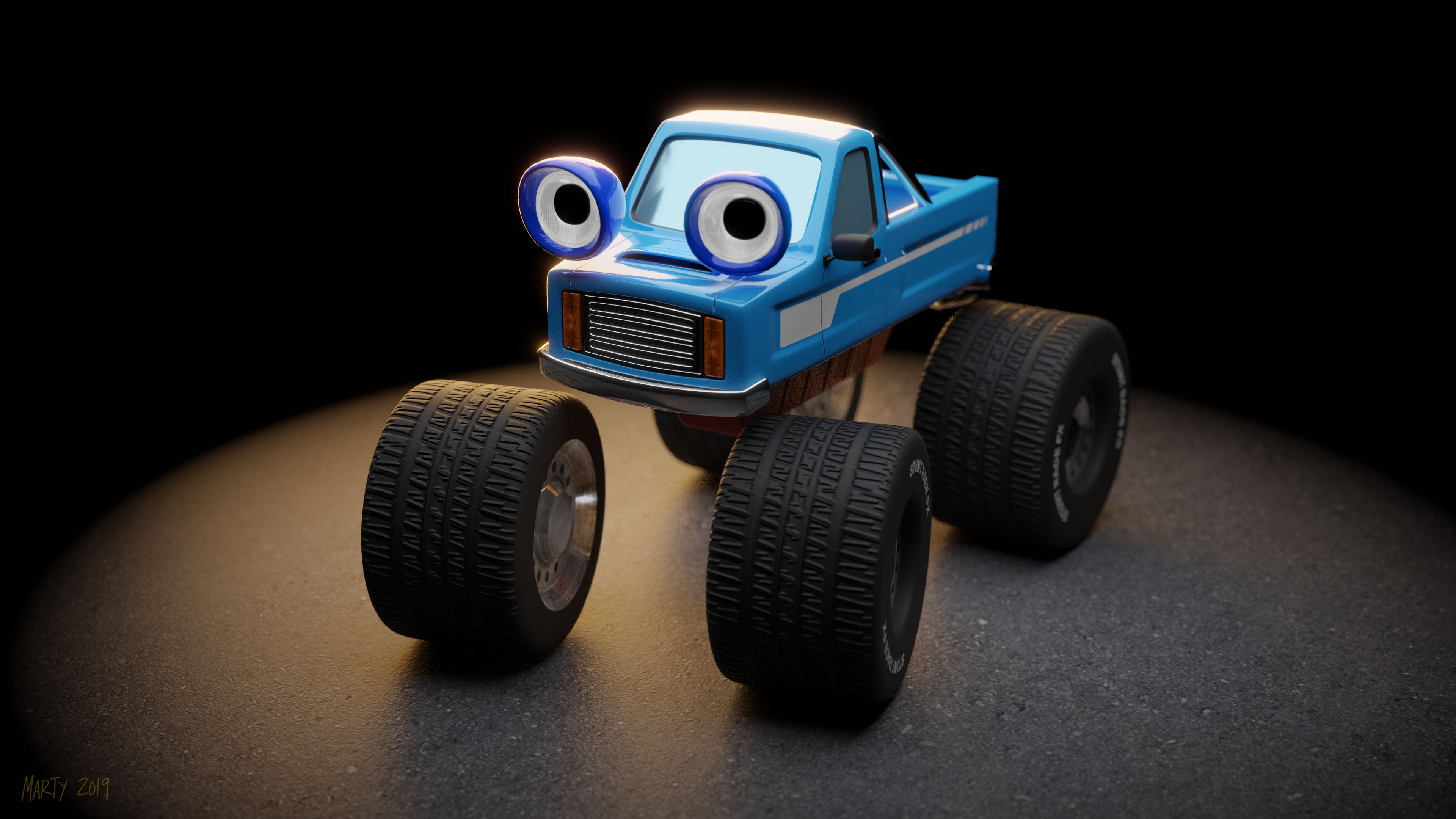
This is one such project, where I tried to take the ancient, low-poly 4WD Truck from Stunt Race FX, and make an updated version to render. This was one of the few 3D games available on SNES, and being excited about that (and a fan of racing games), I played a lot of it.
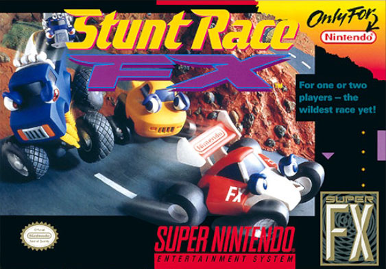
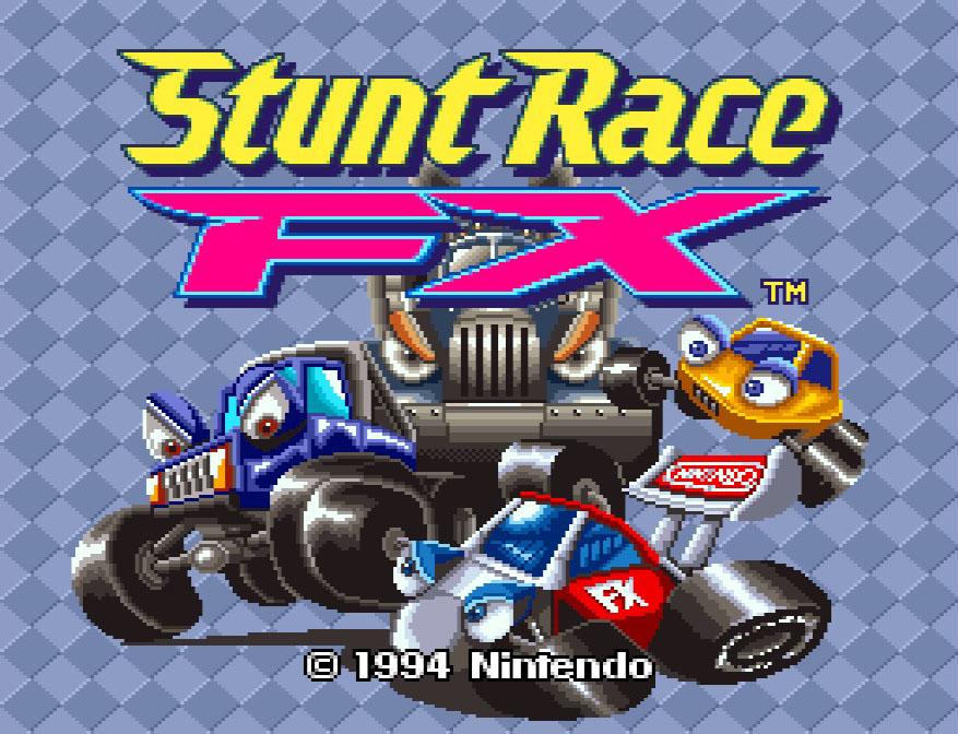
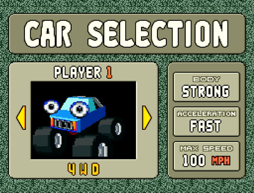
As I worked on this, I tried not to think too hard about the clay models that Nintendo used in various forms to market the game. I wanted to make the render more true to what exists in the game itself, but with a few added details.
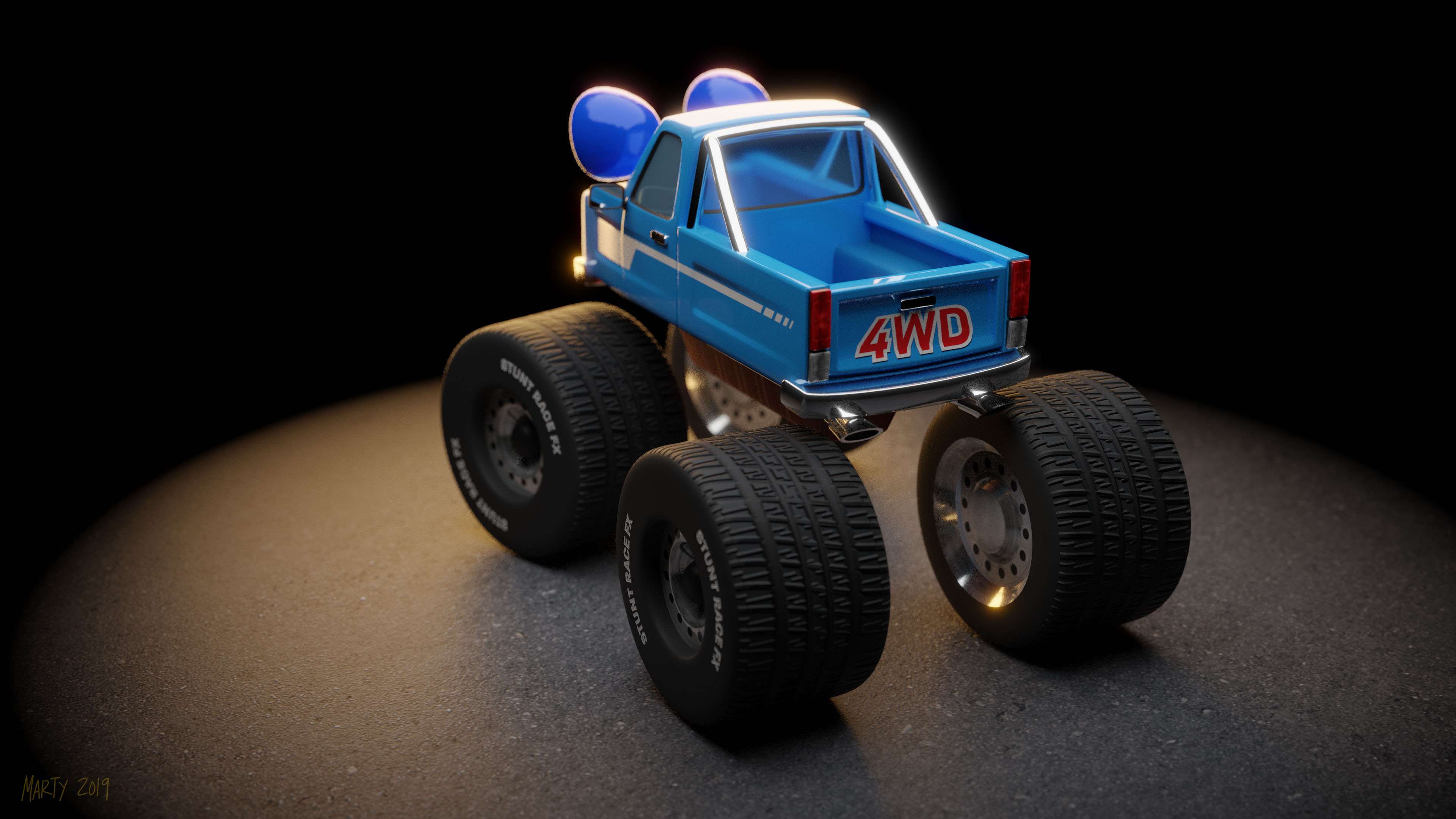
I did a second view of the back of the truck too, since that's what you see most when you play the actual game.
There are a few areas where I might go back in and clean up, such as the places where the roll-bar posts attach to the truck's bed. I'd also love to create a scene for the truck to live in that looks like one of the courses from the game.
Ultimately though, I'm pretty happy with how the whole thing turned out. I'm still learning Blender 2.8's interface, and even though this project was a simple one that didn't take a lot of time, it helped me figure out a lot of stuff.
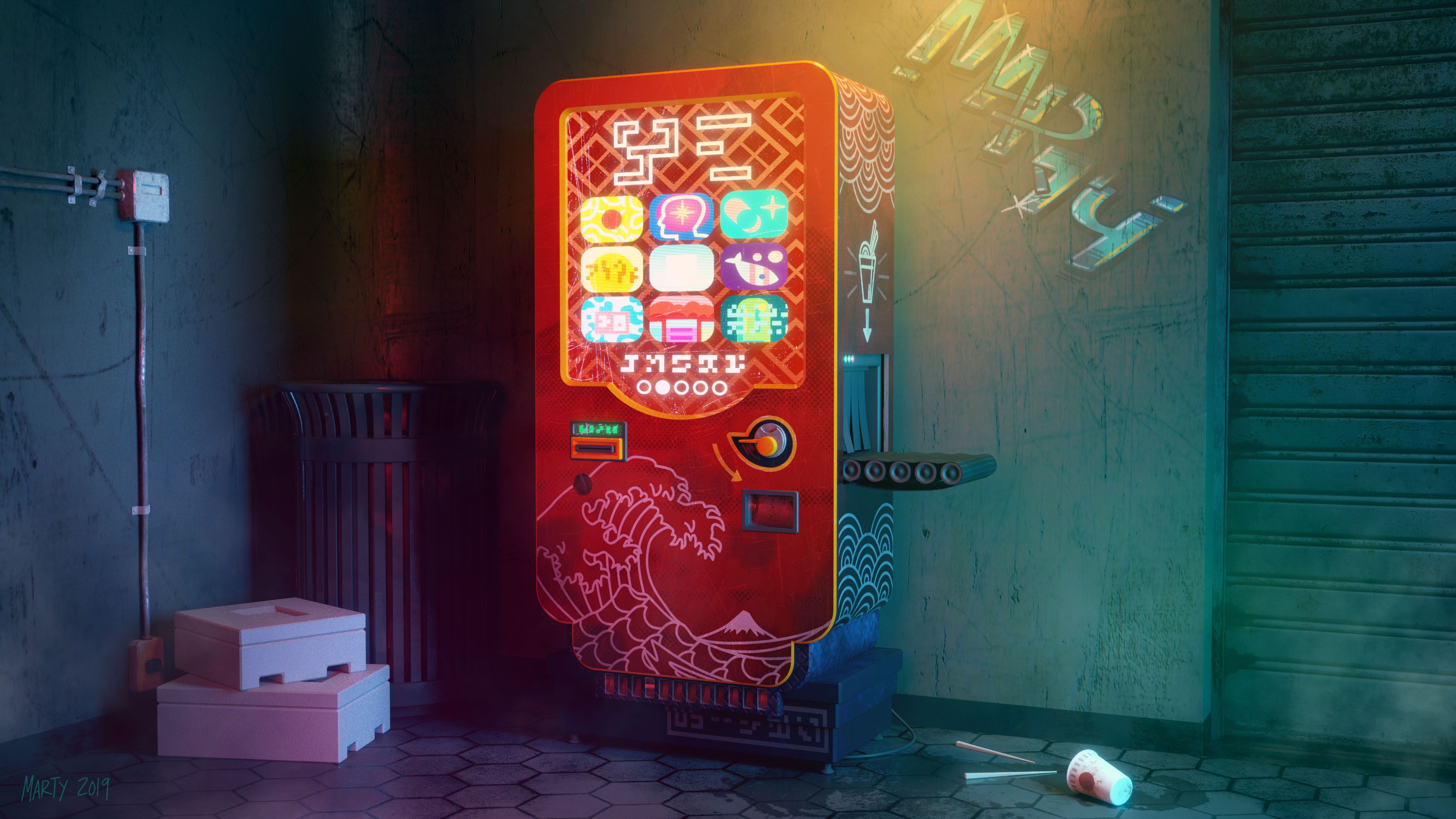
I was browsing reddit a few weeks ago and came across this post, featuring some animated pixel art of a set of four cyberpunk vending machines, by a guy named Seppuku_Doge. I really liked the aesthetic, and being on a bit of a William Gibson tear right now, I wanted to do a render of one of these machines, with all the detail 3D and Blender can provide.
This render is the result - featuring the red noodle machine, and with some extra scenery thrown in to set the mood. This project took about 20-30 hours to finish, but I'm very happy with the result, and it gave me some practice with Blender's "principled shader" in Cycles. Some of the textures were sourced from textures.com, pixabay.com, and I created the graffiti on my Surface Book.
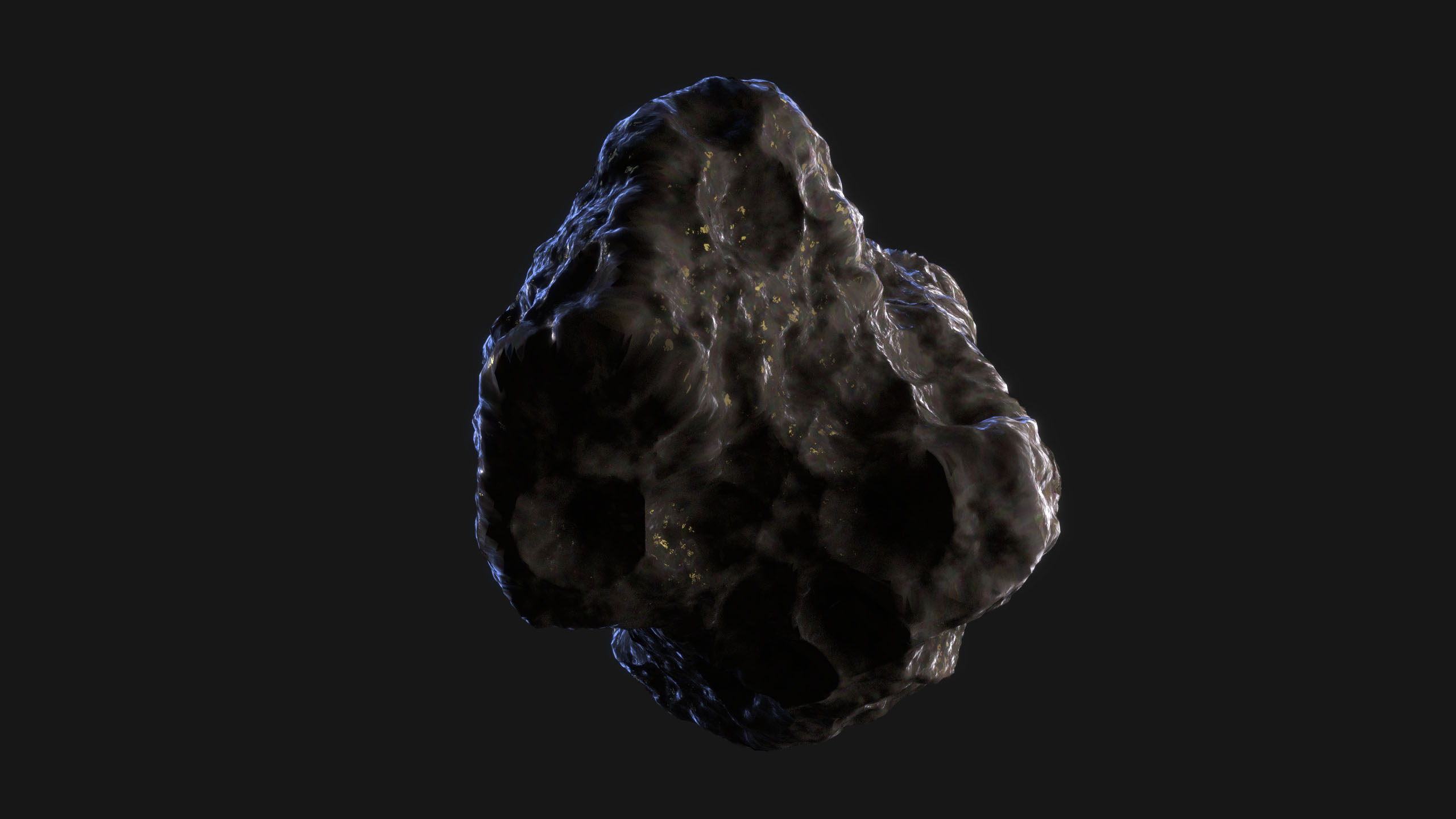
I was playing around with some Blender stuff for work, and experimenting with creating rocks/asteroids. This isn't a design we ultimately went with, but it was a good subject for some lighting and texture practice in Cycles.
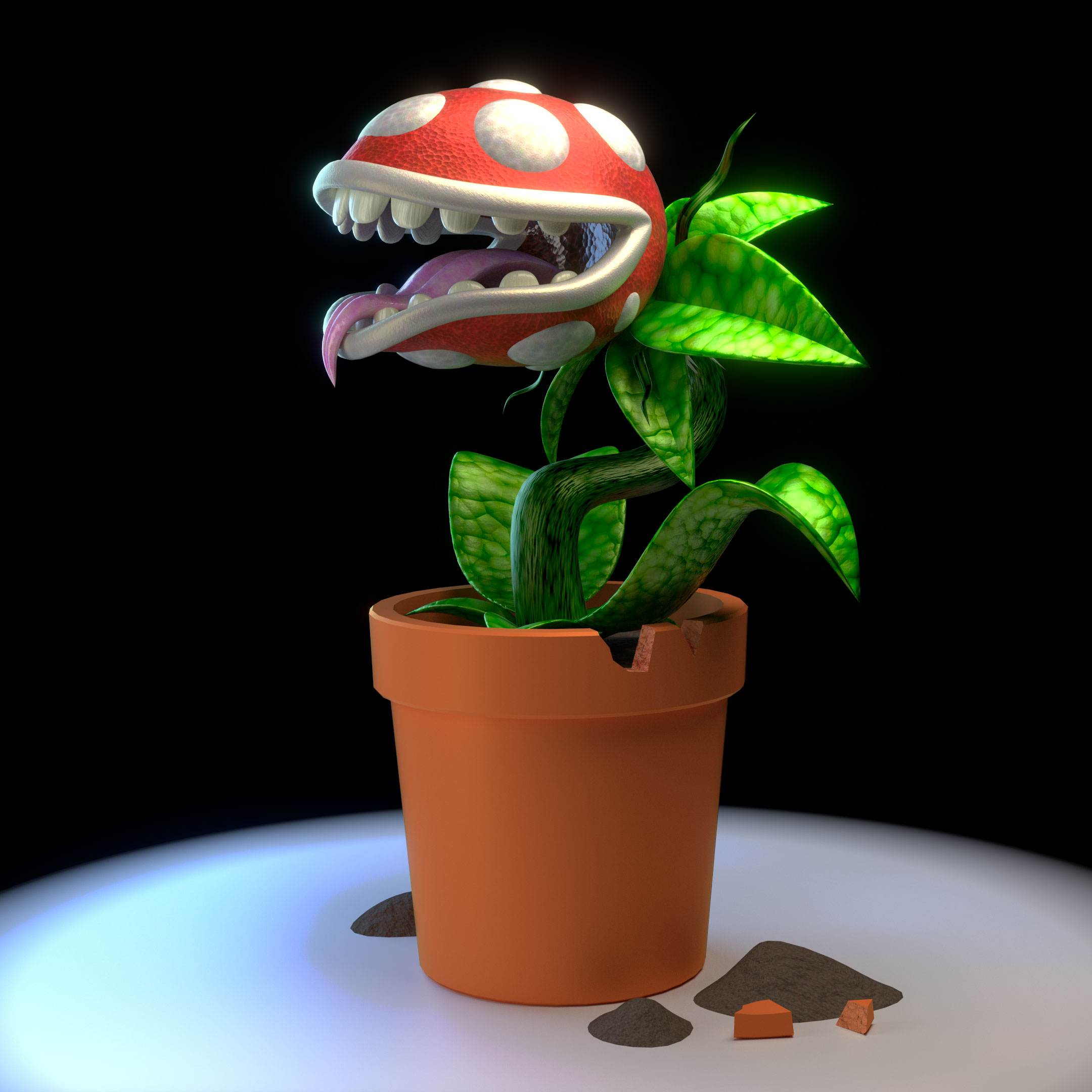
As a practice exercise for modeling/creating materials in Blender, I decided to work on a model inspired by the famous pipe-infesting Piranha Plant enemy from Super Mario Bros.
The model was created as a very simple low-resolution mesh with a SubSurf modifier to add detail, and all the textures were created using Blender's internal texture nodes, in Cycles.
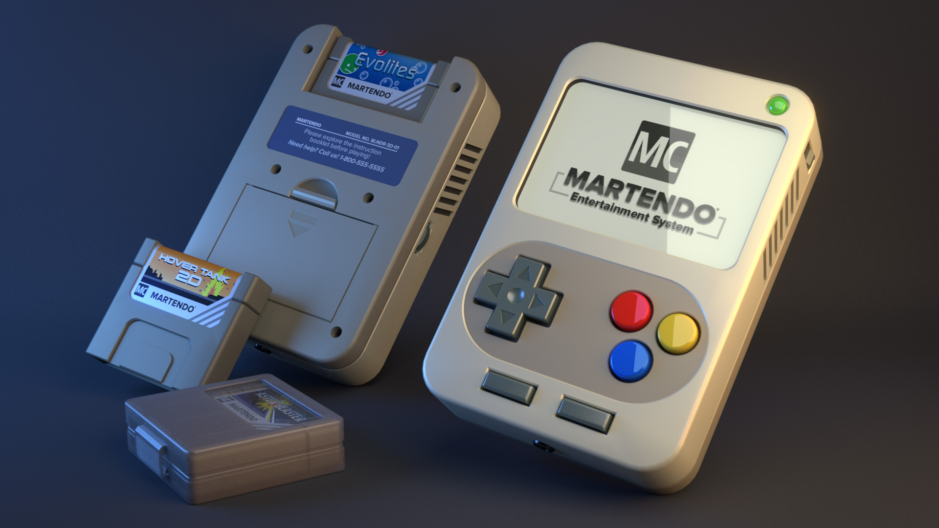
After finishing the last render in this series, I posted it to Facebook and a friend of mine who has a lot of experience working in the VFX industry gave me some great critique. So I took this the project back to the drawing board and using his notes, re-worked almost every part of the scene. The result is a much better render!
You can read a bit about the process of building this render here.
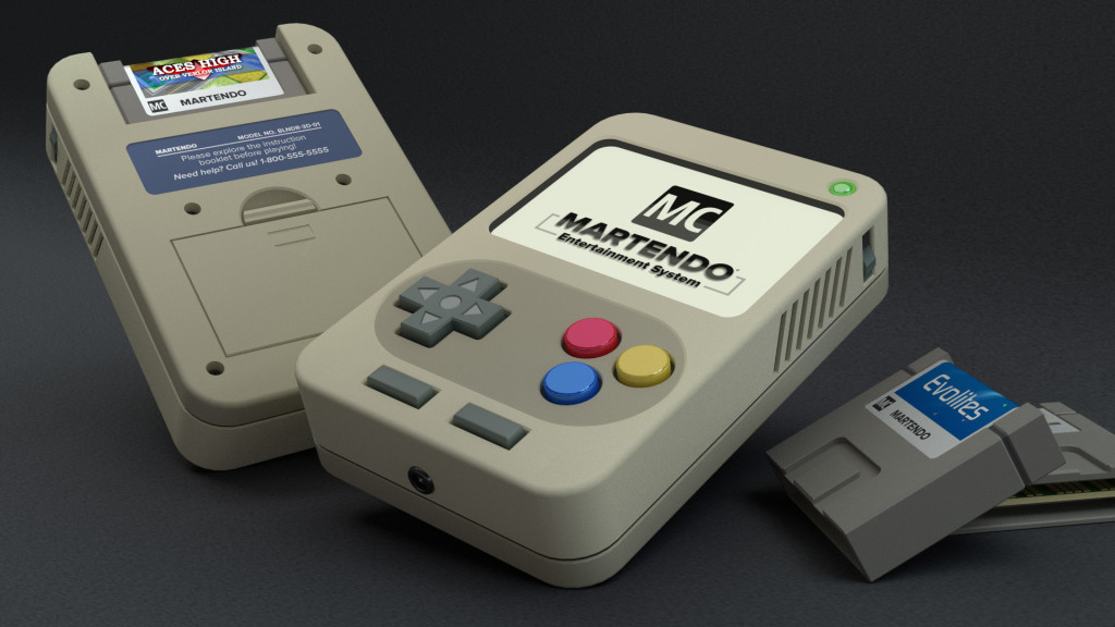
Here's the final render for my handheld system, which I've dubbed the Martendo.
To finish this one off, I tweaked a lot of the finer points of the geometry of the cartridges, added pins to the boards, and put some images on the screen and cartridge labels.
This was a satisfying little Blender project for me. It's always nice to be able to set aside some time and just make something for the fun of it.
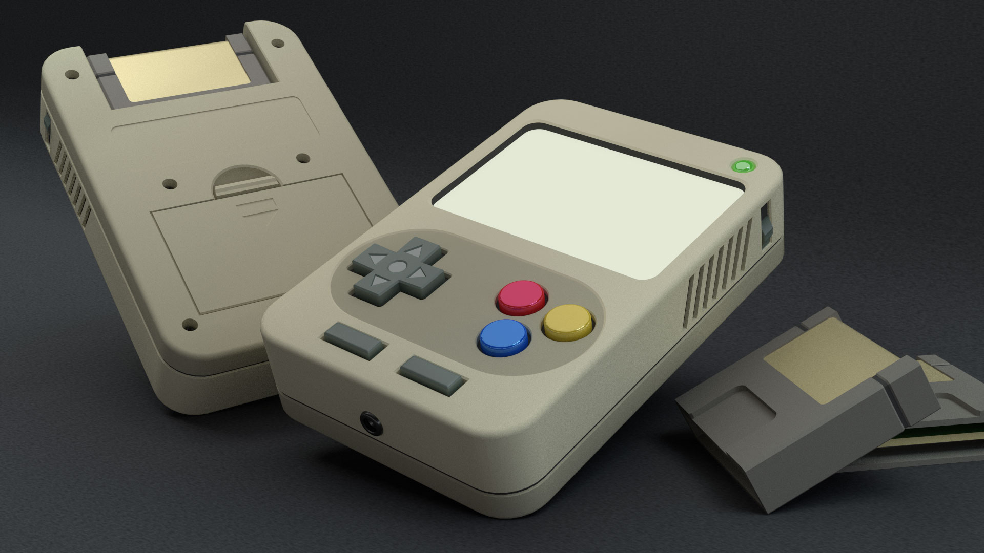
A small update to the render I posted the other day, featuring a chunky little handheld game console.
I've worked on the back a bit, adding a battery compartment, an indentation for the console information, and some screw holes (which actually have screw heads in them).
I thought I was pretty much done with this, but after I rendered it out, I noticed that the cartridges just don't look finished. I think I also want to add some generic branding/labels to the carts and the back of the console too, and maybe a simple image on the screen. I might do that part (the screen) in Photoshop though, just to make things simpler. We'll see!
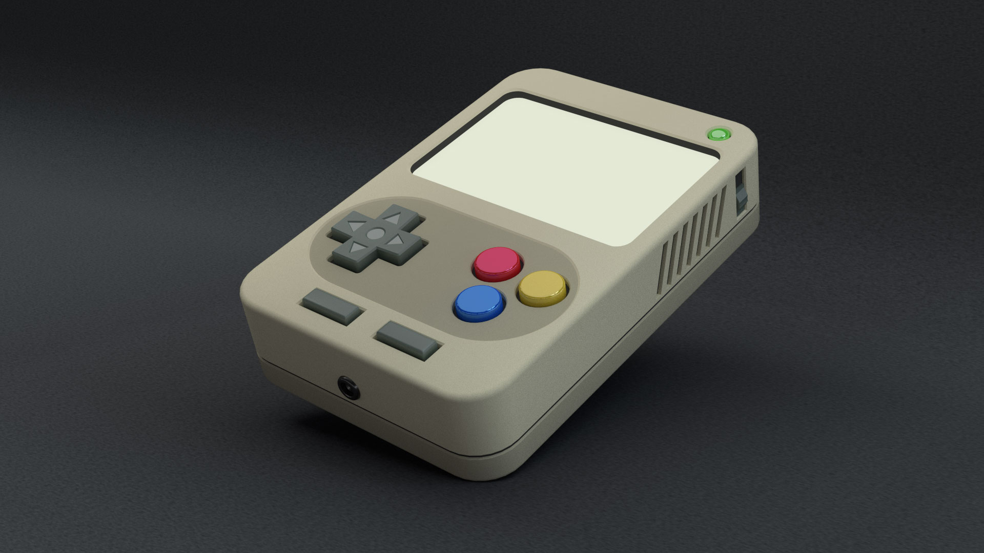
This is just a quick little render of a handheld video game console I made today. The proportions are probably all off, but I like how it looks. There's a volume wheel on the opposite side, and I even left a slot in the back for a cartridge.
Future additions will probably include a game cartridge in the back and a battery compartment cover.