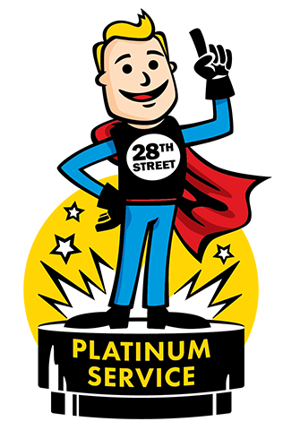
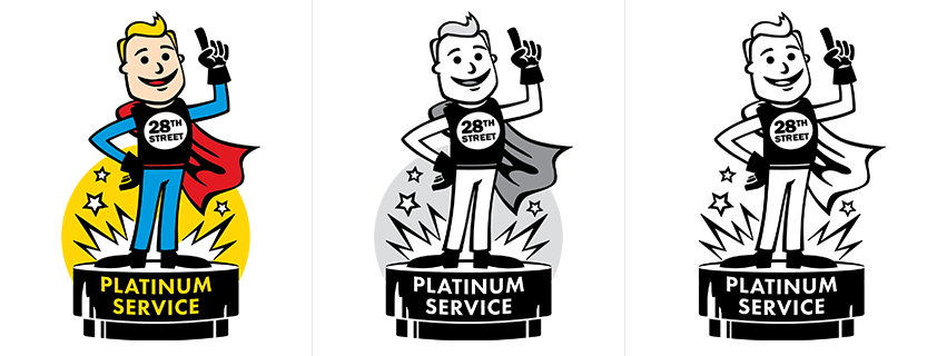
A friend of mine who works for a customer service organization in this county reached out to me to ask if I could help create a logo for their department, and I was happy to help. The logo above is the final, full color version of the logo. Below are the alternate color variations I made to accompany it – plain color (no shading), grayscale, and black and white.
As is typical for jobs like these, this logo went through a few variations from concept to final. The progression of the idea was interesting, as it changed from a more simple, stylized look to a cartoon, as guided by client feedback. Here are the original sketches I made to propose design ideas for the client:
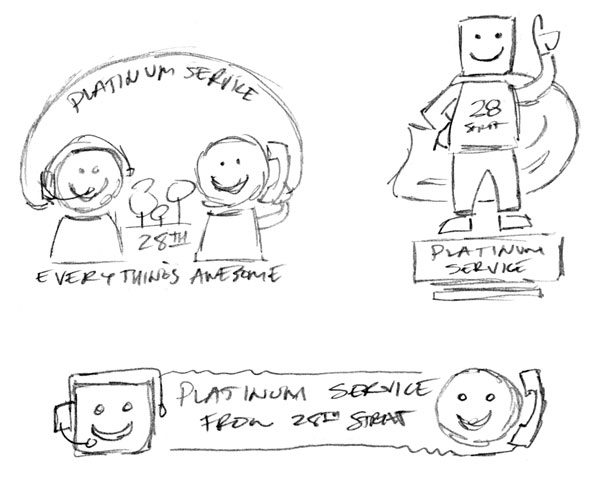
My original inclination was to have the people in the logo be represented by smiley faces which would embody the happiness that good customer service can provide, and which abstracted things like gender, race, etc. Two of these first variations also included the headset/telephone imagery to further show how the agency provides support – the third logo (which would eventually become the final) was included as a suggestion by the client.
Following some client feedback, I went ahead and created more refined versions of the first two logos:
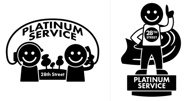
I like to work in black and white (or at least, with as few colors as possible) at first, so I don’t get too carried away creating something that won’t work in situations where the colors being used are extremely limited. This also helps me figure out the flow of the design more quickly – what shapes things should be, how they should relate to each other, etc.
In these logos, the smiley faces are really strong, and the result is almost stamp-like quality. Even if the logo gets too small to read, the smiling faces are hard to miss.
Still, the client wanted to see something more cartoon-like, with more definition in the faces. So I re-imagined both versions of the logo with friendly cartoon faces and a more loose style to the artwork:
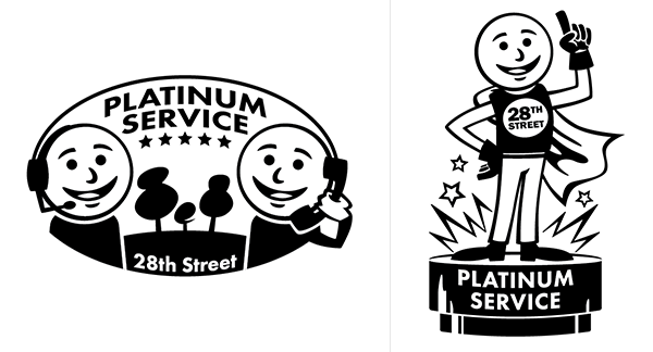
The “hero” logo on the right is starting to look a bit more familiar now!
I actually preferred the logo on the left at this point, because I like that it actually shows a good customer service experience happening, but the arm holding the phone needed some further refinement. The client liked the “hero” logo however, and chose that one as the logo we would move forward with. They wanted only minor improvements now, to give the face more character. So I cast aside my earlier goals and went ahead and changed the shape of the head, adding ears and hair as requested, and filling in with color.

And here we are at the final version – that’s how this logo got made!