During April and May of 2015, petRockBlock (the makers of the RetroPie project) hosted a design contest in which participants were asked to develop a logo for them. The idea was to create a visual element that would help users identify them easily, and which could be used in a variety of ways – overall, a pretty typical logo design request. There were a few stipulations, but I’ll discuss that in a blog post.
Because this was a contest, there couldn’t be any of the typical client/designer communication that would help refine ideas, so I opted to send an array of options, in hopes that if petRockBlock liked any of them, we could spend some time further developing it before they unveiled it. Here is what I sent them – three different approaches with variations on each idea.
The first set is designed to echo the look of many of the controllers older systems had:


The second set takes a similar approach, but focuses more on the iconic D-pad, which can look both retro and modern, since newer systems still feature this tried-and-true design. I also tried to use color schemes which evoked a retro feel:

Finally, the third set goes more basic with hardly more than some type and a blocky element reminiscent of pixels, using a retro and classic RGB color scheme:

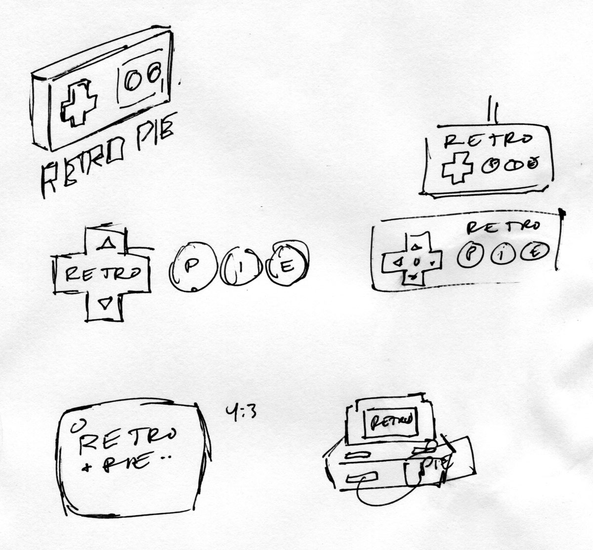
Maybe not my most inspired work, but I did spend a lot of time thinking about how best to approach this project. Just for fun, here’s a few sketches I did on paper before jumping into Illustrator:
As you might have guessed by now, I did not win this contest – but I wanted to share my logos here anyway because I really liked them and felt like it’d be a neat way to expose some of my process. So it goes!
7 Comments
I like yours better than the winner.
Thanks – me too! :P
But hey, a contest is a contest. I didn’t go in expecting to win, and it was a fun design challenge in the end.
I agree with Duff Morrow. Any of your entries is way better than the winner. My favorite is the second version, first variation.
Cheers
Thanks Henrique – maybe I should find a way to alter the RetroPie logo and offer these as an alternative? Hmmm…
Thanks, Henrique! Maybe I’ll release some of these as a pack that can replace the official logo at some point. Might be fun to investigate how theme-able RetroPie is.
Hello sir, I was searching the web for some interesting splash screens for retropie and stumbled upon your page. Just wanted to say that I really like your designs. I also appreciate the way you voiced your frustrations here without being nasty or demeaning towards the winner or those who held the contest. You seen like a class act with some first rate designs.
Thanks Brandon, I appreciate the compliments! I actually created a full RetroPie theme which utilizes a version of one of these logos, but I haven’t released it publicly yet. I might do that in the future though, so stay tuned! :)
1 Trackback or Pingback