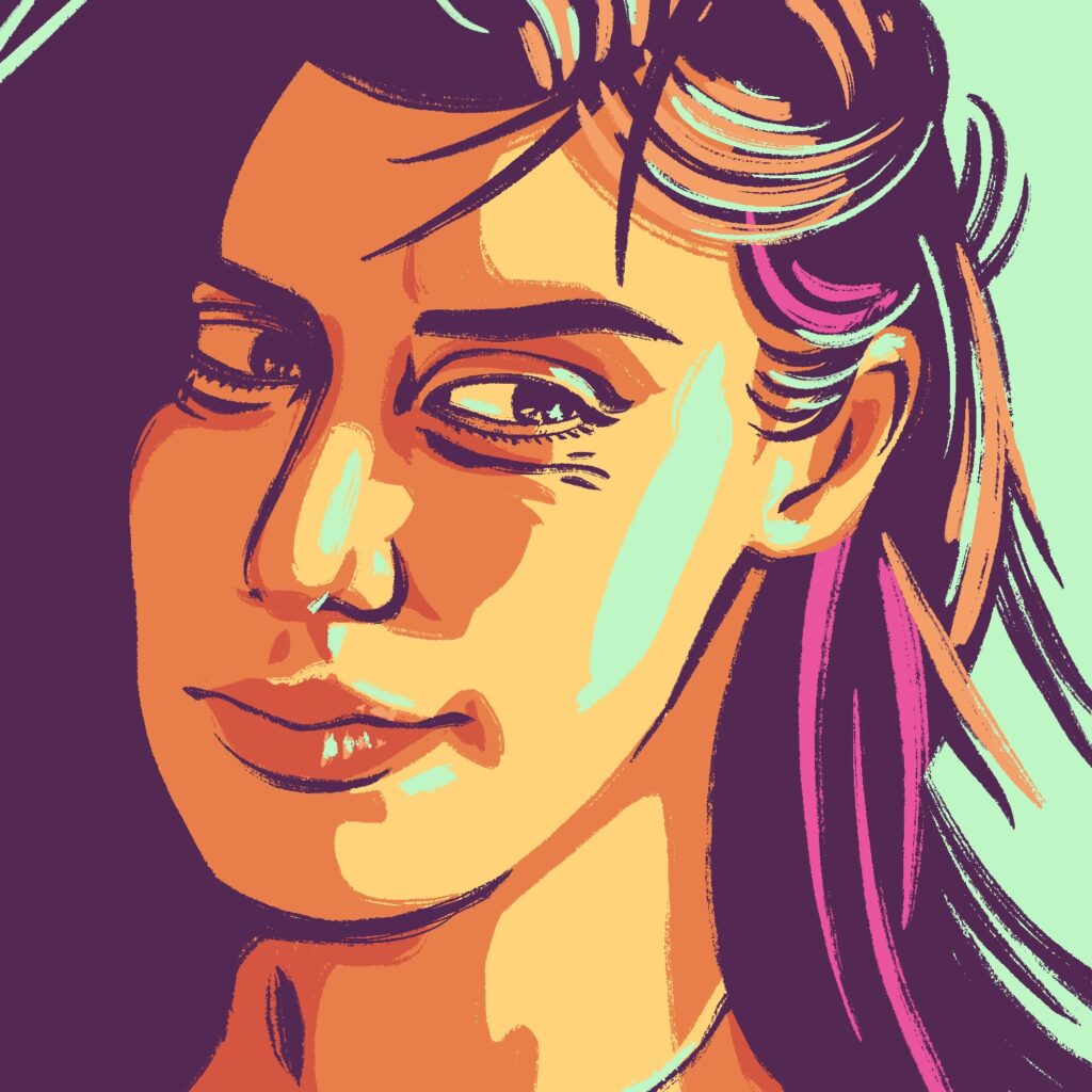
Here's my sixteenth illustration for Drawrch!
It took me a moment to like how this one turned out, but I really dig the colors - especially that light blue/green color as a highlight - and I feel like the proportions came out pretty good too, though maybe the eyes are just a tiny bit too big. The framing could be better too, I suppose.
This was created in Procreate with an iPad Pro and Apple Pencil, using the Procreate Pencil brush for sketching and the Inka brush for linework/fills. I'm really liking the Inka brush for stuff like this, though I wish strokes had just a smidge less uniformity sometimes.
The photo I used as a reference for this drawing is from SketchDaily.
If you'd like to see how I drew this one, you can watch the time-lapse below: