
We're diving underwater for today's Drawgust illustration - and it's a hairy situation!
We're diving underwater for today's Drawgust illustration - and it's a hairy situation!
Here's Drawgust drawing #4, a dark afternoon - punctuated by some lightning!
Be sure to check the Drawgust 2021 post on my work page to see all of my drawings up to this point!
My third drawing for my month-long Drawgust series. This one is a woman playing guitar for a fascinated child!
Here's drawing 2 for my month-long Drawgust series: a serpent chomping through the landscape!
Here's the time-lapse of my first drawing for Drawgust 2021 - a surprised cat!
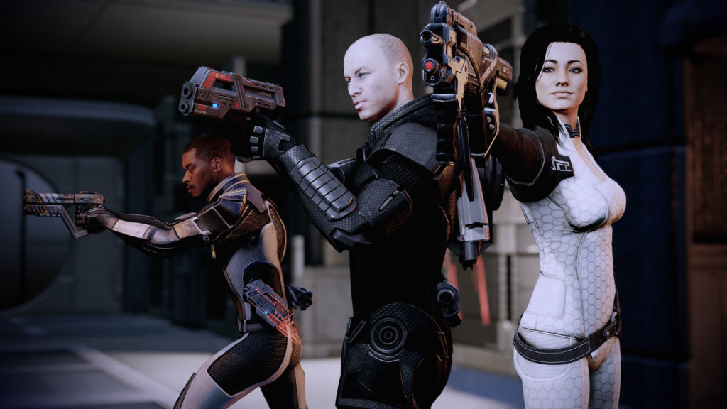
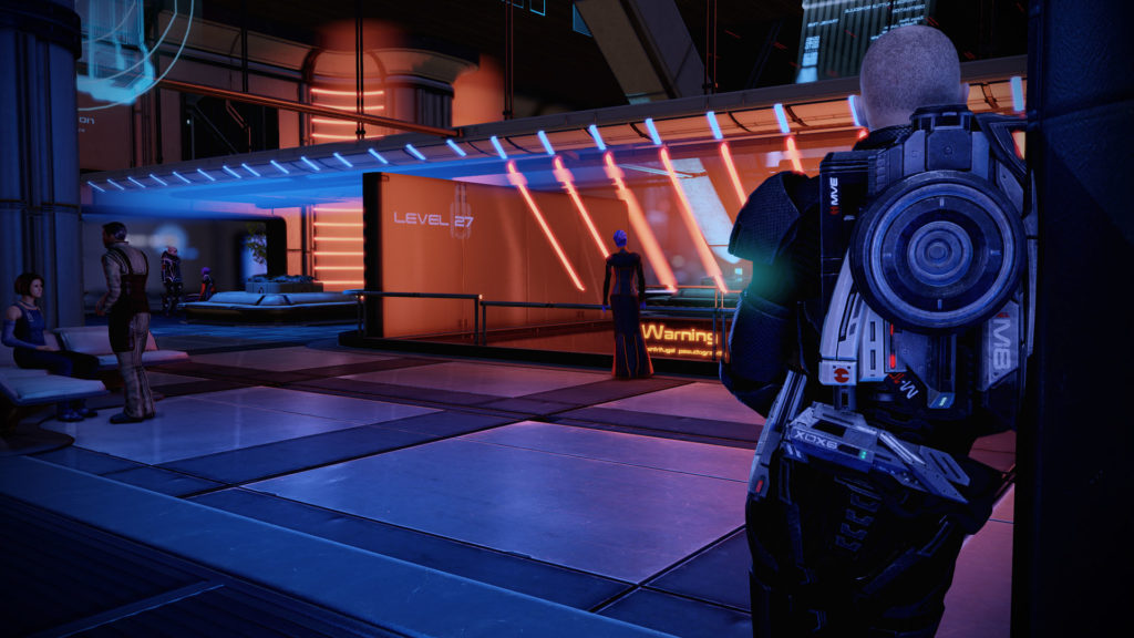
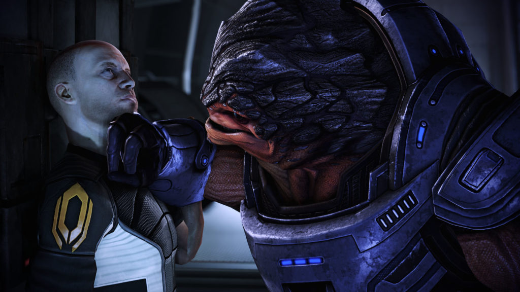
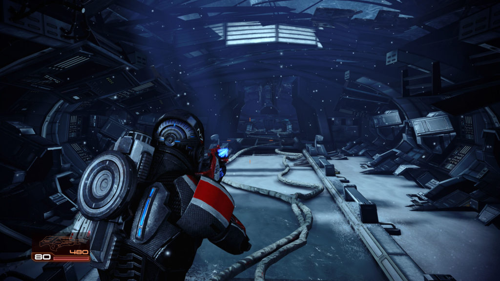
I've finally finished Mass Effect 2 again - and I've got a lot to say about it!
Just an FYI: if you care about spoilers for this 11 year old game, stop reading now.
I'm a fan of the Mass Effect series - I've read the books! - but I remember surprisingly little of this game from my first play-through back in 2010. I didn't replay it as many times as the first game, because I didn't really like many of the changes BioWare made. I have a better appreciation for ME2 now, although there are still some things I find annoying.
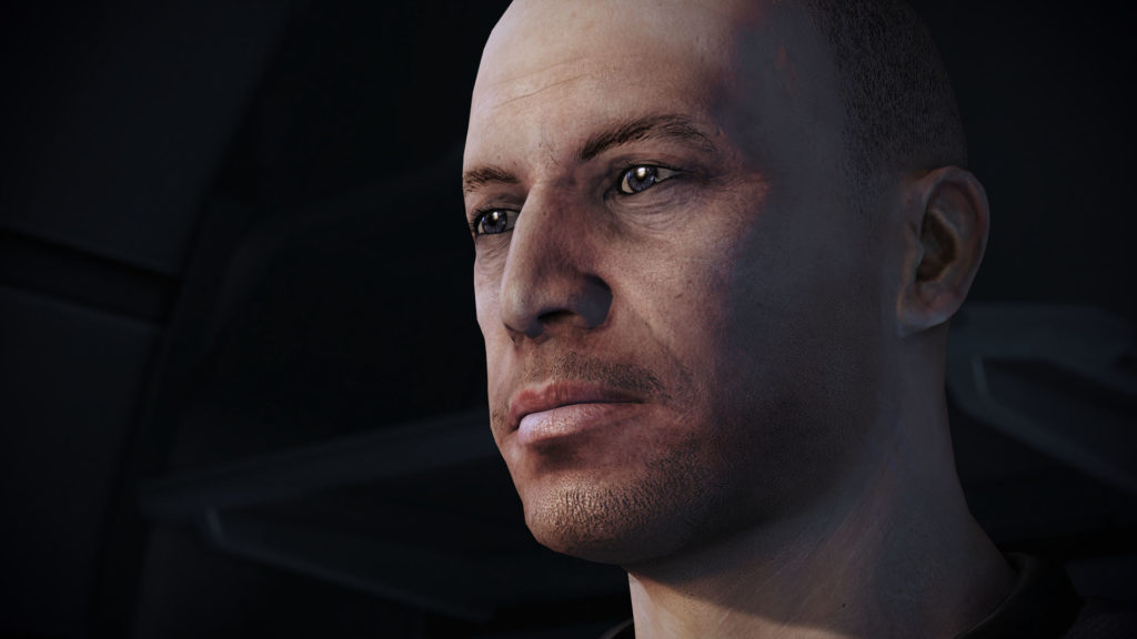
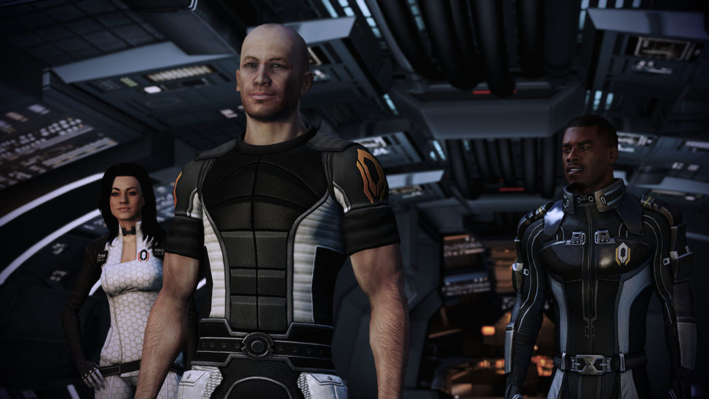
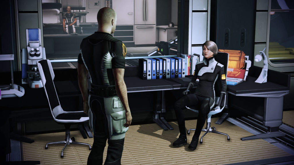
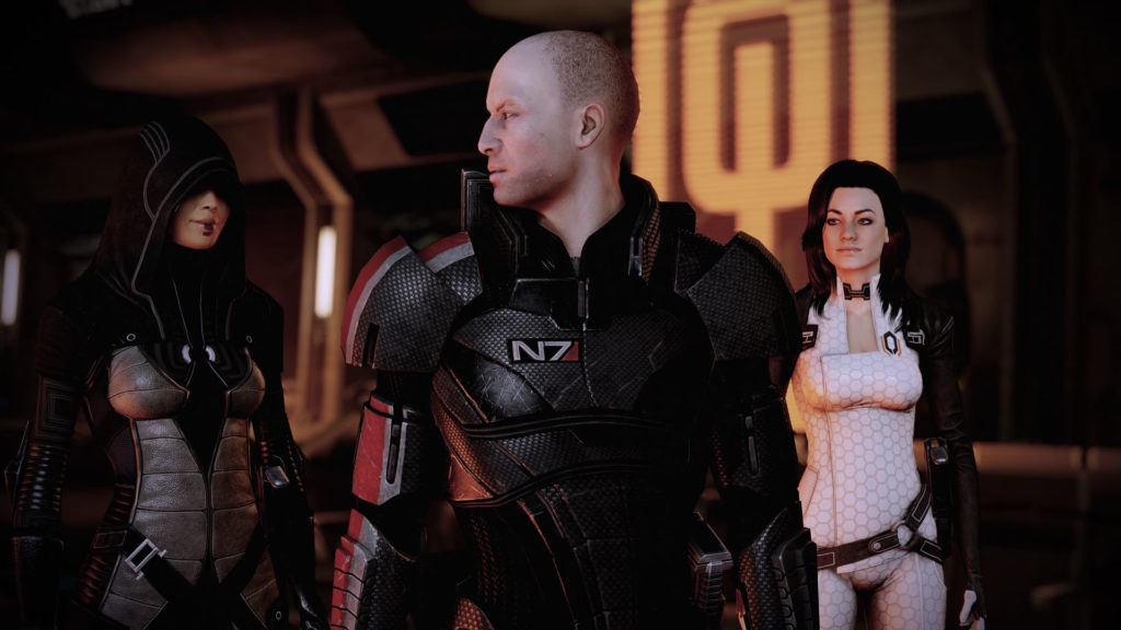
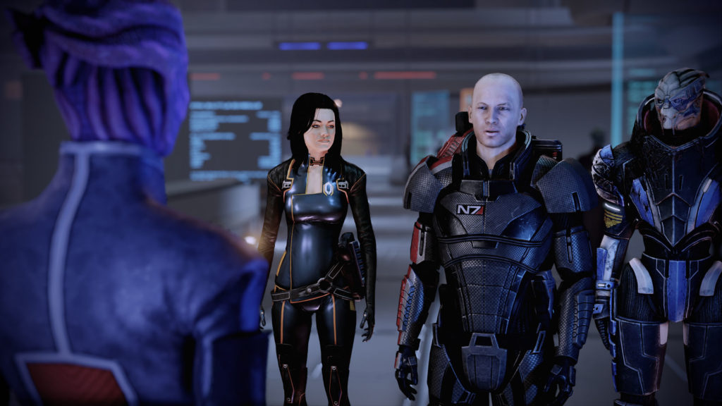
My baldy Shepard is back! I like that he's sort of a normal-looking dude, though. It helps sell the game's story.
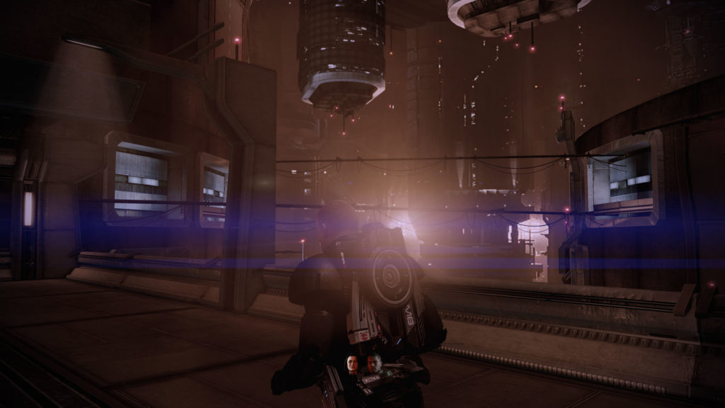
In a lot of ways, ME2 feels like the game that Mass Effect 1 wanted to be. Gone are the long "gray box" hallways, the elevator loading sequences, and the generic planet bases reachable only by way of the Mako. In their place are a number of custom set-pieces and scenarios that never feel like they've been copied and pasted from another part of the game. There are a handful of large city areas to explore. The expanded interior of the new Normandy is more believable. The combat feels more strategic and punchy, and the game overall just feels more solid. ME2 is what ME1 might have been, had it had a longer development cycle, and a larger budget, I suspect.
Coming straight off the first game, ME2 is much darker - both in presentation and story.
The lighting effects in this game are much more dramatic than the original game, likely the result of the better-produced game world. Sometimes, it's distracting, and I did miss the softer, film-grainy look of ME1, but it's not necessarily bad.
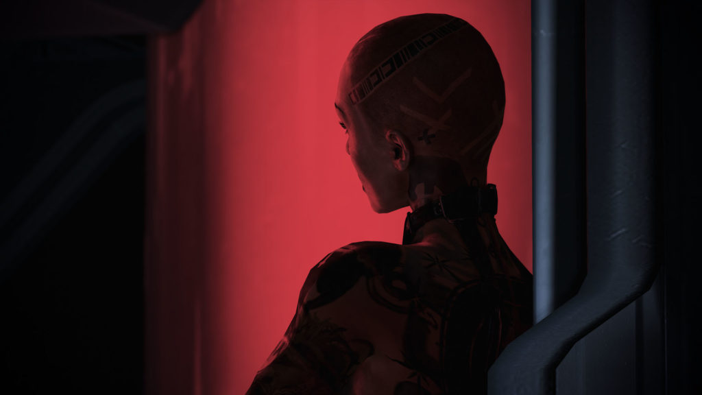
With Shephard relegated to the seedier side of the galaxy, the subject matter in this game is accordingly much darker as well. New, more scary alien races are introduced as villains, as are a number of missions that have you exploring messy subjects like human experimentation, forced captivity, slavery, etc. Many of these themes are present in the first game's lore, but they are brought to life in ME2. There's also more cursing, which I personally don't mind, and is more a sign of the times during which the game was developed, rather than anything that services the characters or story.
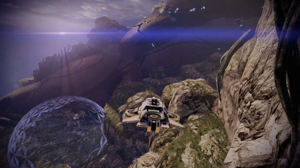
ME2 still has the same expansive feel of the first game, minus (most of) the planetary romps. The galaxy map is augmented with a new mechanic where you have to buy/spend fuel to get around locally. Rather than bouncing around planets in the Mako, you now scan planets from the comfort of space and send out probes to mine resources. Included DLC adds the Hammerhead, a hovercraft that you take out on a few short missions, but those are neither interesting or particularly memorable - I didn't do any of them until I was ready to complete the game.
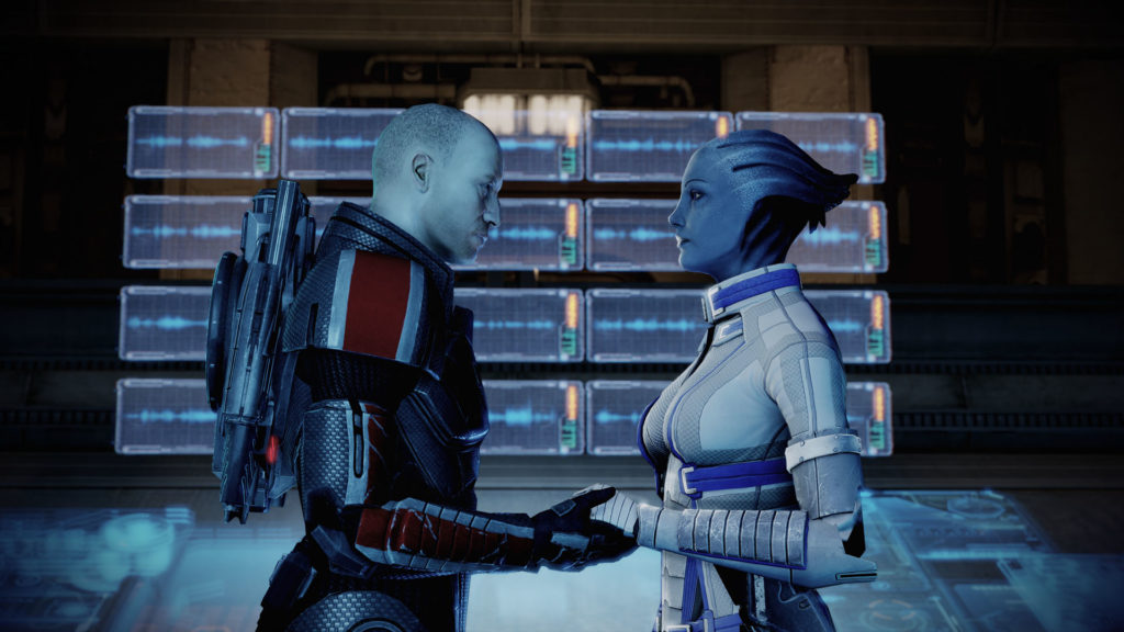
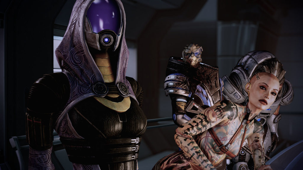
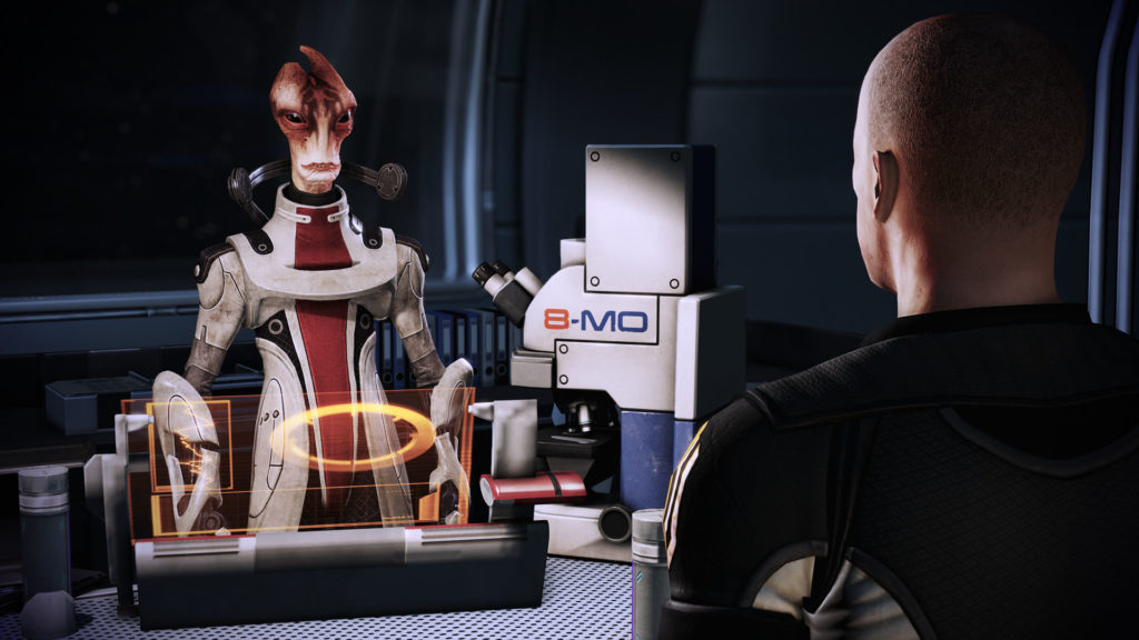
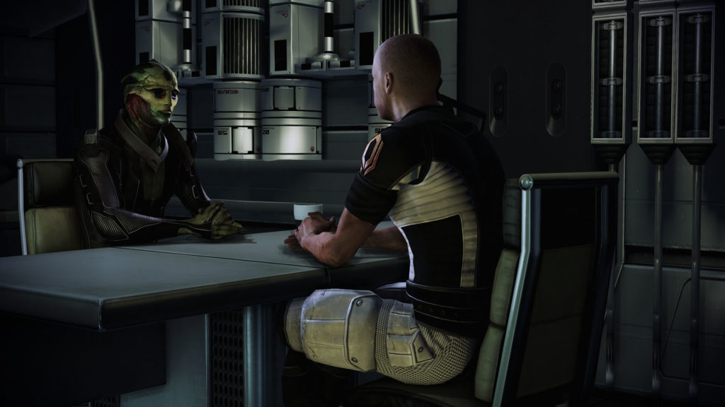
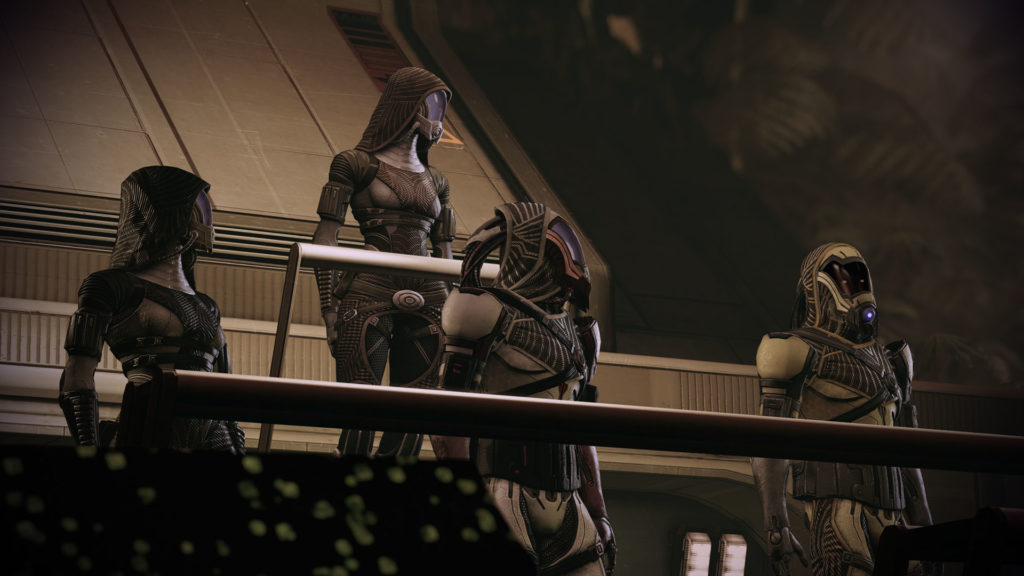
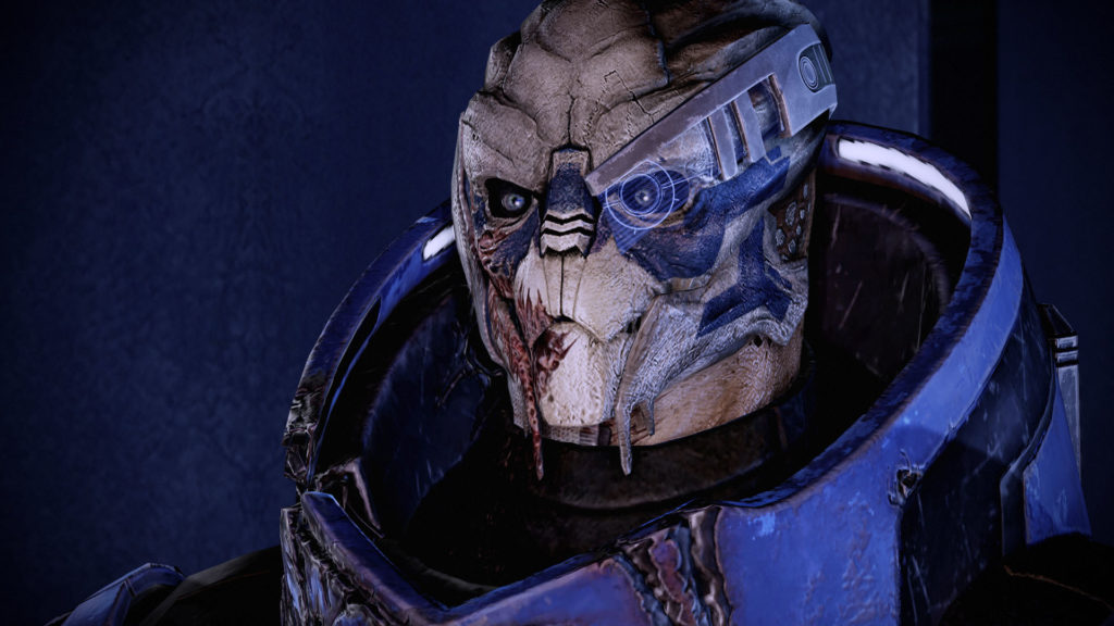
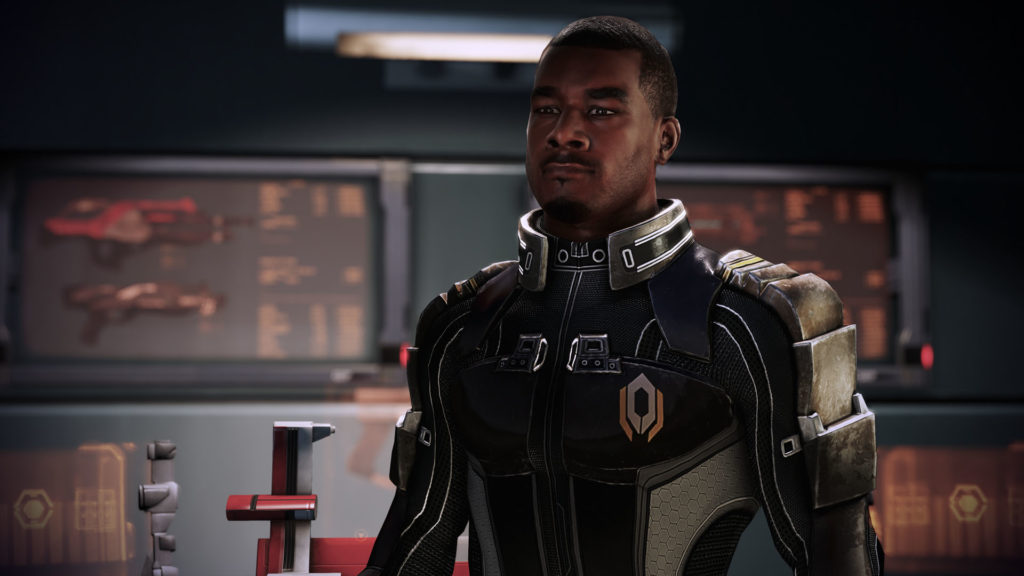
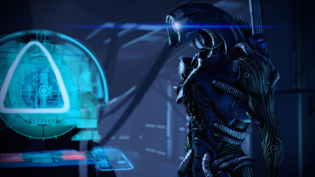
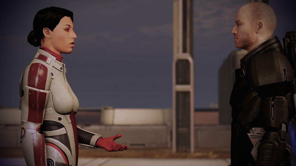
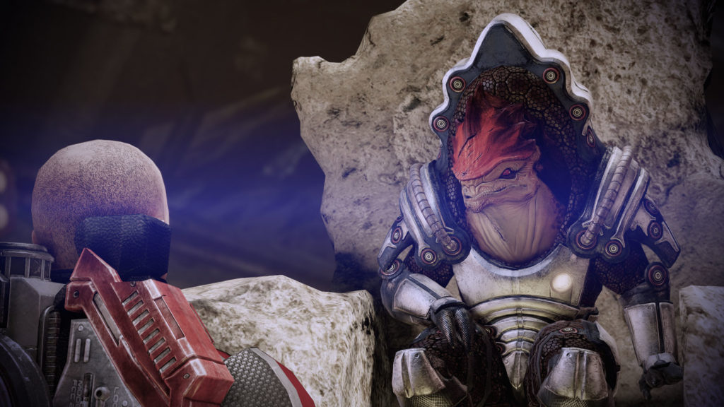
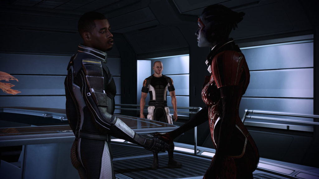
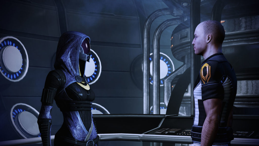
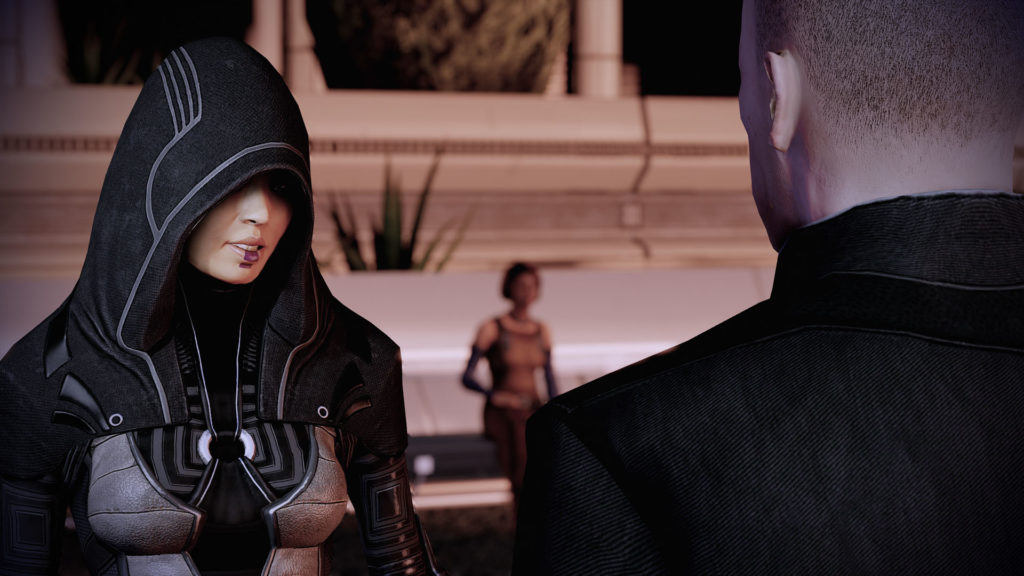
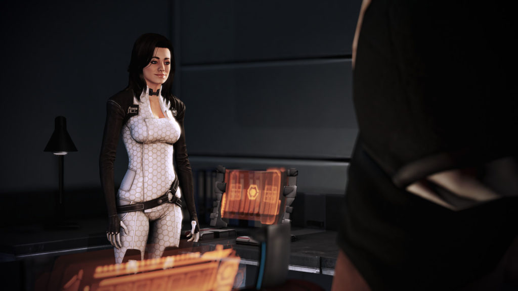
I appreciate all the work that went into ME2. As I mentioned above, levels feel complete and fleshed out, in both size and detail. There are a number of cool surprises in the story: Tali appearing with the Quarian strike team in the opening sequence, Ashley (confronting Shephard!) on Horizon, the reveal of Garrus as Archangel, the battle with the Shadowbroker, and the last addition to your team, a rogue Geth platform. I had a great time cruising around the galaxy collecting team members and helping them out.
The core of the game is less intimate than the first, but it's still quite engaging. I actually felt a bit touched when Shephard met old members of his team and gave them a hug. That is what humanity brings to the stars!
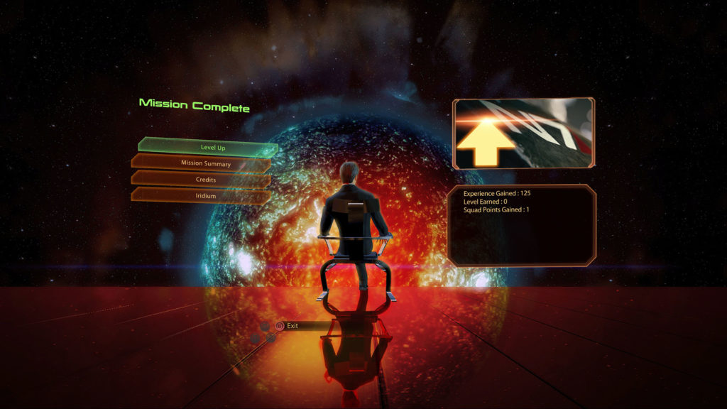
There are the inevitable bumps in the road, of course. One thing that I really dislike is the inclusion of a "mission complete" screen at the end of each sequence. Outside of these screens, the game retains the same cinematic feel as the first - so it is particularly strange to me that BioWare felt that constantly reminding players that this is, indeed, a game, was a good idea.
Another annoyance is that, in the Legendary Edition, it's not uncommon for some bits of dialogue to get cut off just before it finishes. It doesn't happen frequently enough to ruin the game, but it happens often nonetheless. This bug was present in ME1 as well.
The soundtrack is a little less synthy than I want it to be, but there are some cool moments there as well. It's serviceable.
One final gripe is with the end-game sequence where, after the Normandy's crew is abducted, you are given the option to keep exploring/completing missions or get right to the rescue effort. Unless you're familiar with the game, it's not obvious that you will trigger this event until you do - and then it's not obvious that there will be consequences if you don't begin the end-game immediately. Wanting to get the best ending, I had to play through the last few hours of the game twice, because on my first run, I opted to finished up all my open missions before tackling the finale, and nearly all of my crew was killed before I got there.
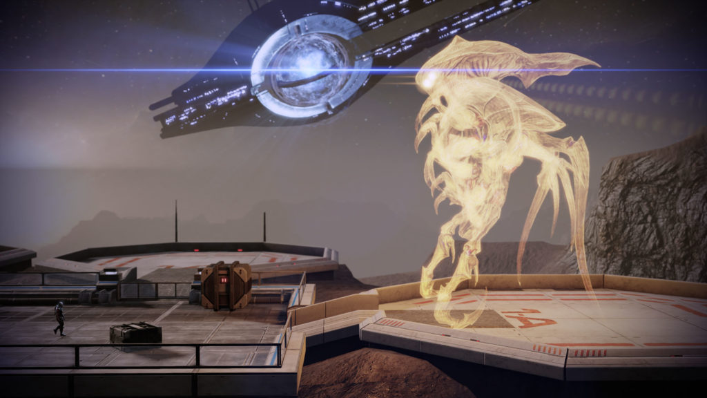
The end-game is cool. Instead of the standard 3-person mission, you work through a number of sequences where you choose a leader for a second strike team, an infiltrator, and other specialists. Who you choose and their loyalty status determines the outcome, and there are a number of things that can go wrong if you pick poorly.
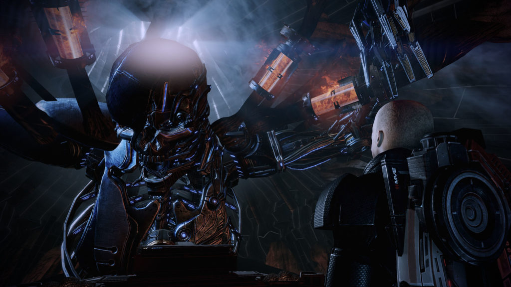
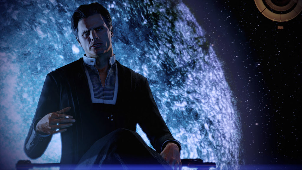
I'm not a fan of the final boss: a human Reaper, which looks like a giant Terminator robot. It's huge and scary to look at, but the idea that the Reapers, ancient machine-beings that kill all sentient life every 50,000 years, needed to make a human version of themselves is just silly to me. There is some voiceover-provided lore about how they assimilate new sentient races to make new Reapers, but all the rest of them look like insects, so it just doesn't fit.
Anyway, I'm on to Mass Effect 3 now, and I remember absolutely nothing from that game. I will be back with another progress report once that one's behind me!
Here's a concept I made recently - hopefully the first of a set. It's the first real digital drawing I've made with my new iPad Pro (using Procreate) and I'm starting to get the hang of it.
Will it ever become a game? We'll see!
For now, more concepting, and more practicing digital sketching.
Here's a time-lapse of the sketch:
The seasonal Summer Games event is back in Overwatch this year, and it comes with another collection of cool hero skins. As always, I want a bunch of them.
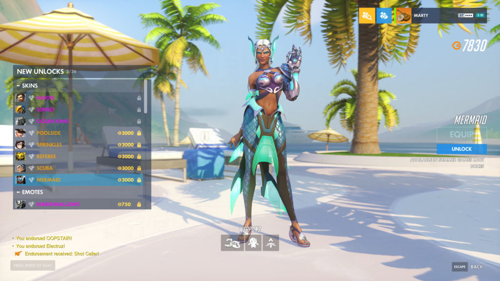
Who can argue with the Mermaid skin for Symmetra? I can't.
I've been using a Surface Book for my digital sketching since the device launched, back in 2015/2016, and it's served me well. For a first-generation device, it's a great machine. Were it not for its waning battery life and increasingly slow feel, I'd probably keep using it.
So I've been eyeing an upgrade for a while now, following the release of the Surface Book 2 and then the Surface Book 3, but noting several issues with each iteration of the hardware: pen input jitter, battery volatility, specs that aren't even close to cutting edge, etc. It's been disappointing watching the Book line be relegated to the back of the pack.
I'd hoped this year we'd see a refresh that made an upgrade worth it - even at a premium cost - but I don't see any updates on the horizon, especially with the global chip shortage looking like it'll continue on into next year.
Where does that put me? Well, if you remember some of my really old blog posts, I'm eating crow. I'm trying out an iPad Pro as a replacement.
It's Microsoft's loss, honestly. I've been an evangelist for the Surface Book since I've owned one, and I still like the device. But it just doesn't make sense for me to wait another 6-12 months for a half-step upgrade. Especially when it might still have the same issues people are facing now. Especially with the less accurate pen input. Especially when it will likely cost more.
I might come back to the Surface Book in the future, but for now, I'm going with an iPad Pro for digital drawing. Let's see where that takes me.
So I'm a little on the fence about Starfield, but this trailer gives me hope.
I don't know a lot about Starfield (does anyone, really?). I guess it's going to be an RPG in space. I expect it'll feel a little like Fallout, but I don't have any good reason to think that, other than that Bethesda is making it.
This trailer though... it's short and it doesn't show gameplay. But it's in-engine footage, and the score sounds hopeful/aspirational. I sorta like it.
And now I'm sitting here waiting to see how Starfield will turn out.