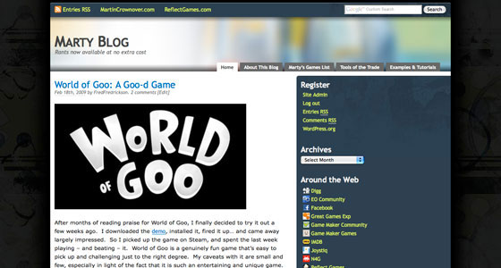
As you've probably noticed, I've changed out the theme for Marty Blog again - but this time I feel like I'm really giving it the proper attention it deserves, with something a little more unique, and a lot better to look at.
The new theme is very loosely based on the excellent PrimePress Wordpress theme by Ravi Varma. It also makes use of QuadGrunged, an awesome set of Photoshop brushes by env1ro.
There are still a few quirks I'm working out, like getting the search page functional again and adding a few of the widgets that I had added manually in the last iteration. I'm also considering changing out the header image, or having it be randomly switched out or something; it's a work in progress, I suppose. Overall, I really like the direction I've taken the theme, and I hope that everyone out there who drops in to read the blog likes it too!
If you encounter any odd problems with it, have questions, praise, or just feel like posting a comment on a website, drop me a line below. Thanks for reading!
16 Comments
Looks really good, but one suggestion – add a link to comments underneath each blog entry as well as above them on the main page. I tend to read the blog entry through the main blog page, and if I want to comment, it means I have to go right back to the top of it.
Noted and corrected – thanks for the suggestion NAL!
I was actually a little concerned that people might not be able to find the comment link tucked up there anyway, so it should be better now that it’s in two places.
I hate it.
Urgh. To be honest, I preferred the old look – I really liked that one. Sorry.
I’m a little (read: lot) tone deaf, but I don’t like the header image. As for the rest, I’ve already forgotten what the old one looked like :whistle:.
There’s a bit of a bug at the header for me. Here’s a screen:
http://img187.imageshack.us/my.php?image=28243366.png
What browser were you using, darkshado?
I’m using Firefox 3.0.6
The header image is currently based off of a painting I did a while back – but I agree, it should be changed out. My goal is to draw a few pictures (or something) that will cycle each time the page loads, or maybe just every minute or so, to keep things fresh.
I might also throw some content into the footer, but I’m not sure about that yet.
Sorry to those who dislike it, but I think it’s much better organized than the previous theme. :P
I do appreciate the input, however – thanks for letting me know!
Oh, I actually like this one, the old one was great, but his is defiantly unique!
Unique is good – most of the time.
Looks good to me ;)
Uh-oh… Has your blog “jumped the shark”?
I mean, this is the blog about the blog… but it’s getting more comments than your usual blog posts.
Fred’s so meta.
That does seem a bit… wrong. The blog is turning into a Matryoshka blog, of sorts. :D
Did someone call me?
No, nobody called you. And how did you get past the spam filter?