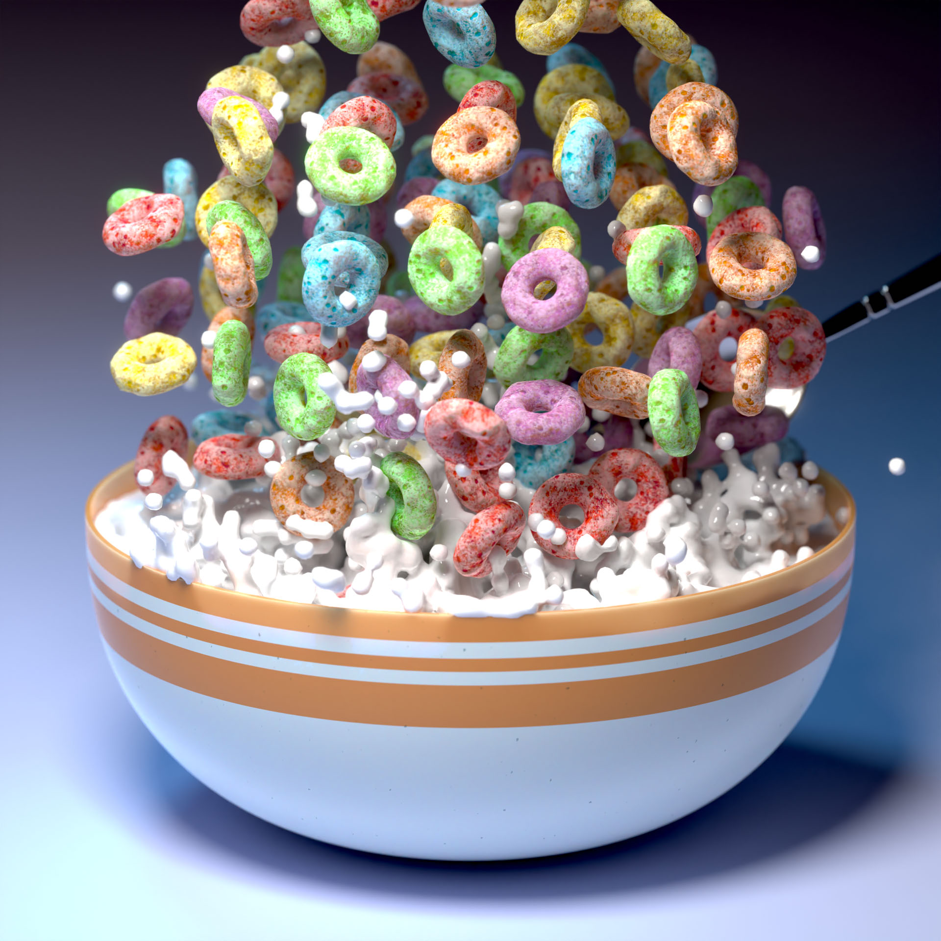
This milk is looking thiiick. 🤤

This milk is looking thiiick. 🤤
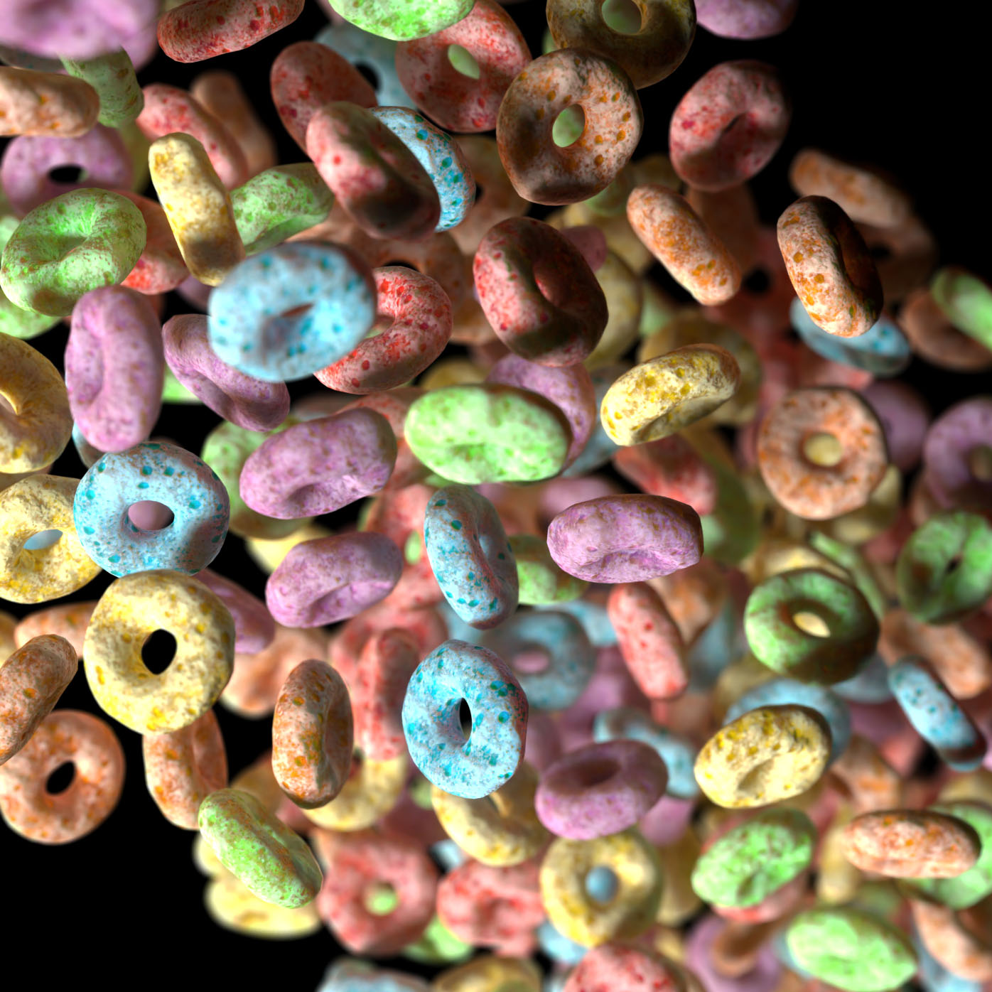
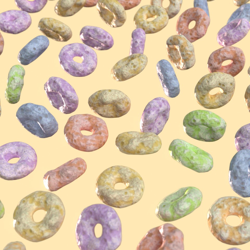
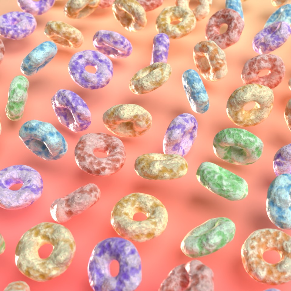
Here's another cereal render. I adjusted the colors a bit here so they are more true to what you might see in a real cereal like this.
Mostly happy with the cereal piece for now, though I plan on making more. Couldn't help but try out some physics sims first, though. Fill 'er up!
I tried making the bowl an active physics object in this one, but Blender does not like my mesh, so it gets a little jumpy. Fun to watch anyway, though.
I've been thinking about a creative project I want to do that will incorporate almost every skill I have, and these explorations in 3D rendering cereal might be the start of that. 😄
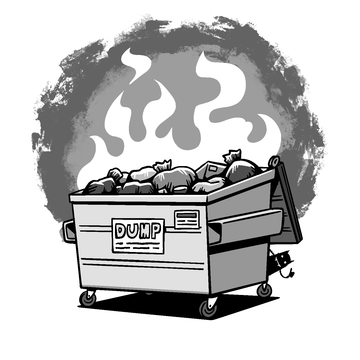
Here it is - my last drawing for Inktober 2023! The prompt for this one was "fire", and after really trying to come up with something fun, I landed on this.
I'm almost certain that I've done a dumpster fire illustration for a past project, but I need to get this one done and found a neat way to tie it into this year's Inktober set. Can you find it?
I had a great time doing this project. Thanks to everyone who has been following along throughout - I hope you've enjoyed watching it as much as I have making it. 😄 As always, this was created in Procreate with an iPad Pro and Apple Pencil, using the Procreate Pencil brush for sketching, the Syrup and Inka brushes for linework, and the Hartz brush for background texture.
If you'd like to see how I drew this one, you can watch the time-lapse below:
And if you're interested in seeing all of the time-lapses for this year's project, you can find the playlist here.
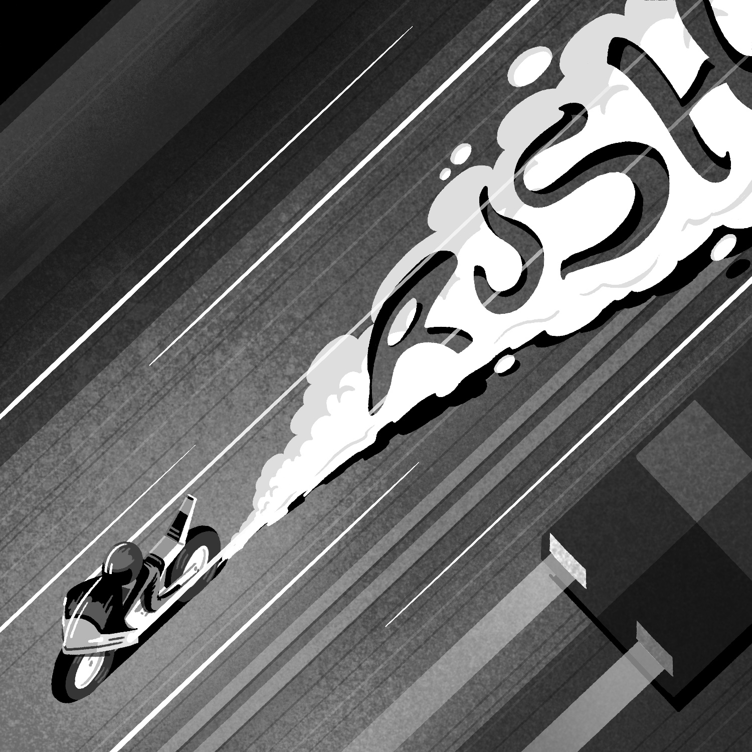
Here is my drawing for today's Inktober prompt, "rush".
I don't usually use the prompt words in my drawings, but I saw someone else's work where they created an 'R' in a sort of gilded/cloudy look, then added motion lines to it, and it inspired me.
I don't really draw motorcycles often and I hate to draw vehicles in general, so I was challenging myself, especially with the overhead oblique angle. I'm really happy with how the motorcycle and burnout smoke turned out though!
Just one more to go, whew! 😅
This was created in Procreate with an iPad Pro and Apple Pencil, using the Procreate Pencil brush for sketching, a modified Mercury brush for linework, the Syrup brush for some small details, and the Medium Nozzle and Fat Nozzle spray paint brushes for shading/texture. I also used the Soft air brush for fading some of the effects.
If you'd like to see how I drew this one, you can watch the time-lapse below:
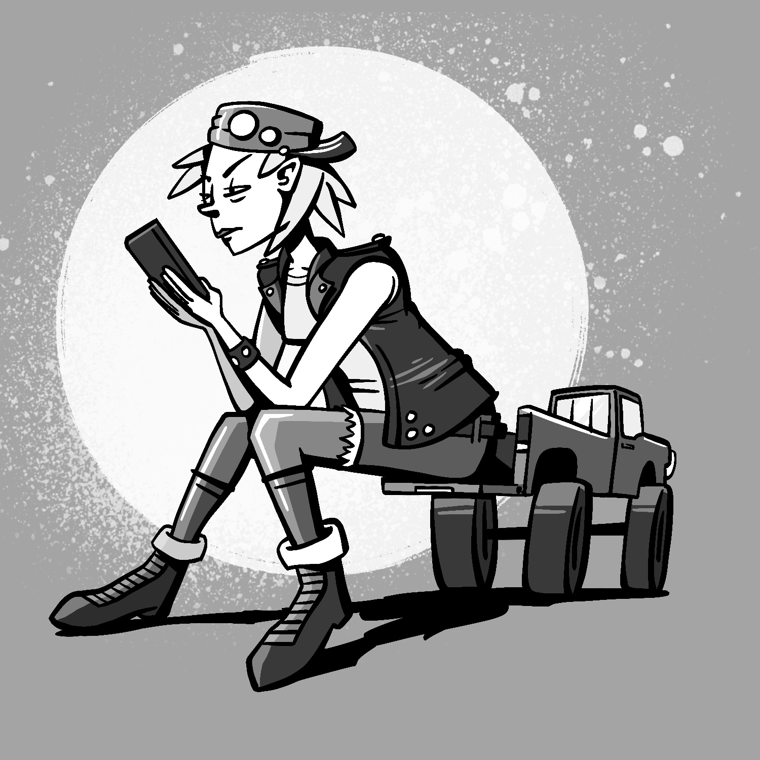
This is my illustration for today's Inktober prompt, "massive".
I had a pretty busy day today, so I had to power through this one. The shading is a little sub-par in my opinion, but I like how it turned out, and I like the composition of it.
I didn't spend a lot of time working out the proportions of the woman, so hopefully nothing looks too far off. 😅
This was created in Procreate with an iPad Pro and Apple Pencil, using the Procreate Pencil brush for sketching, the Syrup brush for linework, and the Inka brush and Fat Nozzle spray paint brush for background texture.
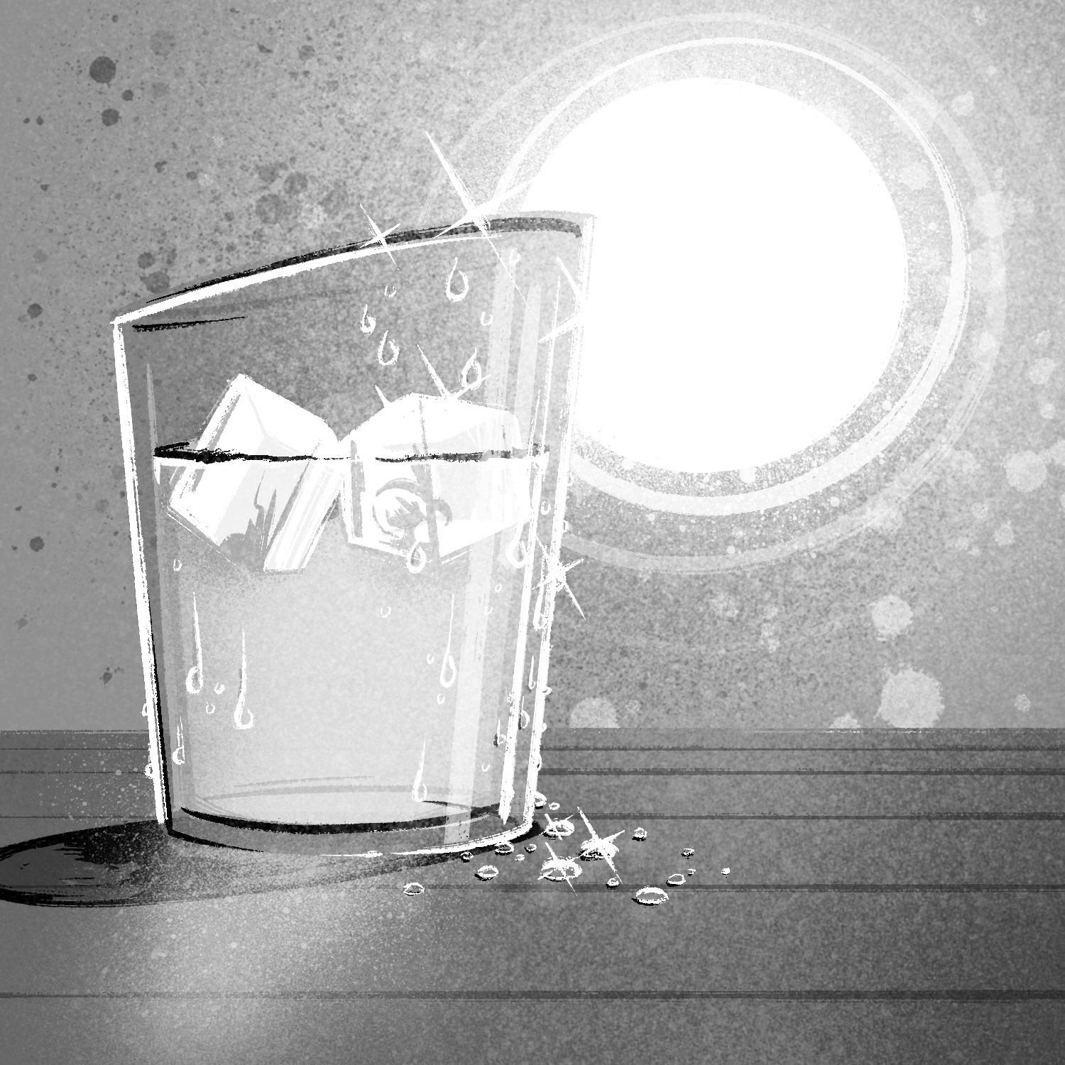
Here's today's Inktober illustration, for the prompt "sparkle". It's a nice cold glass of water!
I didn't set out to make this one look realistic, and I drew it (mostly) without any references. When I got into doing the lighting and shadows though, I couldn't help myself and ended up doing a lot of little things that I see in my 3D renders. 😅
It probably would have turned out better if I had just kept it simple, but this is just how it turned out.
This was created in Procreate with an iPad Pro and Apple Pencil, using the Procreate Pencil brush for sketching, the Inka brush for linework, the Medium Nozzle spray paint brush for shading, and the Flicks and Fat Nozzle spray paint brushes for texture.
If you'd like to see how I drew this one, you can watch the time-lapse below:
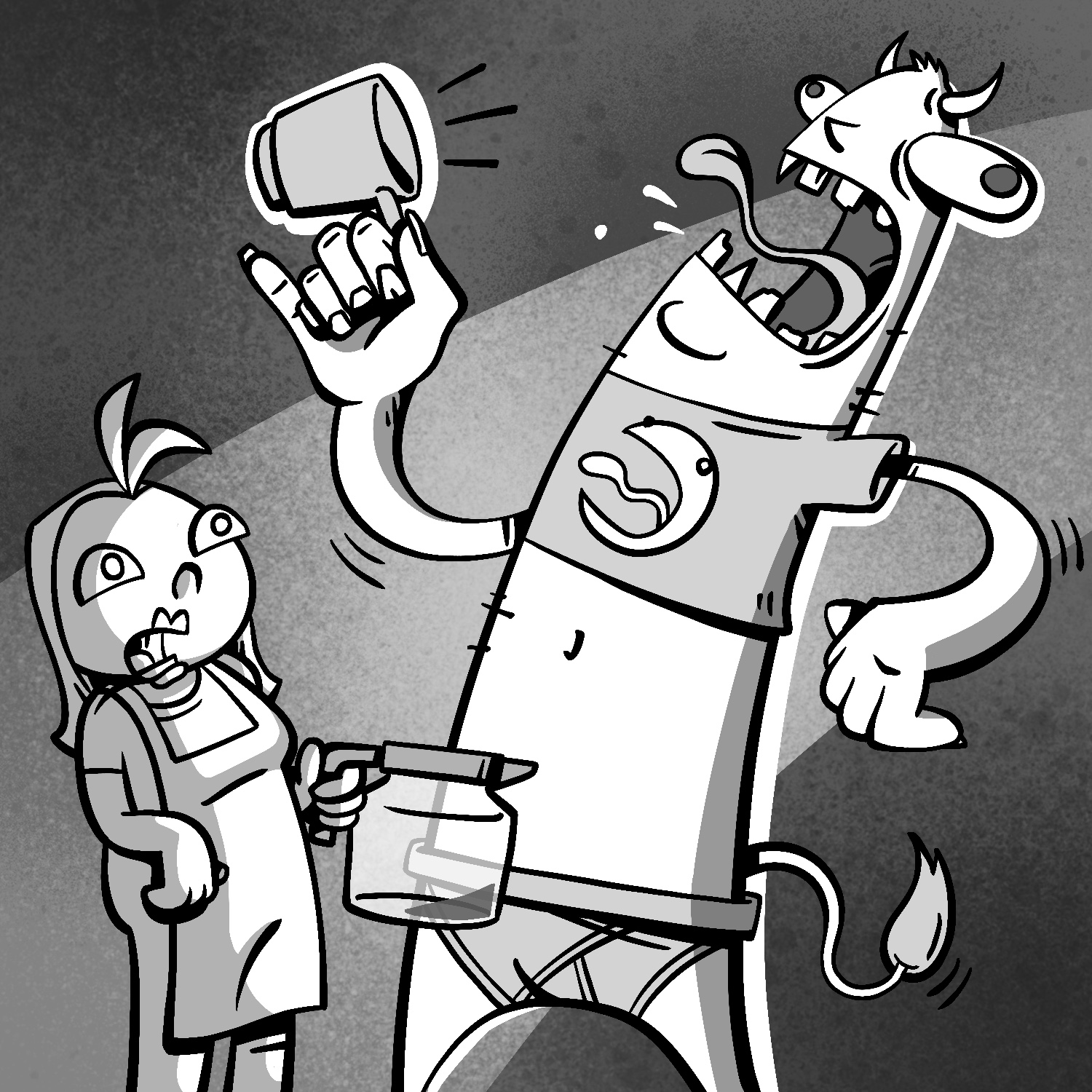
Here's my Inktober illustration for today's prompt, "beast"!
I thought it'd be nice to have our beast just be a dude who ran out of coffee. The poor barista. 😔
This one started in one place and finished in a slightly different place, but I like how it turned out. The square canvas made the composition get a little boring near the bottom, but that doesn't take away from it too much.
As always, this was created in Procreate with an iPad Pro and Apple Pencil, using the Procreate Pencil brush for sketching, the Syrup brush for linework, and the Medium Splatter, Fat Nozzle, and Burst spray paint brushes for background texture.
If you'd like to see how I drew this one, you can watch the time-lapse below:
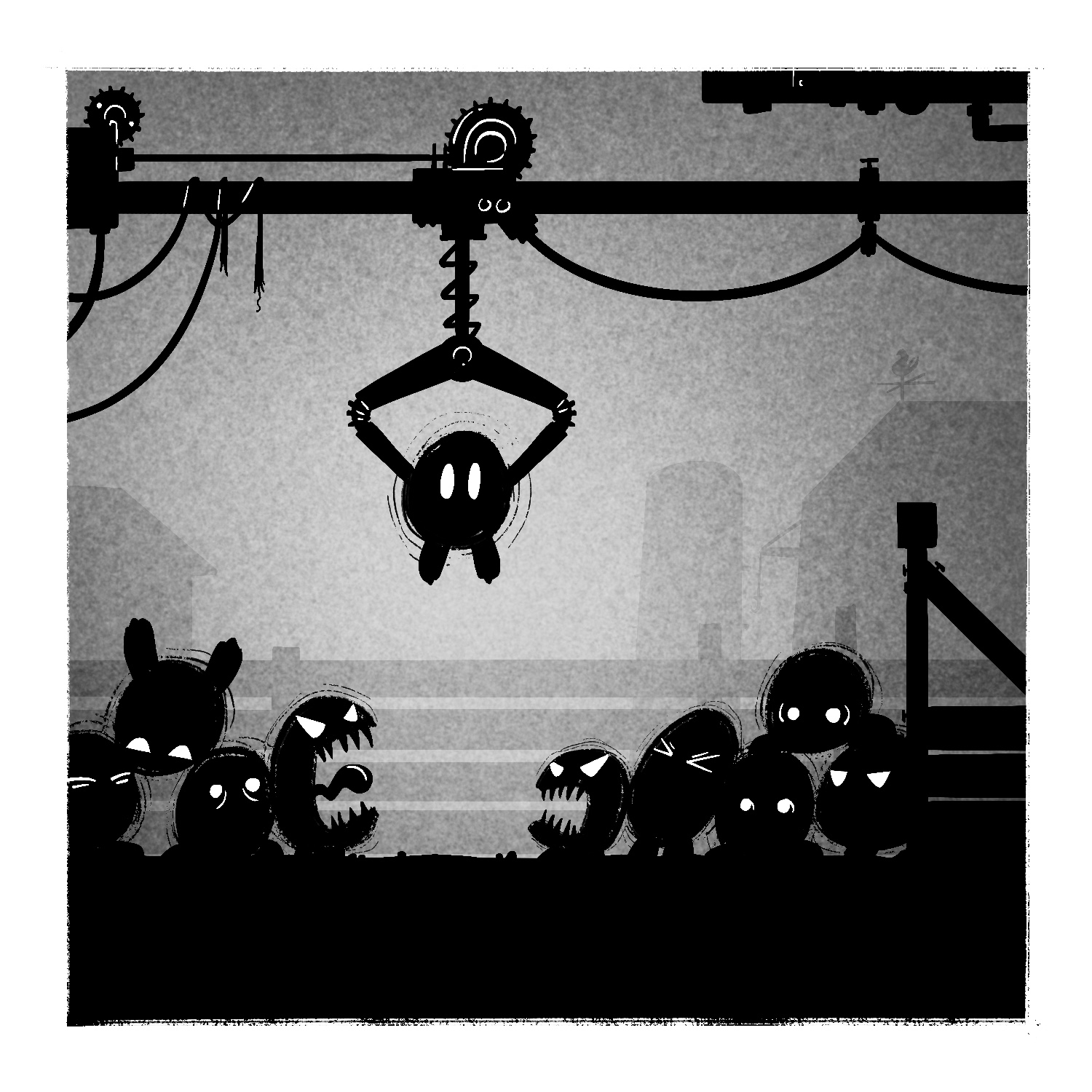
Here's my twenty-sixth illustration for Inktober 2023. The prompt for this one was "remove".
This was sort of a last-minute idea that I had, and I'm a little indifferent about how it came out. I don't hate the depth of it, or the character of the creatures being farmed, but maybe it would've been better with more of them? Who knows. This was just one of those drawing that needed to get done. 😅
Somewhere from the depths of my mushy brain, this was loosely inspired by the games Limbo and World of Goo.
As usual, this was created in Procreate with an iPad Pro and Apple Pencil, using the Procreate Pencil brush for sketching, the Syrup and Inka brushes for linework and blocking out shapes, and the Medium Nozzle spray paint brush for texture.
If you'd like to see how I drew this one, you can watch the time-lapse below: