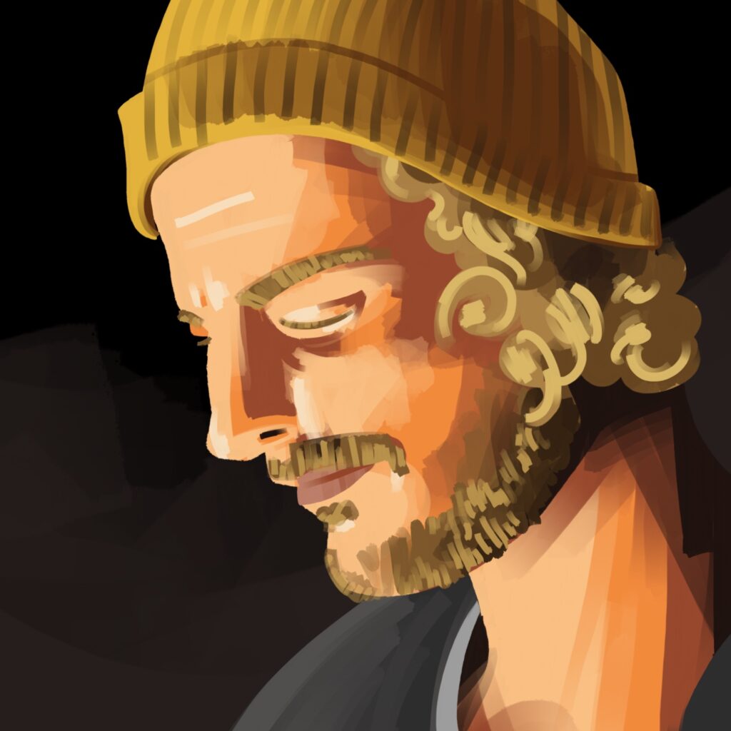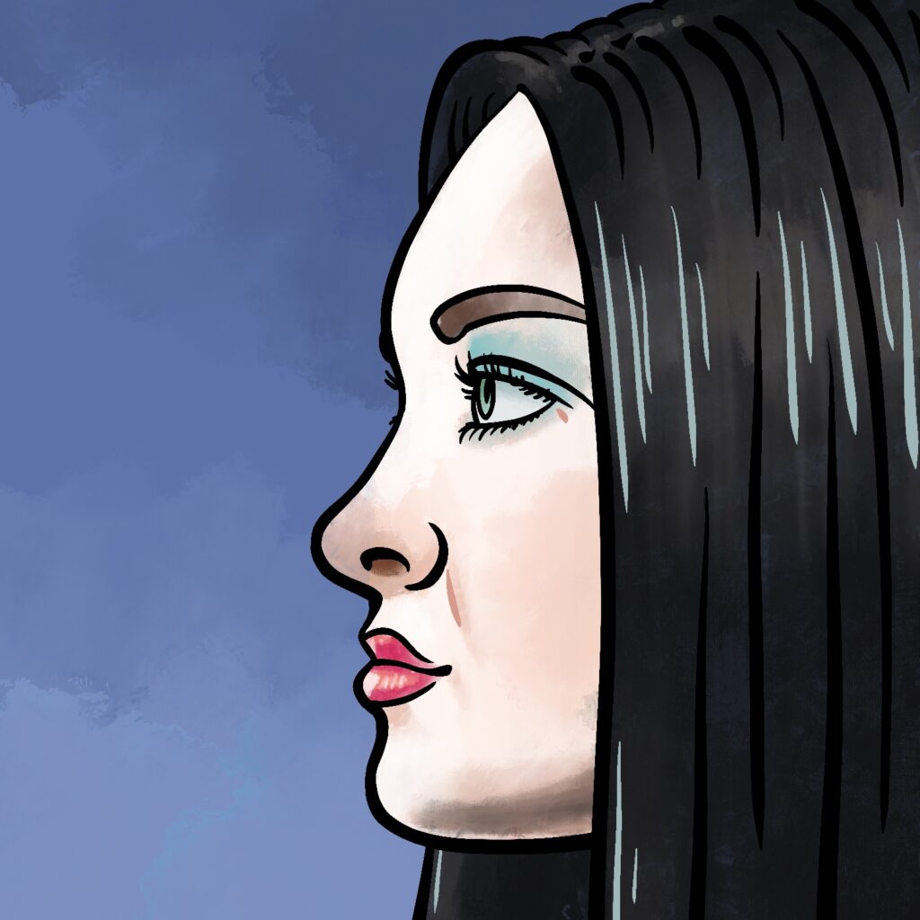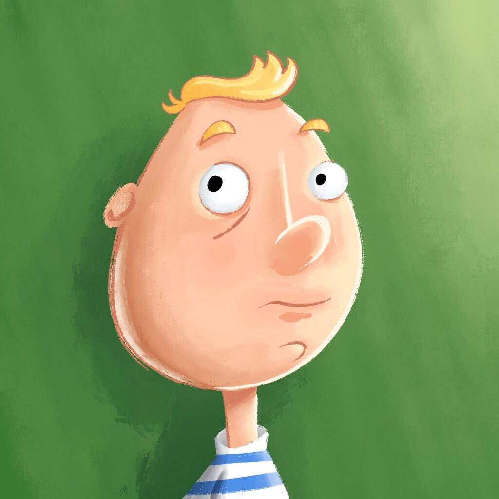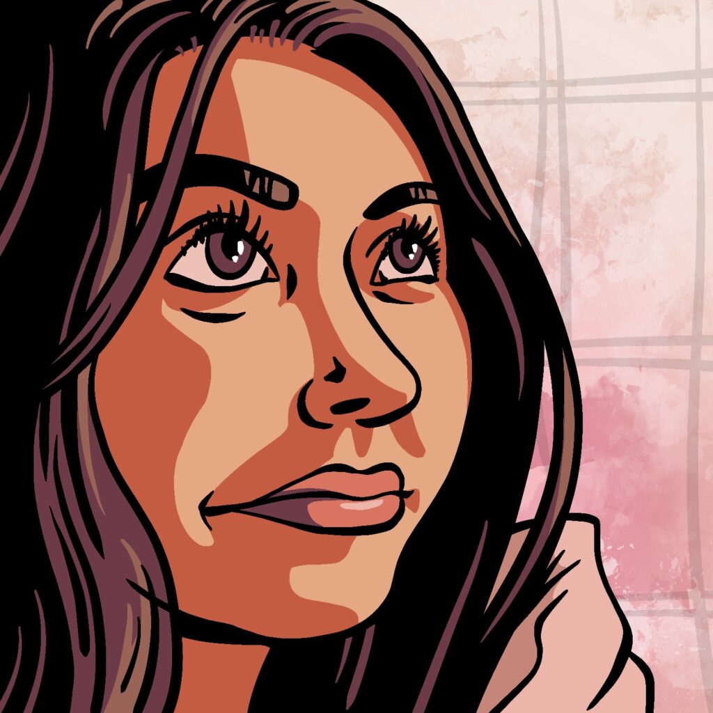
My ninth illustration for Inktober 2022 is the remnants of my usual breakfast: a granola bar wrapper.
Created in Procreate on an iPad Pro with Apple Pencil. Used the Procreate Pencil brush to sketch, a modified version of the Technical Pen brush for coloring, and a little bit of the Soft Brush at the end for the shadows and gradients.
If you'd like to see how I made this one, here's the time-lapse:
My last drawing for the first week of Inktober 2022 is a sandwich!
I drew this without a reference, just to see how well I could do with textures and such. I think it turned out alright, if a bit washed out.
As usual, this was illustrated in Procreate on an iPad Pro with an Apple Pencil. I used the Procreate Pencil brush to sketch, a modified version of the Mercury brush for masking and lines, and Quoll, Old Beach, and Sassafras brushes for texture.
If you'd like to see how this one came together, here's the time-lapse:
My sixth drawing for Inktober 2022 is a bad bear who just threw open the door!
As usual, this was created in Procreate. I used the Procreate Pencil brush for sketching, the Syrup brush for linework and shading, and the Clouds and Old Beach brushes for texture.
I was feeling very uninspired for this one. Originally, I wanted to just make a hulking creature being silhouetted against the door, but felt like it didn't look menacing enough once I started going down that route with it. Eventually, I just made it into a bear.
If you watch the time-lapse below, you'll see that I meandered a lot in the middle, experimenting with adding a second, smaller bear hiding to the side. I gave up on that though, because it felt too much like an adult being threatening towards a child. Even though they are bears. Oh well.
My fifth illustration for Inktober 2022 is a scientist tinkering with his robot buddy - as the robot looks on.
I always like drawing robots, but I wanted to switch it up a little this time and have a little story in the frame. I still can't make up my mind if the scientist is "mad" or not.
Created in Procreate with an iPad Pro and Apple Pencil, using the Procreate Pencil brush for sketching and the Syrup brush for linework/shading.
If you're curious how this one was made, here's the time-lapse:
This is my fourth illustration for Inktober 2022 - a gangster squid man!
Created in Procreate with an iPad Pro and Apple Pencil, using the Procreate Pencil brush for sketching, the Syrup brush for linework, and the Old Beach and Hartz brushes for background texture.
If you're interested in how this one came together, here's the time-lapse:
My third illustration for Inktober 2022 is a flashlight laying on the ground.
I had slightly higher hopes for this one when I started, but I'm not unhappy with it. If I were to spend more time on it, I'd probably change the perspective of the shadows a bit and add some more lighting to the background.
If you're curious how this one came together, the time-lapse is below!
It's October today, and that means another Inktober project. This is the first drawing for the month, and I'm looking forward to getting back into the groove with my iPad Pro and Procreate, which I've been sort of neglecting lately.
I hope you'll join me as I create a new illustration each day of the month!
Oh, and here's the time-lapse for this one, if you'd like to see how I made it:
Here's a fourth update to the most recent version of my Parks project in Blender.
I've added and moved a few elements here and there since the last version. The biggest change is a little more under-the-hood, though it is obvious when you compare the images directly; I've re-worked the core of my water shader/material.
It's still not quite where I want it to be, but the ripples look more water-y to me, and it's now a lot simpler in how the effect gets built. It also plays nicer with the waterfall objects, which were looking a little too much like plastic to me in the last iteration.
Since the last version, I also had an opportunity to explore the scene in VR, using my Oculus Meta Quest 2. The scale of things looked mostly okay, but the "small" hedges, which are meant to be about waist-height, are almost as tall as me! So, I'm sort of entertaining the idea of re-working those. And then back to building out the rest of the scene and adding some more park objects to it.
I also did a test render of a different lighting setup that I thought was cool. Check this out:
This is a night/sunset scene, and I can now make all the windows light up with just one click, controlled by a world variable in Blender!
I'm not sure which I like better, honestly. But it's easy to switch between the two setups, so I'll keep plugging away and experimenting. If I end up going with the latter setup as the final, I'll have to tweak the color corrections a bit - there is a lot of odd pink-ish banding in the highlights.