All posts tagged Game Maker

The Shifting Game Maker Scene

Martin · 14 years

A lot of other Game Maker-related events have happened since I last blogged, as well.

New Admins

Another big development over the last few months is that I am now an admin at the Game Maker Community forum.

Following the sudden retirement of longtime community leader KC LC, the GMC needed admins. Chronic, who was pretty much the sole active admin after KC LC's retirement, needed help. Xot and I talked with YoYo Games' Kirsty Scott about this, and within a few days we were given promotions. We've both previously served as global moderators, and earlier, simply moderators. And I'd also like to think that we both bring something fresh to the community's leadership.

I guess it all sounds a bit silly when you write it out. But I am happy to be a part of the community, and glad that YoYo Games trusts many of us enough to help guide the forum into the future.

Game Maker on PSP & iOS

Speaking of the future, a lot more information has come to light recently (and over the period of time where I didn't update the blog) on the continued development of Game Maker's runner.

At the beginning of the summer, we were shown a copy of Skydiver running on PSP, and much more recently, we've seen Madness Madness Madness running on an iPod and Skydiver on iPad. It's an impressive feat, and I look forward to seeing where it leads for Game Maker users.

The PSP runner wasn't as impressive to me, simply because I knew that even if they did work out all the kinks, it would never truly be easy to release GM-made games on the platform. There are simply too many hoops to jump through. For that reason alone, the iOS runner seems much more promising to me. I hope that I might get a chance to help push out some games for it early on, depending on how YoYo Games plans on publishing user-created content.

I still hate saying "iOS" out loud though. Eye-oh-ess. Does not roll off the tongue.

Oh, and I've also been really happy with all the information Mike Dailly (YYG) has been posting on his blog about the development of upcoming Game Maker releases. It's been a good read, and I like that someone so experienced is heading up that project.

Discovery Competition Entry is Go. Er... No.

A much smaller blip on the radar was the Discovery Competition entry me and some buddies (Matt "Lethalanvas" Griffin and David Perritte) were working on. It took off at tremendous pace, and then we all got a little too busy and we stopped working on it.
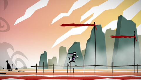
Originally, we wanted to keep it a secret, so there wouldn't be much hype about it if we didn't finish (good thing, right?), but now I figure we might as well show off what we've done.

Basically, it's a game about a ninja assassin type guy who's lost his memory and who wants to stop the world from collapsing around him. It features a robust platform engine, coupled a ton of slick animations by yours truly, which lets you run, slide, grapple ledges, swing from ceilings, and eventually a lot more. The gist of it was to create a story-driven platforming experience that gave players a lot of difference challenges at once, so they could work on levels in whatever order they liked, to an extent, depending on their skill level.

If we can all find the time, I wouldn't mind working on it again sometime next year, actually. We all put a lot of work into it, and although there isn't much to do in the game right now, there is a lot of stuff that we have done, including a written story, an awesome platforming engine, some killer graphics and animation, and some cool tunes. I don't want to see it go to waste.

I'll try to get a demo or something up eventually. Like I said, we don't have much of the actual gameplay hammered out yet, but it's fun to play around with.


Per the request of one of my Steam buddies, I've added the Game Maker file from an old visual demo I'd made to the Examples & Tutorials page.

This example uses paths, textured vertexes, particles, and a noise overlay to create a slowly changing, relaxing visual based on the Outta Space desktop wallpapers of the same name created by Philipp Antoni. You may find the flowing movement similar to the flowing home background on the PlayStation 3/PSP as well.

I originally intended to make this into a screensaver, but never got around to finishing it for that purpose. Still, I think it's a good example of an abstract visual that can be achieved with Game Maker using a few different effects in tandem.

Looks like the cat is finally (officially) out of the bag!

What was alluded to in a few obscure screenshots and then not very subtly in the YoYo Games Competition 5 rules has now been made official in a Glog post today; that YYG has been hard at work on a version of the Game Maker runner that works on PSP.

YYG also announced that they have hired Russel Kay as their Chief Technical Officer in charge of all future Game Maker development. Kay is the former Senior Software Architect for Realtime Worlds, and while his new post at YYG seems to imply that Mark Overmars may not be taking as big a role in future versions of Game Maker, Sandy (presumably) tries to lay those fears to rest in the announcement:

Also, don’t worry about Mark Overmars, he won’t be disappearing. Mark is too busy with his university commitments to take up a full-time role at YoYo Games, but he has recently strengthened his links with us and he has been fully involved in the process of recruiting Russell at every stage. Mark has already been working closely with Russell and he will continue to have a great influence on Game Maker and our community.

I'm pretty excited for YYG and Game Maker - I think that if they can successfully make the jump to consoles/handhelds they could become a very lucrative company (almost like Steam for consoles/handhelds). I also think that with new talent on board, we might see larger advancements in the power of Game Maker, and sooner.

Of course, if they can't make that happen it could spell the end of Game Maker. But with a lot of smart, talented people on board, I'm not concerned about that. Interesting news, anyway.

Happy Holidays

Martin · 14 years

Well, that last post was a doozy. A bit of a hard act to follow, eh?

Jokes aside, that last post really was partially to blame for my recent hiatus from posting here. After the fallout over the old-new Game Maker logo settled, the dust cleared, and (some of) the anger subsided, YoYo Games stated that they'd be open to suggestions for altering the new logo. So, I helped produce a topic on the Game Maker Community to get everyone's suggestions in one place, and we eventually ended up putting logos to vote and submitting them to YYG as the community's official suggestions.

As many of you might already know, it worked out well, Sandy Duncan/YYG liked our ideas, and they ended up changing the logo. It was a great accomplishment for the GMC, and I am glad that we were all able to come together and set things right - but keeping it all organized left me quite exhausted. That, and I have had a lot of other work to do lately, helping a friend get a website off the ground, working on my own games/projects, doing the last Reflect Games game development competition of the year, fixing my laptop, shopping for the holidays, etc.

So the blog got left behind a bit. I did manage to sneak in and fix up some of the graphics on the theme. It's that time where I've started wanting to change it (again, I know), but a quick refresh of the sloppy parts has satisfied my urge to change it for now.

Most of the things I mentioned above are over or winding down now though, so I'm hoping that after the holidays I'll have more time to play with Game Maker, website development (yes, the ongoing Reflect Games website is still in the works!), and other related stuff. It's just been a busy time.

Anyway, I'm not sure if I'll be updating the blog again before the bulk of the holidays hit, so I just wanted to wish everyone out there a happy holiday and a good new year! I hope the end of 2009 turns out to be well for everyone!

Thanks for reading, and I will see you all in 2010!

The New GM8 Logo Stinks

Martin · 14 years

I'm really disappointed with the new Game Maker 8 logo.

Let me preface this entire post by saying up front that I am not mad that I lost, since I had a logo in the running. I'm really just dismayed over the logo that did win, which I felt was one of the worst of the four runners up.

I also want to say that as a runner-up, I will be receiving a free copy of Game Maker 8, and I am grateful for that. I am glad that since YoYo Games has taken over the Game Maker project, they have kept the community involved as much as possible. I think that hearkens back to the days when it was still only Mark Overmars working on the project, and if you'll pardon the pun, it keeps a friendly face on the company.

Since YYG's inception, I've been a supporter of theirs. When questionable decisions have been made, I've tried to see things from their side of the aisle, and most of the time, I've ended up agreeing with what they have done. I've defended them many, many times on the GMC, in some cases above and beyond what I would consider what is "required" of the forum staff.

But this time, for the new Game Maker 8 logo, I strongly disagree with their choice. As both a professional graphic designer and a Game Maker user.

When I was brainstorming for my own logo ideas, I considered using a gear or cog in the image. In the beginning, it seemed a fitting and iconic thing to use in a new logo for game construction software, but as I played around with various other ideas, I began to feel that the gear was too cliched. I also felt that too many other users would enter graphics with gears in them, so I was not surprised to see that half of the runners-up had done so.

Not only does the winning logo contain the over-used cog, but it also makes use of a giant smiley face - which is, at best, a rip-off of other iconic images (Yahoo Messenger's logo, the 4chan C&H smiley), and at worst, a childish and shallow attempt to bring in a young crowd of indie game developers.

Also, it looks like it's crying.

The designer in me cringes every time I see it; every part of the logo is covered with gradients. This ensures that reproducing the logo in print will be difficult, and it makes the design look unprofessional. Not that Game Maker is a professional program, but this point doesn't have to be hammered home at every facet.

And that's the other problem I have with this decision - I understand that Game Maker isn't a professional tool by any means, and I know that YYG wants to convey this to potential users. And maybe they want the program to appeal to a younger demographic as well. But the bottom line is that nobody, new and old users alike, wants to feel like they're using a program that is gimpy or for children. And that's the vibe this logo emanates.

I suppose it's oddly appropriate that a tool for amateur game developers employs a logo that looks like it was created by an amateur designer. I just really feel that YYG took this idea and ran a bit too far with it.

Carl the Cog, from Conker's Bad Fur Day.

I've always said the power in a tool lies in the hands of the person who wields it, and not solely in the tool itself. And while I still believe this to be true, I also think it's important that the tool isn't made to look completely stupid by its manufacturer. Perhaps the many people who claim to be leaving the GM scene over this are over-reacting, but when a decision is made that so negatively affects the nature of this tool in the eyes of others, I can't blame people for being upset about it.

Ultimately, this logo was a piss-poor choice, and that's all there is to it. I leave you with this quote from the logo's creator, Albert Zak (courtesy of Game Maker Blog):

I’m however still kind of puzzled why only 8% picked this as their favorite, but I’m glad Sandy and a few others realized what’s really behind this logo.

Is this what's behind the logo? Maybe that's why the big face is laughing so hard.

Well, this isn't nearly as controversial as my recent rant about proprietary Mac hardware or the problems with piracy, but I'd like to announce that I have updated the Examples & Tutorials page and added a new example/tutorial to boot.

The new addition, an example/tutorial (perhaps an 'examporial'? 'tutample'? okay, I'll stop) shows how to create a somewhat realistic fire effect using Game Maker's particle system, and takes you through the entire process, from sprite creation to tweaking the final effect for perfection. You can check out the write-up and download the example files here.

And as mentioned above, I've also re-tooled the Examples/Tutorials page, so all the ugly boxes are gone, and everything is much cleaner and better organized. You'll also find a partially re-written tutorial for 3D model importing/UV mapping in there, though I'd like to completely re-write this in the future, as my methods have changed a bit since I wrote the original. I'll probably be adding my completely unfinished competition project to the open source/abandoned section soon, too.

If you have any suggestions for other examples you'd like me to make, sound off in the comments!

Back From Thanksgiving

Martin · 15 years

I'm finally back from my Thanksgiving holiday at my parents' house, and I can hardly believe it's already December! Where has this year gone?

Anyway, I had a couple of things I wanted to post today.

A recent episode of The Simpsons took Apple down a peg, as Springfield mall got its first "Mapple" store. It was quite enjoyable. Of course, all the YouTube links are gone now, so you'll have to find the episode yourself.

The next thing I wanted to post, also a video, is a new trailer released yesterday for the Black Mesa mod - a Half-Life 2 mod that is looking to recreate the original Half-Life with the Source engine, but with more content, higher resolution textures and models, and environments that take better advantage of the engine than Valve's original port of the game. Normally I don't get too excited over Source engine mods, since they rarely make good on their promises, or even get finished for that matter, but the amount of polish that has gone into this trailer makes me hope otherwise for Black Mesa. You can view the trailer below and find out more about the mod at the official site.

I played through a huge chunk of Half-Life 2 this holiday weekend, so I guess I'm a little bit excited about Half-Life in general again.

I'm glad to see that people found my recent set of examples interesting too, and I hope to get a fixed GM6 version of the 3D Rain example up sometime tonight. Sorry about the slow rain example, I'll play with it and see if I can get something up that's a little easier on the older machines soon as well!

That's all for now - thanks for reading, and I hope everyone had a good Thanksgiving (or just a good weekend if you're not from the U.S.)!

Update: I've made a new GM6 file that should run better than the previous rain example, and which should load correctly in GM6. The area that the rain covers is a bit smaller than the original example, and the rain is a bit more sparse, but you should get the idea.

You can download the new example at the link above!

Marty Moved

Martin · 16 years

Over the last week I was busy boxing up all my stuff and trying to coordinate all my services (cable, internet, electricity, etc.) to have things ready for my move, and this weekend I got everything moved over - I am now officially moved out of my old apartment, and living with my girlfriend at the new one. There are still a lot of boxes to sort through, but the computer is set up, the Xbox is up and running, and... I've got no internet yet!

You see, me being the master planner that I am, only called up AT&T to transfer my existing phone and internet service on friday of last week. This translates into my landline being moved today and my internet being reconnected on Wednesday. Not an entirely raw deal, as I can go about most of my business without it - I've got plenty of games that need playing, and the aforementioned boxes to unpack. Still, it has been an inconvenience when I've needed to get phone numbers and other information which I normally collect from the internet in about 5 seconds, but now have to obtain either by searching the phone book or calling up 411, both of which are expensive prospects in time and money respectively.

At first, I was tempted to activate my cell phone's limited internet capabilities (by adding a $5-a-month charge to my plan) but being through the bulk my time without the internet now, I think I'll just wait it out.

Being without the worldwide time sink that is the internet, I've also had some time (between games and unpacking, of course) to think about some of the GM content I want to release here on my site in the near future, particularly of the example and tutorial flavor. I still want to put together a simple tutorial about how to make that animated water texture I introduced in my 3D example, as well as an example for the fire particles I used in Sun Sun Der, and a few other small things. I should have plenty of time to work on a couple of these over the next few days, so we'll see what I can come up with. If anyone has any ideas about what they'd want to see, please let me know in the comments below.

Anyway, I just wanted to write a little about where I am with my GM work and offer an explanation as to why you might not have seen me on AIM/MSN/XBL/GMC/etc. over the weekend. Thanks for reading, and again, please let me know of any examples/tutorials you might want to see, preferably graphics oriented.

Time Keeps On Slippin’

Martin · 16 years

October is drawing to a close, and I'm questioning the future of my newest project, as far as its status as a YYG Competition #4 entry is concerned.

I'll be the first to admit that this is not an entirely unexpected outcome - my project was a bit ambitious. I still want to complete it someday, as I think the game concept is a good one, and I really liked the way the game was turning out. Unfortunately, with my trips to Vegas and BlizzCon, and lots of my free time being spent with my girlfriend as we search for a place to live together, I've not been able to devote the necessary time to Game Maker, and I don't want to be stuck trying to rush the game out, since it is still going to require a lot of artwork and programming.

Not all is lost, however.

A few days ago I came up with a decent idea for a smaller game, and if I have the time, I'll throw it together for the competition.

Since only a handful of people got a chance to play the other game, I'll post a demo here later for anyone who's interested in trying it out. It's nothing more than a driving engine with some simple collisions currently, but as I mentioned, I would like to expand on it eventually.

The whole year of 2008 has been like this for me, actually. I've begun (and continued) many projects, including the site update for Reflect, a new version of the Reflect system itself, a few games, and some paintings; disappointingly, hardly any of it has gotten finished. I suspect that much of it has to do with my limited time for personal projects, an issue that's been troubling me for quite a while now.

I don't blame most of my day-to-day obligations, however - I enjoy spending time with my girlfriend very much, and I waste a lot of time playing games and surfing the web to wind down, which is absolutely necessary to my continued sanity.

Other things though, like my daily commute, are increasingly annoying to me - I lose almost two and a half hours per day just driving to and from work. It's quite frustrating that, as a creative person, I have such sparing time for actually being creative.

Ugh. I hate that feeling I get when I have a project I've worked very hard on, but which I won't be able to finish for now. It's all part of the process, I know, but that doesn't make it taste any less bitter.

Anyway, I'll be posting updates on my competition #4 work as (and if) it progresses. Thanks to everyone who has supported me in my work thus far, and thanks for reading the blog! I shall find the time to finish some of my projects - it just takes time!

650 96 2

This weekend was a much-needed break from all the stuff that's been going on lately. We got a nice bit of rain on Friday night, and my girlfriend and I spent that night and all of Saturday watching movies and lounging around. I would have liked for the cloudy weather to last a little longer, but the Friday rain left Saturday feeling cool and fresh, if not gray.

So now I've finally seen Baby Mama, which was hilarious, and Iron Man, which was also good. I also saw bits and pieces of 27 Dresses, a movie my girlfriend picked out, as I bounced back and forth between my computer and the TV. It had its moments.

The rest of my weekend was spent at an indoor soccer game, doing laundry, working on achievements for Grand Theft Auto 4, and throwing down some retro gaming on my newly acquired GameCube.

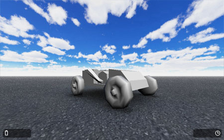
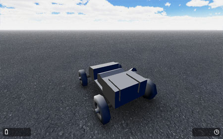
Amidst all that fun stuff, I also found some time to do some work on my YYG Competition #4 entry. The car you saw in the last post now has textured tires, I've made some preliminary tree textures, and I am working on a layout for the area you can drive around in for the activities in the game.

Graphically, I want to see the game look bright, clean and open. Since most of the gameplay will be driving the car around the yard (what I'm calling the open, drivable area) and a racetrack of sorts, I think it's important that the graphics are bright and clear, and fun to look at. Sound will also play a large role in bringing the world to life, but I won't be adding that until much later in the design process.

I believe I mentioned this in my last post about the comp, but as far as control goes, the car in the game is mostly finished. It's able to go forward, backward, brake, turn left and right (at greater degrees depending on speed), and use a simple e-brake for making tighter turns. I've got collisions in the game now as well, so the car can bump up against walls... It's basic, but I'm afraid I don't have time to program anything too advanced as far as collision physics go. I might refine what I have a little later on to make them a bit smoother, but for now what's in there works. The only thing I may tweak as far as the collisions go is upping the scale of the game by two, so that I can use more precise sprites for collisions. This shouldn't be noticeable on the graphics end, thanks to the nature of 3D.

Most of the work I am focusing on now is conceptual - I know where I want to take the game, but I need to envision what the world should look like, and how the interactive areas will play out. I have a look in mind for the area decor, but translating a painting of a scene in your mind to working, interesting 3D can take some time and thought. I'll probably be working on maps later on tonight - perhaps I'll post one when I'm finished.

Also on the table is a little bit of character design, as I'm going to have the few characters in the game be represented as simple cartoon-style characters, hopefully to strike a good balance between something a little realistic (the driving portion) and a little more inviting (in menus, interacting with NPC's, etc.).

So yeah - lots of work to do. Plenty of time to do it. I'll continue posting my progress as the game gets built. Thanks for reading!

889 88 6