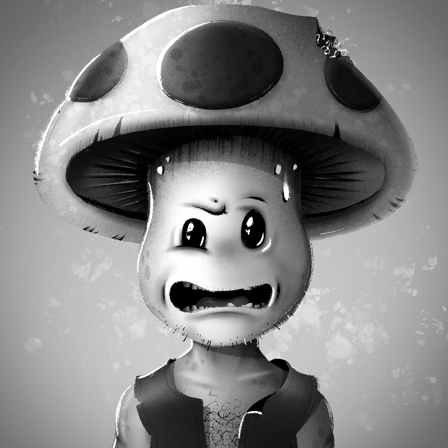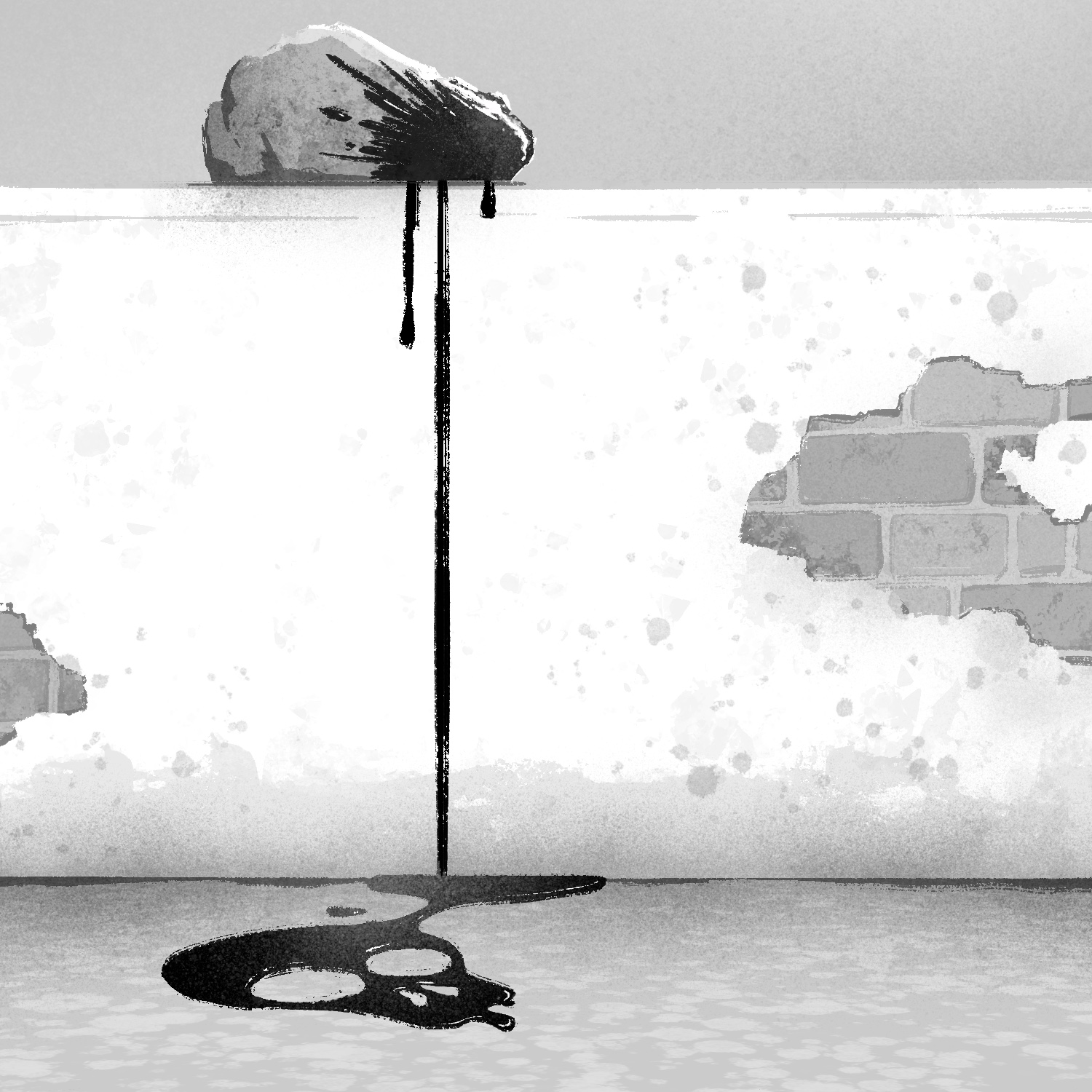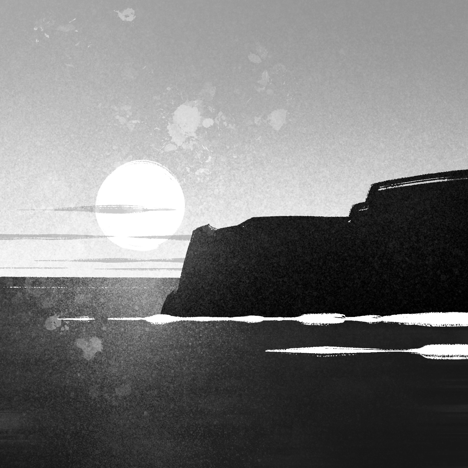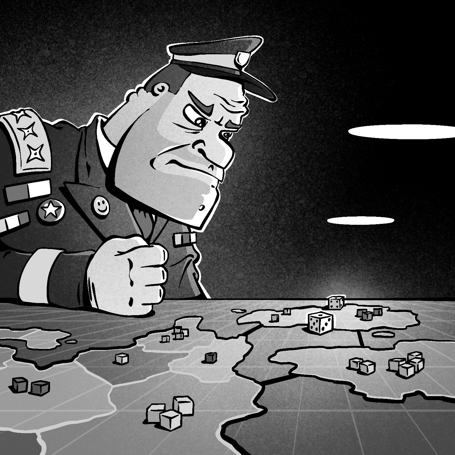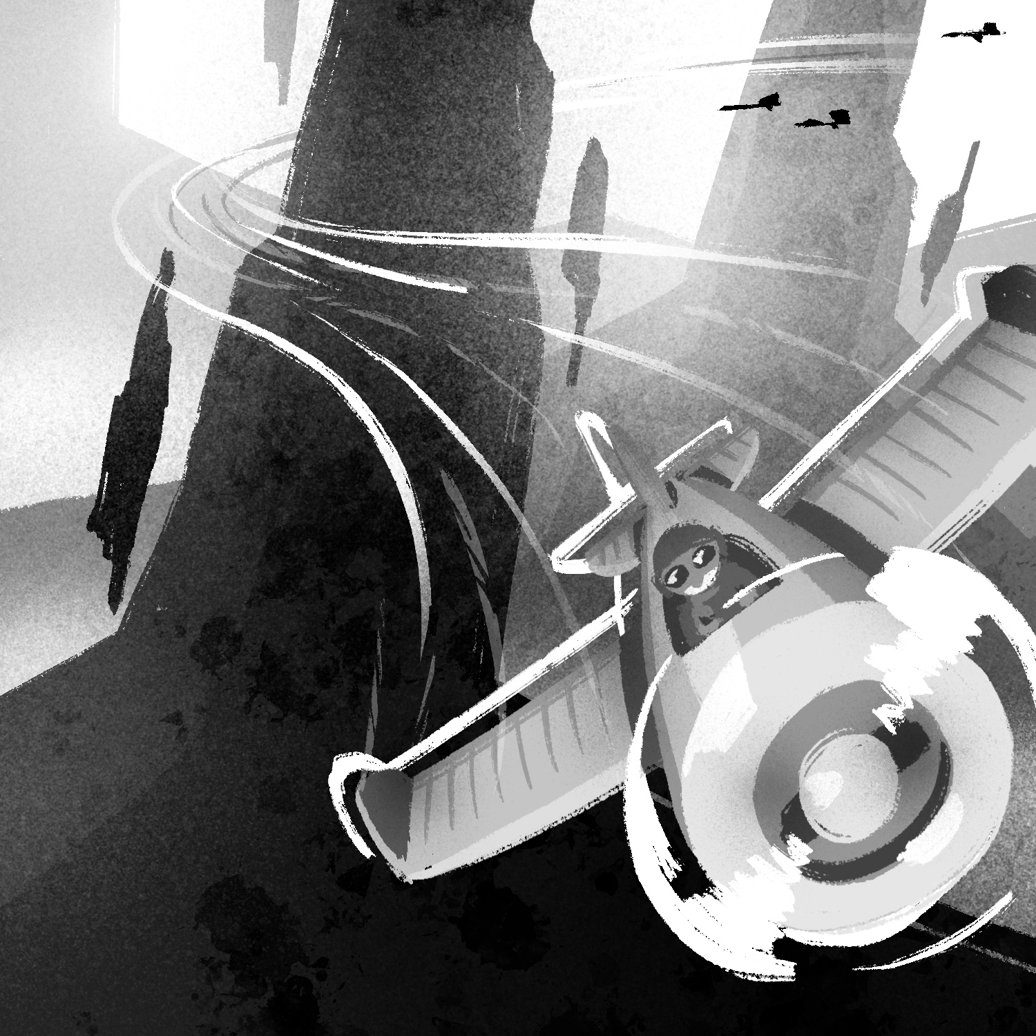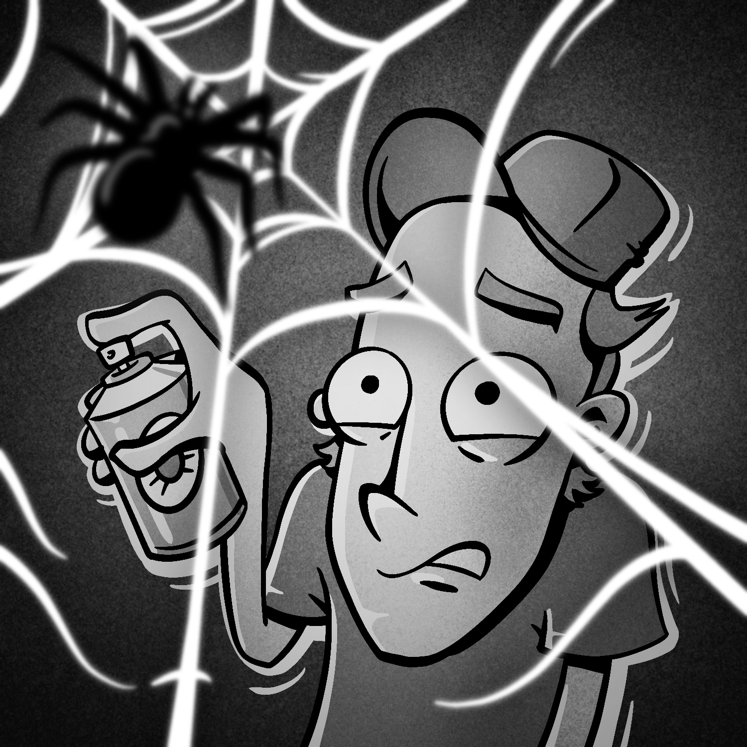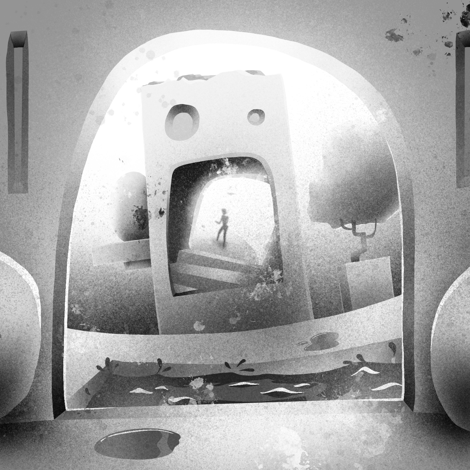
My eighth illustration for Drawrch is back to cartoons. I wanted to do something simpler than last night, but it still ended up taking a fair amount of time to finish because I spent so much time brainstorming.
I really like the colors for this one. They came out just how I wanted as the vision came together.
And yeah, I know drawing someone in a VR headset is kind of a cop out for a month-long drawing challenge about faces, but hey, it's my project. I'll do it how I wanna!
My seventh illustration for Drawrch, and the last for the first week - whew!
I started working on this one with the intent to just scribble some lines to layer values and get it done quick, but then I got caught up in painting it and next thing I knew, I'd been working for over an hour. It's not the best portrait I've ever done, but for not having done a portrait in probably 20+ years (and the first one I've done in Procreate) I don't think it's too bad.
The proportions are a little off... the eyes are too big and the mouth is too small. It was good practice, anyway.
I used varying sizes of the Parapuna brush for everything but the underlying sketch. The image was a random image from SketchDaily.
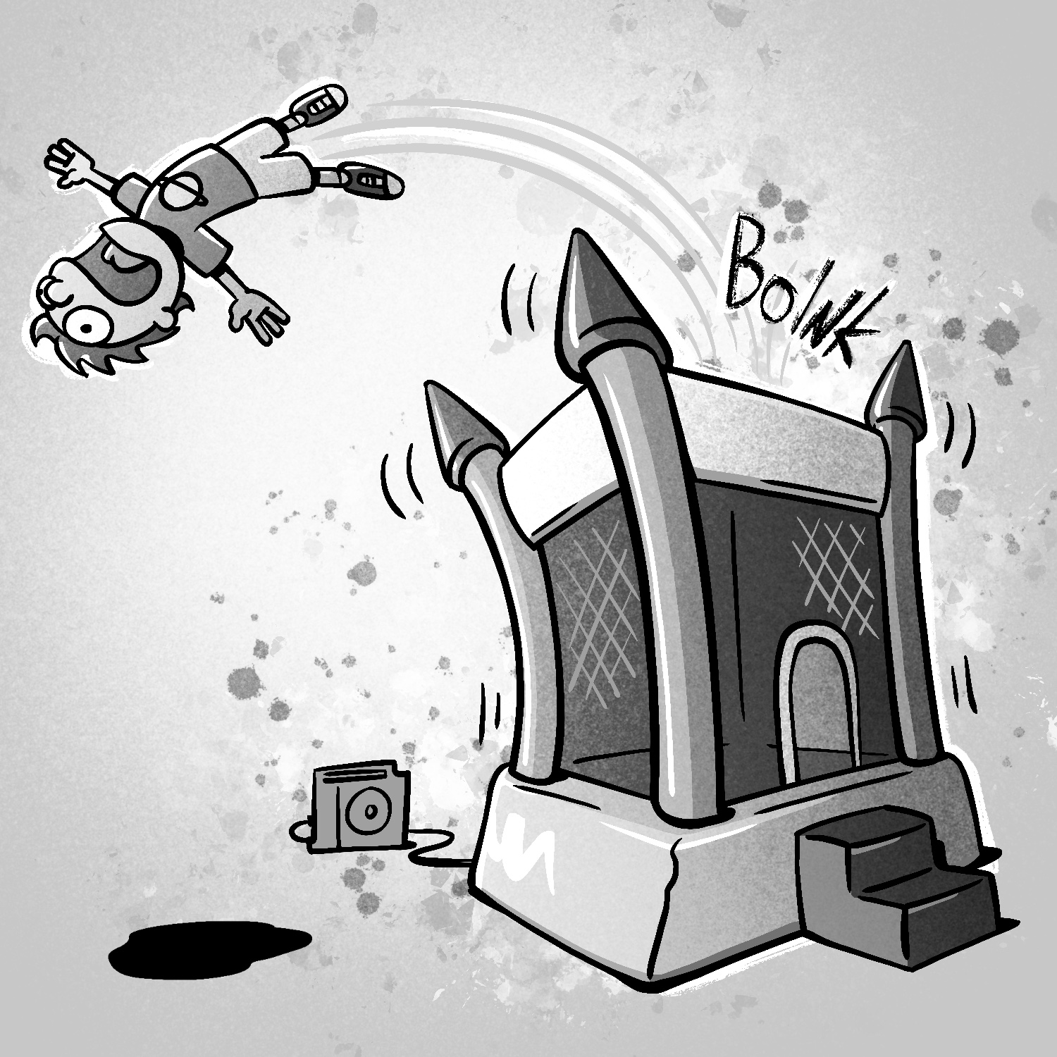
This one's meant to be something like the Monopoly Guy (Rich Uncle Pennybags) - getting the last laugh as you land on his expensive hotel-laden property.
I originally wanted to do something a little more realistic and a bit more experimental, but as the day wore on and I slowly got through all the other things I needed to get done, I ended up settling on something a little more in my comfort zone.
The tapered Baskerville brush is back, and I'm a lot more comfortable with it. I ended up working around some of the weird chunkiness that can happen with shorter strokes by just planning it out better, and really only had to worry about it in the teeth.
This is my fifth illustration for Drawrch - almost done with the first week, whew!
For this one, I used a tapered pen, but instead of the Baskerville pen I used one called the Studio Pen. I didn't really like how thick it got with so little pressure, but it wasn't too hard to control.
I also utilized Procreate's ability to do bilateral symmetry, so filling out the two sides of the drawing was pretty easy, and I only had to add a few asymmetrical details here and there, mostly at the end.
I'm not super happy with the colors now that I see the image on my computer, but that's what I get for working on my iPad in the dark, I guess. It looks kinda like a character portrait from a C-list video game.
Anyway, if you want to see how this one was made, here's the video:
I've always loved the art style of playing cards, and so I thought I'd do a less conventional view of one of the queens - having a beer!
I draw this while looking at a playing card, but the profile view is entirely my own. It's not perfect, but the proportions are decent. I went with tapered lines again too, though it's a bit less obvious than the last drawing. It actually caused a few issues with the geometry of the bottle and the finer details on the bottle's neck label - I will have to find (or make) a brush to use that can handle those types of details without breaking too hard from the sharp edges of the main brush.
For my third Drawrch illustration, I wanted to try something a little different from my normal cartoons.
Usually, I don't draw with tapered lines. I love it when artists use them, but I haven't practiced it much myself, so I have a hard time controlling the width of the lines as I draw. Concentrating on regulating the pen pressure isn't something that comes naturally to me; when I work with physical materials, I almost always use a gel ink pen, and I press uniformly hard.
My lack of experience with tapered lines also means that I often have to spend a lot of time thinking about where lines should begin/end, where they should taper off, where I can get away with splitting broad strokes in two, etc.
So I thought I'd give myself a small challenge today and draw with tapered lines. I used a brush called Baskerville, which creates very sharp edges. It also has some extreme stroke smoothing that took a little getting used to.
I'm pretty happy with how it turned out, and I'm looking forward to spending more time with this brush. It may become a part of my standard brushes.
As always, here's a time-lapse of my progress creating this illustration:
I am not going to do many drawings with this level of detail for Drawrch! But I have to do one every now and then just for practice.
I'm not particularly good at rendering lifelike faces, and I draw this one without a reference. It's not meant to have realistic proportions, but it is meant to look more real than, say, my first Drawrch illustration.
Here's the time-lapse of this one, which is probably one of the longest time-lapses I've made in Procreate so far!
I loaded up Procreate to take a look at something this evening, and a little "what's new" message was waiting for me. I clicked it and, among other things, Procreate has a 3D mode now. Sweet!
Definitely still a 1.0 addition, but I can't wait to add some more painterly effects to my models without having to do a big export/import dance across my computer and iPad Pro. This software is really amazing.
This is my final illustration for Inktober 2021! This one was for the prompt "risk", although I think the real title ought to be "I hate drawing hands".
If you watch the time-lapse below, you'll see a couple of misfires in my sketches before I finally settle on what to draw.
First, I thought I'd draw someone playing Risk (the board game). I thought it would be cool to see the thrown dice tumbling toward the viewer and the board below. After getting started on the sketch though, I just didn't like the way it was looking.
Next, I thought I'd draw a baby reaching up and trying to stand. I don't really like drawing babies though, because the proportions are difficult to get right, so I scrapped that one quickly.
Finally, I settled on the sketch for the finished drawing, but not before considering another idea my wife had about a creature taking off their human mask, revealing a werewolf, vampire, or some other monster underneath (it's Halloween today, after all). I liked that idea a lot, but I didn't feel like doing something so complicated, so I pushed ahead with the hands.
The idea behind this is the risk one takes whenever they express their true feelings towards someone else. It makes me think of my wife - we've been together much longer than when we got married, and it always amazes me how a relationship like that starts with such simple but powerfully charged gestures.
Anyway - there's a time-lapse of this drawing's creation below. If you've been following along with me as I make these each day, I appreciate it, and hope you've been enjoying them!