All posts tagged Reviews

Costume Quest

Martin · 12 years

Back in 2010, a week or so before Halloween, Double Fine Productions released Costume Quest. Somewhere between then and a month or two ago, I bought it on XBLA, and I finally got around to actually playing it about a week ago. It's a cute, fun little game, and I enjoyed it.

It's basically a light RPG-type game, where you run around neighborhoods trick-or-treating houses, collecting candy, costumes, and battle stamps (which improve your abilities in combat). Encounters with monsters are the meat of the game and trigger a sequence where the cute cartoon children and silly monsters morph into giants who do battle over the town in a turn-based RPG style. It kind of reminds me of that episode of South Park where the kids morph into anime characters and battle each other.

The cartoon graphics are crisp and colorful, and the sound design is simple, but does all the appropriate things. Controls are easy. Overall, it's a shorter, but quality title - the quality of which I've come to expect from Double Fine.

If you haven't played Costume Quest yet, I'd recommend it. Maybe save it as a little Halloween treat for later this year.

Windows Phone 7

Martin · 13 years

It's been a couple of weeks since I picked up my HTC Trophy, a Windows Phone 7 handset, and I'm back to report how things have been.

The verdict so far? So far, so good. Only a few bumps in the road. Read on for more detail on what I like, what I don't, and how things have been!

Things I like

The interface. Though the WP7 UI (named Metro) looks simple at first glance, it is actually quite slick. Animation is used throughout and goes far to enhance the interactivity of the touch interface. Particularly nice are the Live Tiles (large, customizable icons on the main screen of the phone), which display animations while the phone idles, and fly in and out of the screen fluidly.

Text is also given a lot of good treatment in WP7, with menus using large headers that often extend off the screen, and smaller bits of text being animated as you flip through different screens.

It's actually kind of funny; though I've always liked the understated design of the WP7 interface, I've also felt that it would have a hard time competing with all the gloss, shadow, and animations used in iOS. After spending time with WP7 though, my iPod Touch feels very dry. The animation feels rigid, and all the gloss and shadow applied to the on-screen items just seems overdone. I'm not saying that iOS is bad, just that a lot of the things that made the OS shine have started to look stale to me after using WP7 for some time. Perhaps iOS 5 will change that, but that's how things stand to me for now.

Of course, the WP7 interface is a bit nuanced, and it's clear that while Microsoft has a good grip on how to lay out apps in an intelligent way while adhering to the design standards of Metro, third party developers still struggle with it. It's quite obvious when devs have made an effort to stick to the principles of Metro, however, and these efforts usually go far in making their apps seem more legitimate than others.

Integration of services. One of the prime reasons for owning a smart phone is to utilize the internet in various ways, and WP7 integrates social media and information services smartly in various ways.

For example, one of the first things you see on the phone is the People Hub, a Live Tile that shows you various thumbnails of the people you know (pulled from your Windows Live and Facebook contacts), and with a touch, gives you easy access to their status updates, allowing you to quickly see what all your contacts are up to. You can also pin individual people from your contacts to your menu as an individual Live Tile, which will automatically update now and then to show you snippets of their most recent posts, pictures, etc. I like this because it makes it easy to personalize the phone and keep up with people you're interested in talking to more frequently.

Another neat feature is that, like the Zune application for Windows, the Zune music player in WP7 also loads up supplemental information about the music you listen to (when available). Pictures of the current/last-played musician load up in the background of the app, and biographical information becomes available for you to read. Links to buy more content from the artist appear, of course. The Live Tile also updates to show pictures of the latest artist played, further personalizing the home screen's appearance, and with no additional effort from the user.

One of my few major gripes with WP7 also involves the integration of services, but I'll get to that later. Overall, the WP7 experience is highly enjoyable in this regard.

Speedy access to information. This isn't to say that other phones don't do the same job just as good, but I've really been impressed with the ease and speed at which I have access to the things that I find important to check, like text messages, email, and appointments/events.

Displayed prominently on the lock screen, available by pressing the hold/power button, is the time, date, and any upcoming events you've got in your calendar. Below that, icons are displayed for your text messages and various email accounts, followed by a number showing how many new messages you have. This makes it extremely easy to see if you've got any unread messages waiting, and quick to put away if you don't.

Care has also been taken to make the capturing of photos and video efficient, with each WP7 handset being required to have a dedicated camera button which, when pressed and held (even when the phone is locked) loads up the camera app and lets the user quickly start taking pictures. It's a small feature that's easy to overlook, but for me, most of the time when I wanted to take picture with my previous phone, it was a pain to have to unlock the phone and then wait a few more moments for the camera to start. By the time everything was ray, the ideal moment to take a good picture had often already passed. I suspect this will not be the case with WP7.

Build quality. I can't speak for other WP7 phones, but for my HTC Trophy, the build quality is great. The phone isn't heavy, but doesn't feel so light that it's cheap. All the buttons feel solid, and the rubberized casing feels good in your hand. The screen has a slightly different feel to it than my iPod Touch, but works well and generally feels good to touch.

The Trophy feels good in your hand, doesn't feel cheap, and isn't too big. There's not much else to say about the build of the phone, really.

Things that take a little getting used to

Internet Explorer Mobile. I understand this is going to get better this fall with the upcoming "Mango" OS update, which will include a mobile version of IE9, but for now, the current mobile version of Internet Explorer (resting somewhere around versions 7 and 8) is serviceable, but clunky at times. To mobile IE's credit, it's just about as snappy as Apple's mobile version of Safari for rooting around pages, but page rendering feels a bit slow sometimes, and some websites which seem like they ought to work simply don't.

I'm hoping that IE9 will help keep WP7's browser in a more modern space than the originally included browser. It'll help the platform keep parity with other mobile operating systems, and will help web designers by giving them a consistent mobile platform to develop for.

Still, even if IE9 doesn't turn out to be a game changer, mobile IE, in its current state, is definitely useable. It just takes a little time to adjust to it.

Context sensitive buttons. With most of my mobile OS experience centering around to my iPod Touch and its solitary hardware button, the addition of a dedicated Back and Search button with WP7 took a little bit of learning to get used to. Instead of using an on-screen button (typically in the upper left corner of the screen in iOS) for going backward, all WP7 phones are required to have a hardware button at the bottom left of the device for going back.

This, in itself, is not too hard a transition to make, since the functionality is very similar to that of other mobile operating systems. But then comes the tricky part: when you've reached the end of going backward through pages in the current app, pressing the Back button again will bring you back to the home screen, or back into whatever app you had open before. The Back button acts on a more global level than you might first think.

Once you get used to this behavior, it's actually quite easy to use it to skip around between what you're doing on the phone. It's especially useful in light of the fact that there's still no real multi-tasking support, though this is another feature coming in Mango.

The Search button has similar behavior, but since I don't use it that much, it hasn't caused me as many problems yet. It is handy to be able to access search in apps, like Marketplace (the WP7 equivalent of the iTunes App Store), but in almost all other situations, it merely loads the Bing search tool. The often-beautiful photography on Bing is a nice surprise as times, but I'd still appreciate more of an explanation now and then as to exactly what I'm going to get when I press the Search button.

Battery life. Other people who have been using smart phones for a lot longer than I have will probably think me silly for complaining, but if there's one thing I miss about my old LG Chcolate phone, it's the battery life. If I didn't make many calls, it would sometimes last two or three days without a charge. My new phone lasts a little over a day to a day and a half, depending on usage and where I take it. Sadly, my current work building, a steel and concrete industrial warehouse, seems to make the phone strain for a signal, and thus drains the battery quickly.

Even then, it's not been a huge inconvenience yet… but in the future, when I am traveling or when I am off hiking or something, it worries me that my phone might wind up dead rather quickly, and those are the situations where I would need it most.

Zune. Figuring out how the Zune music (and video) player works is a little confusing after having spent so much time using my iPod Touch, but I'm getting the hang of it. Generally, the functionality is identical to the iPod; the hardest part is just finding where all the same controls are.

I also find it a bit strange that Zune handles music and videos, but images are handled by a separate app. I'm not sure exactly why I find this weird, but it just seems like if it's going to handle more than one type of media, it might as well handle all of it.

Things I don't like

Missing apps. It seems that every few weeks we see another press release about the growing number of apps in the WP7 Marketplace. That's great, but I'm still missing a few of the apps that I've been using on iOS for a long time now, like Tweetdeck, and the small handful of financial apps I used. Sure, I can do most of this stuff via similar, lower quality apps, or through the web browser, but it'd be great if more companies would get on board with WP7 and publish official apps. Millions of people are using this OS, after all.

This isn't really Microsoft's fault, and I'm sure it'll get better over time, but for now it's still a little disappointing that so many companies out there are courting users on other platforms and virtually ignoring Windows Phone 7.

Marketplace content. This is a small gripe, but it's still something I don't much like, and feel is worth mentioning. The amount of adult content in the Marketplace, and the randomness in which it crops up in search results is stupid. Searching for "Twitter", the sixth result in the list of results is "Sexy Babes FREE". That's just idiotic.

I'm not some kind of prude, and I think people definitely be able to create and sell whatever kinds of apps they choose, but there needs to be some way to filter this kind of content out of search results, or even from the default view of the Marketplace to begin with. I don't think most people are going to the WP7 Marketplace looking for these sorts of cheap thrills, especially when they have a perfectly capable browser at their disposal.

I'm certainly going to have a hard time recommending WP7 to anyone with a vagina when even a casual visit to the app Marketplace involves sorting through dozens of apps showcasing "sexy babes". For the same reason that a bookstore doesn't place adult magazines between every other book on the shelf, the WP7 Marketplace needs to filter out this stuff and put it in its own special place, away from everything else.

The way the default Live ID is handled. Probably my single biggest annoyance with Windows Phone 7 so far has had to do with the way the OS handles your Live ID when you first activate the phone. Upon first startup, WP7 asks you to create or use an existing Live ID (a Windows Live, Xbox, or Hotmail account) for the phone. This is mandatory, and is used to sync contacts, get you an email account, make payments, etc. It makes sense, it's easy, and I like it. So far, so good.

But then, if you used a Live ID you've had for years (like I did) you'll load up your contact list and find that it's been populated with all sorts of random people- many of which are just casual contacts from Messenger or Xbox Live who you would never want to call, and really shouldn't be in your contact list by default. Once you've done this though, there's only one way to fix the problem: reset the phone to factory default and start over. Unwilling to do this, I ended up purging a lot of random people from my contacts… something I probably should have done a long time ago anyway, but which I still found annoying to have to do just to get the phone's contact list set up correctly.

If I were to do it over again, knowing what I know now, I would definitely recommend creating a new Live ID and using that for your new phone, rather than importing an old one.

Final thoughts

That's about all I have to rant and rave about for now. Windows Phone 7 is a solid choice for anyone who wants to "think different" from the Android masses, or who is looking for something flashy, but not confined to the Apple ecosystem. I would definitely recommend the platform, and as long as Microsoft continues to support it, I think there are a lot of good things in the future for Windows Phone 7. If you're in the market for a new smart phone, give it a try!
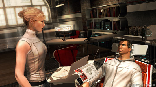
Assassin’s Creed 2

Martin · 14 years

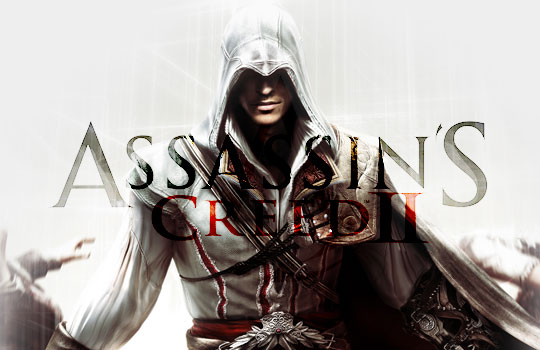
I was thinking about doing a write-up of my favorite games from 2009, but as I was going over most of the games I played last year, many of my favorites turned out to be from 2008 or earlier. I got a few of 2009's finest for Christmas, but so far, I've only had time to play through one of them - Assassin's Creed 2. Luckily, it turned out to be one of my favorite games in a good while, so instead of doing a list I thought I'd just write a game review instead. Read on for tales of free running, theft, death-defying acrobatics, and of course, assassination.

As a note of precaution, I am going to try to keep spoilers for the first game to a minimum, but in order to talk about the opening sequence of the second game, there might be some slight spoilers for the first one. If you haven't played Assassin's Creed 1 yet, and you're planning on doing so, proceed with caution. I will not spoil the content of AC2, save for the introductory portion of the game.

A little over two years ago, I picked up Assassin's Creed 1 (also as a Christmas gift, I believe), and quickly played through it over the course of a few weeks. It was a fun game. With sprawling ancient urban environments, the visuals were particularly impressive, as were the movement mechanics for the player. In the end though, the whole thing became somewhat repetitive, with each level in the game playing exactly like the last. There were a few quirks with the fundaments of the game that could probably have been overlooked if the rest of the game had been better, but which ended up standing out instead. And the finale of the game, which was deliberately left open for a sequel, was somewhat of a letdown.

Despite the first game's drawbacks, however, I did have a good time with it. So when November 2009 rolled around and Assassin's Creed 2 was released to better reviews than its predecessor, I was excited. Unfortunately for me, I usually don't buy myself many games between November and December, just in case someone decides to get me a game for Christmas or my birthday. I waited for the holidays, did in fact, get the game, and played through it over the last few weeks. After nearly 24 total hours of game-time and collecting 47 of 50 achievements, I can say with confidence (and puns) that Assassin's Creed 2 is leaps and bounds above Assassin's Creed 1; it's truly a great game.

AC2 begins right where the first game left off. Desmond Miles, the surrogate protagonist of both the first and second games, has finished locating the Piece of Eden for Abstergo, and locked in the laboratory with the Animus. Lucy, the technician who projects sympathy for Desmond in the first game, returns to the lab and the two escape from the Abstergo building, seeking refuge with a group of modern-day Assassins. Armed with their own Animus, the group enlists Desmond to help them find out the truth behind the Piece of Eden, and we delve once more into history via Desmond's biological memories.

Almost all of the game takes place inside the Animus, in a virtual recreation of ancient Italy. The story follows Desmond's ancestor Ezio as he uncovers a vast Templar plot, and includes many historical figures like Niccolò Machiavelli, Rodrigo Borgia (Pope Alexander VI), and even Leonardo da Vinci.

One thing you'll notice right from the start is that AC2 makes a much stronger effort to explain the story better than the first game. The virtual past is a bit different, it is explained, because the new Animus is more feature-packed than the one used at Abstergo. At various points in the story the other characters who monitor Desmond's progress will voice over and explain what is happening. And all the people and places of interest you visit in the game is explained in historical context via a large collection of database entries that are added to Desmond's Animus menu as you progress through the game. It's all very well done, and I spent a lot of time reading the database as entries were added to it. In many instances, the historical information is actually a pretty interesting read, and it adds a lot to the game as well.

The story that Ubisoft has woven into real-life history for Assassin's Creed, particularly this second game, is compelling. The interactions between Ezio and other characters, both historical and fictional, is very well done and does much to add a distinctly human element to the game. Whereas in the first AC game you were relegated to performing the same pattern of actions over and over with very little narrative in between, the second game gives you many more unique missions while stringing them along with strong story elements in between.

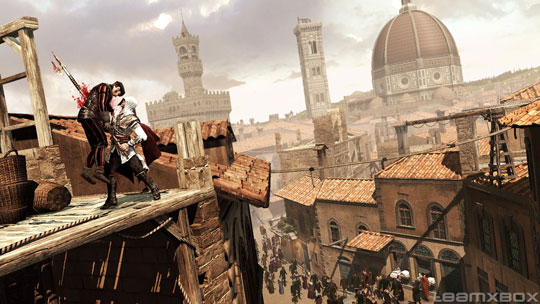
Gameplay in AC2 is varied and thoughtful. Once the initial theatrics are over and you've assumed your role of Ezio, you're given free reign to explore a sizable portion of Renaissance Florence. Similar to AC1, you're able to climb tall structures and use them to scope out nearby missions. Unlike AC1, however, you'll find that you now have access to a few different types of vendor stalls, where you can buy weapons, new armor, quick-travel to different parts of Italy, etc. Missions that do not progress the story include assassination contracts, races, and fighting. There are also many treasures scattered throughout each explorable area that pad your wallet and eventually help you learn more fighting moves and increase your health points.

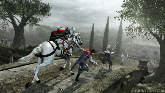
Combat is somewhat basic, but less frustrating than in the original game. There are more ways to dispatch enemies, and there isn't as much emphasis on maintaining an overall rhythm, so there are many fewer times where you get caught in a string of attacks that are impossible to stop. Additionally, you can buy new weapons from blacksmiths, and you can use weapons dropped or taken from enemies as well.

Sometimes, you might not want to fight the throng of guards chasing you - not a problem! There are far more places to hide in AC2, and it's much easier to tell when you're blending into a crowd (for anonymity). You can also hire bands of thieves, mercenaries, and courtesans to help give you a little cover and distract or fight guards when necessary.

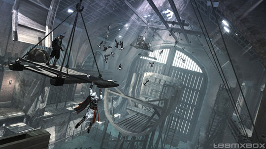
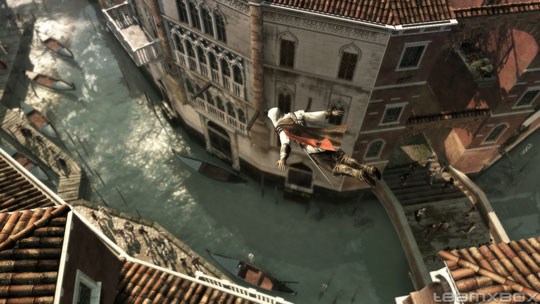
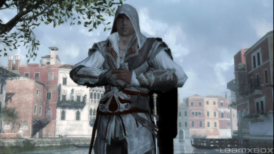
Finally, player movement in Assassin's Creed 2 seems much more refined than before. Ezio climbs and swings around structures much faster than Altaïr, and if you're like me, you will be happy to see is that swimming has been added to the game engine, so you no longer have to fear the random instant death of a bad jump near water. Overall, player movement in AC2 is very fluid, and even though you'll be spending much of your time watching Ezio perform stunts that seem super-human, the animation is so natural you'll come away feeling like it really could be possible for a person to move the way he does. With Prince of Persia, Assassin's Creed, Splinter Cell, and a host of other games, Ubisoft has a good lock on games involving non-linear movement/acrobatic mechanics, and with each new game, the engine only seems to get better.

In addition to the regular assassin gameplay in AC2, there are also a good number of hidden puzzle sequences, where you solve a collection of ever-challenging puzzles in order to uncover more of the secrets about the Piece of Eden. These puzzles serve as a good break from the action now and then, and are quite devious towards the end of the game. Luckily, you can always choose to solve them later on. These puzzles, along with the collectible codex pages and all the other supplemental information included in the Animus database, are a good example of the efforts Ubisoft went to in order to explain the Assassin's Creed world better in the second game. Both the cryptographer and conspiracy buff inside you will jump for joy.

Gameplay aside, the very first thing that might draw you into AC2 (or the franchise in general) is the look of the game.

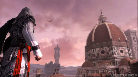
The original game, Assassin's Creed 1, had some good graphics; even playing the game today, I am still amazed at how well the game engine draws the vast expanse of ancient cities and surrounding countryside. Assassin's Creed 2 is no different - and oftentimes better! It is a visual feast, and Renaissance Italy has never looked so good. Everywhere you go, people are walking, talking doing things. The buildings in each area you visit are gritty yet fantastic. Historical sites, like Basilica di San Lorenzo and Basilica di San Marco, are recreated somewhat faithfully (at least, close enough for a game), as are the surrounding area structures. The day/night cycle is slower than most games, and both look great. Visual effects for the Animus and Eagle Vision have been ramped up from the original game. Ezio even looks wet after he climbs out of some water.

Sound is equally good. The voice acting for all the major characters is believable, and the little bits of Italian you hear now and then (attributed to a flaw in the Animus' translation software) adds to the illusion of the whole thing. I thought the soundtrack was particularly nice; it instills feelings of awe, tension, mystery, and urgency at all the right moments, and fills in the gaps between the action nicely.

Assassin's Creed 2 isn't without its faults of course, but they number much fewer than the original, and are ultimately much easier to forgive for all the greatness of the rest of the game. For example, as with Altaïr in the first game, Ezio manages to make some clumsy jumps now and then, which can sometimes result in an accidental falling death. It doesn't happen often, and I can see how the game engine can get confused about exactly which platform you might be aiming for in the distance, but it's not a fun time when it happens.

As with another game I reviewed not so long ago, health potions also seem to make the game a little too easy. Naturally, the farther you get into the game, the harder the bad guys can hit you, sometimes taking 4-5 hit points in one attack. But early in the game you gain the ability to carry around vials that can refill many depleted hit points at once. You eventually are able to carry a maximum of 15 of these vials, and with so many at your disposal, it becomes almost impossible to die, save for an accidental fall. The vials are important to AC2, because unlike AC1, you do not regenerate health over time, but it still feels a little cheap sometimes to be able to just click the D-Pad and become healed. Of course, I also like the idea of your character becoming more adept at what he/she does as you progress through a game, so I can't hate on this too much. Poor planning or lack of funds will limit your supply of vials, so I can live with it.

One final thought I had on the subject of problems is that some of the puzzles you uncover are either unclear in what they want you to do, or are difficult to devise. I didn't have many problems with them for the most part, but some of them seemed to require some very non-linear thought to be solved, and I actually had to wait for the hint to appear before I could get through (an optional hint can be given after a certain amount of time has been spent on a puzzle). This isn't really a problem with the game, I guess, but for some people who aren't very good at deciphering numerical puzzles, it could prove frustrating.

In any case, none of these things detracted from the experience much for me. The level of polish applied to AC2, especially compared to AC1, really shows in this respect.

On the whole, I really enjoyed Assassin's Creed 2. It continued the story from the first game in a smart and provocative way, it fixed many of the problems from the first game, and it did so without being tedious, and without running out of gas. There are lots of things to do in AC2, and if the story line for the series interests you, I definitely recommend giving this game a shot (and the first game before that, if you haven't played it already). I'm really looking forward to Assassin's Creed 3, which I hear is due out in about 2 years. That's alright though, because I'll probably need a while to collect all those feathers (think flags from AC1).

World of Goo: A Goo-d Game

Martin · 15 years

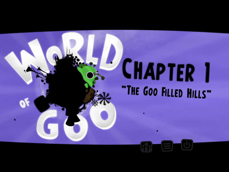
After months of reading praise for World of Goo, I finally decided to try it out a few weeks ago. I downloaded the demo, installed it, fired it up... and came away largely impressed. So, I picked up the game on Steam and spent the last week playing – and beating – it. World of Goo is a genuinely fun game that's easy to pick up and challenging just to the right degree. My caveats with it are small and few, especially in light of the fact that it is such an entertaining and unique game.

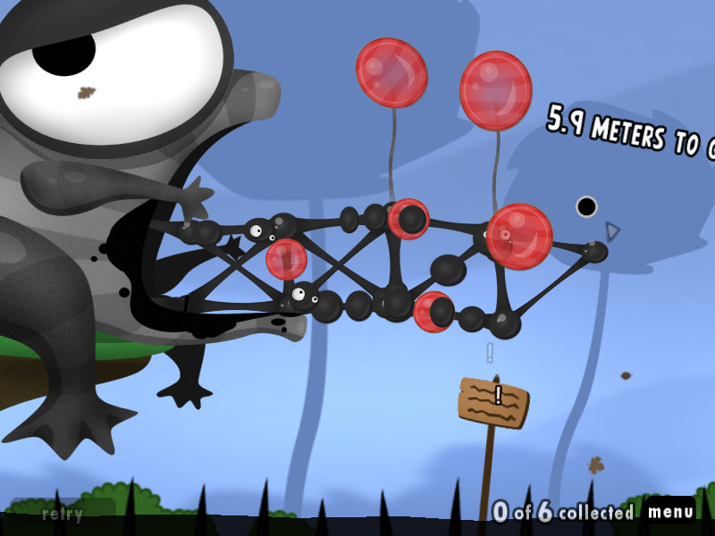
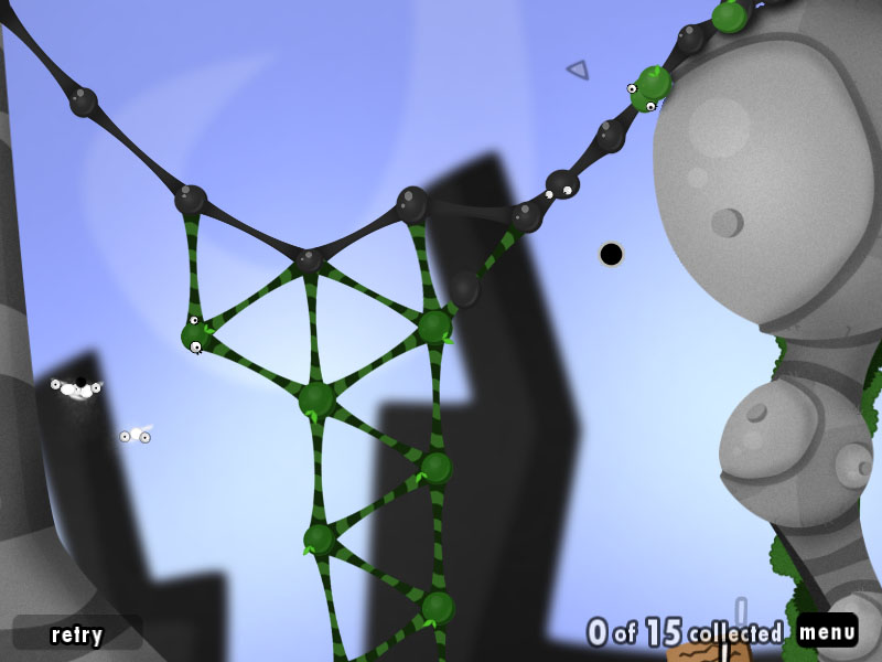
At its core, World of Goo is a simple physics simulation with a little bit of Lemmings thrown in. Blobs of goo roam around the level, and can be picked up and placed within a certain proximity of other blobs to form connections. Using multiple blobs of goo, you can build towers, bridges, ropes, etc. all in an effort to get the remaining goo (which will climb around your structure as you build it) from one end of the level to the other. The level is complete when a pre-set number of globs have reached safety in this manner.

As you would expect, different types of goo are encountered as you make your way through the game's five worlds. The generic gray goo attached to other goo once and cannot be moved, green goo can be attached and detached at your whim, clear goo can only attach to one piece of the structure at a time (good for ropes), and so on.

There are multiple levels of challenge in World of Goo. For example, in one level you are tasked with constructing a bridge across a pit of spikes. The spikes will destroy any goo that touches it, even if they are part of a structure, so when you build a bridge to cross the gap, care must be taken to avoid having any part of the structure being pulled down into them. One part of the goo-bridge being popped by the spikes can throw off the balance of the entire creation, resulting in a structural failure of catastrophic proportions and (usually) all of your goo falling into the pit. Balloons have been provided however, so your bridge won't collapse after extending too far if they are use correctly.

Even this simple scenario presents many challenges for thought and design. Should the bridge be built at an upward angle to further combat gravity? How many pieces of goo should be used to make the bridge stable? At which points should the balloons be placed to ensure the most stable bridge? These are common dilemmas one faces when traversing the levels in World of Goo.

Fortunately, levels in the game are usually fairly straightforward, so in the circumstance that you need to restart a level, there's usually not too much you'll need to do to get back to where you were when you failed before. The physics in the game are very consistent, so you rarely feel that you are leaving the fate of your goo to luck, and you're also given a handful of chances to undo previous moves.

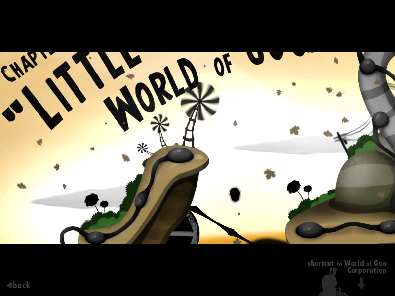
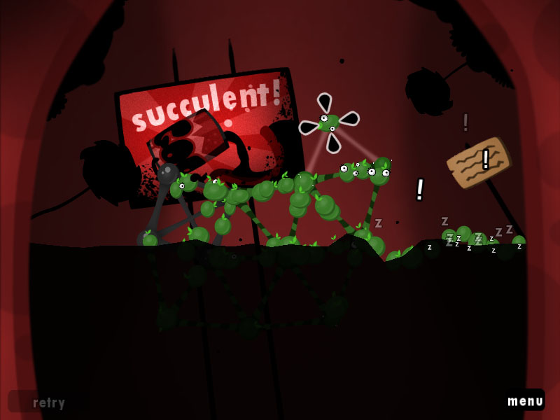
World of Goo's graphics are both a thrill and a disappointment at the same time. The visuals are bright, colorful, and well animated, and even though the style of graphics make them look almost as if they were thrown together rather quickly, there is a polish in the details that even blockbuster games with million dollar budgets have a hard time achieving. Everything in the game that the player can interact with gives great feedback as the mouse bounces around the screen. Color is used liberally and wonderfully. Physics objects are easy to pick out against the terrain, and animations are smooth and fun. The whole game has a very Worms-like quality to it, if you get what I mean.

The only shortfall in the graphics for Goo is that the game runs at 800 x 600, and that's all the graphics were made for. Sure, the game even expands to look fine on my widescreen monitor, but it is slightly disappointing to me that the artwork couldn't have been rendered at a slightly higher resolution, if only for the PC version. I actually wish the entire game could have been rendered as textured vector graphics, since the underlying physics engine probably uses polygons to define all the shapes anyway, but alas, it is what it is - a beautiful, if slightly pixelly, World of Goo.

The audio end of World of Goo is equally as brilliant as the visuals. The music included in the game is very well done, and suits each level's experience well, and the sound effects are spot-on. You'll grow to love all the little squeals and squelches of the goo globs as you form them into structures and progress through the game. The soundtrack for the game can be downloaded for free at Kyle Gabler's blog.

Overall, I had a lot of fun with World of Goo. The level progression is linear, but there are a few points where you can choose to do one level over another, so if one is initially a bit too challenging, you can come back later. And if you get completely stuck (or just bored) you can always go to the World of Goo Corporation to play around with the extra balls of goo you've saved, to try to build a tower. In this mode, you can see other players' tower heights (represented by clouds) as you get farther and farther into the sky. This is a neat little feature that really just adds to the fun, and challenge, of building a huge tower. And it's little things like this that really push World of Goo beyond the realm of your standard casual game.

Sure, the whole concept of World of Goo sounds a bit strange. It certainly looks a bit strange, I'll give you that. But try out the demo anyway, and if you like it, buy the game (don't contribute to the horrible Goo piracy). The two-man team of 2D Boy has put together a wonderful experience with World of Goo, and their achievement is our opportunity for some fun!

Braid Is Incredible

Martin · 16 years

Every now and then a game comes along and takes you by surprise. I had the pleasure of experiencing this a few days ago, and I feel that my horizons as both a gamer and a developer have expanded because of it.

The harbinger of my elation goes by but a single name: Braid.

By now you've probably heard a little bit about Braid here or there - it seems impossible not to. After only a few days on the XBL Marketplace, Braid became the highest rated game on XBL Arcade, and entered the exclusive list of top 10 all-time highest rated games for the Xbox 360, which includes titles like Grand Theft Auto 4, Gears of War, and Bioshock.

While notable in itself, this is quite an accomplishment considering the game was made by only a small team of indie game designers and artists, on an infinitesimally smaller budget than any of the other AAA titles it's contending with.

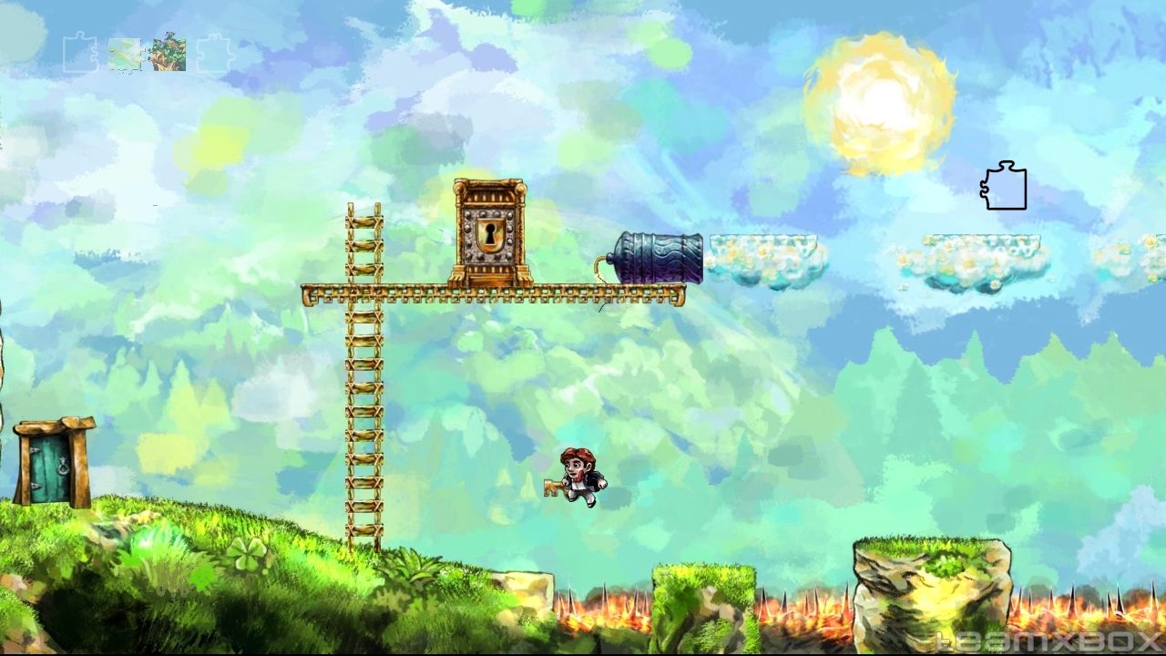
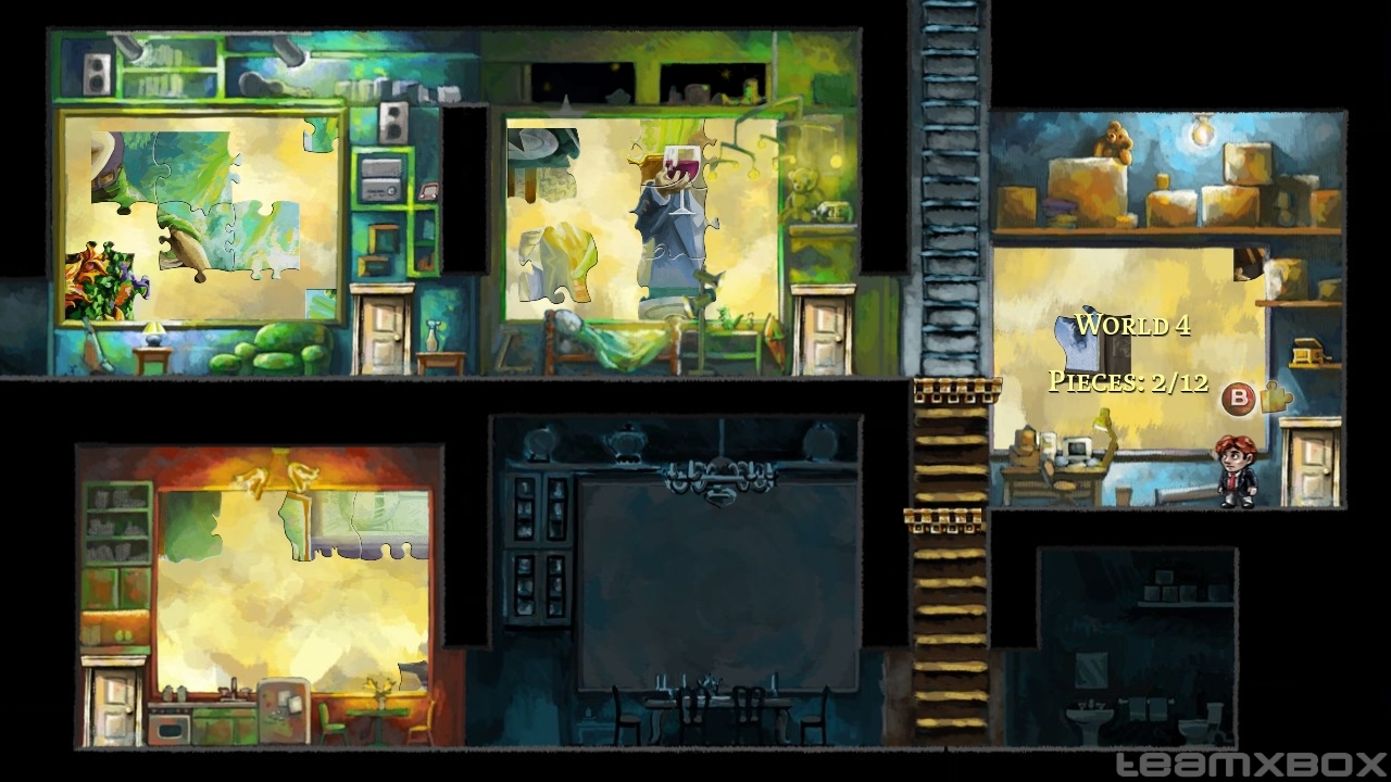
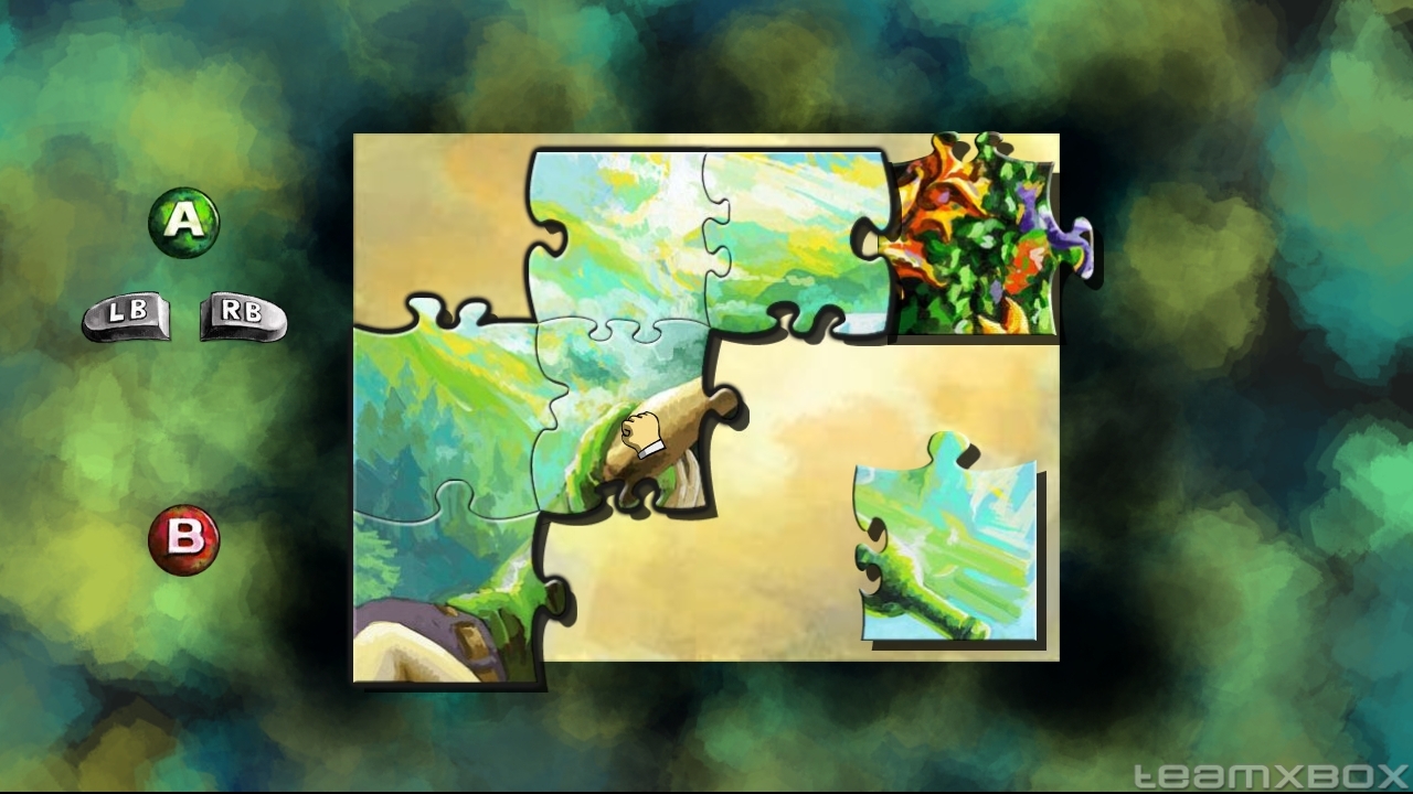
So what's all the hoopla about? At the outset, it's simple enough - Braid is a 2D platform game where you traverse an assortment of levels to find and collect jigsaw pieces. Delve a bit deeper though, and the game quickly sets itself far apart from most other platformers you've played. Time, and the manipulation of it, plays an important role in the narrative of the story, and more importantly, how puzzles in the game are solved. Braid's development team went to great lengths to craft smart, unique levels that take advantage of this element of the game. Each chapter of levels offers a different take on the way time affects you and the environment, with each puzzle more devious than the last. And even though most of the puzzles seem to have only one or two possible solutions, each one will leave you with a feeling of deep satisfaction for solving it.

At this point, I could stop writing and you'd have a pretty good idea of why Braid is a good game, but I really feel that merely describing the game for its amazing technical presentation isn't fully doing it justice. There's a lot more to Braid than that. The entire presentation is mentally stimulating.

Braid's narrative, told through a handful of dialog boxes and books placed on a series of podiums before each level, tell the emotional story of the game's main character, Tim, and his troubles. The text in the game is well-written, and is in some ways, very touching.

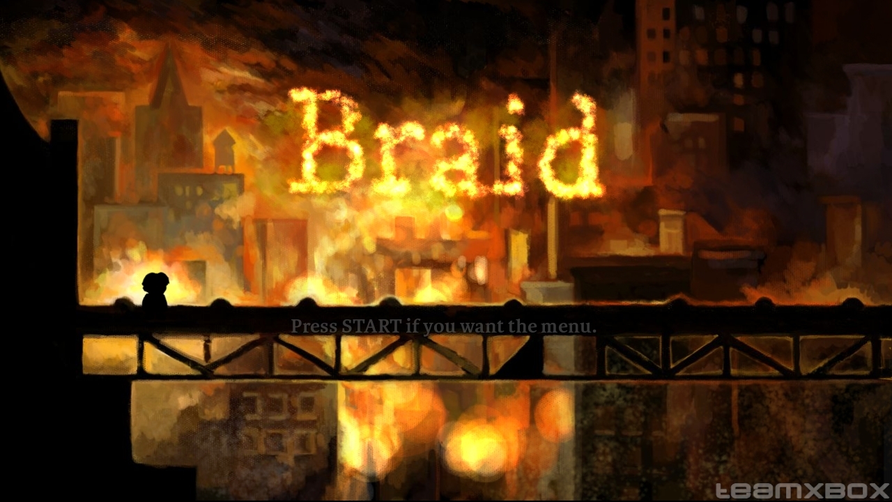
Braid opens with what looks like a painted title screen. After a few moments, you realize that what you're looking at isn't really just a title screen - it's the actual game, and you can actually play it right from the start. I really liked the way the game opens without an interface, and I think it says a lot about how great the game's design is that you don't even need to access any menus until you're ready to leave.

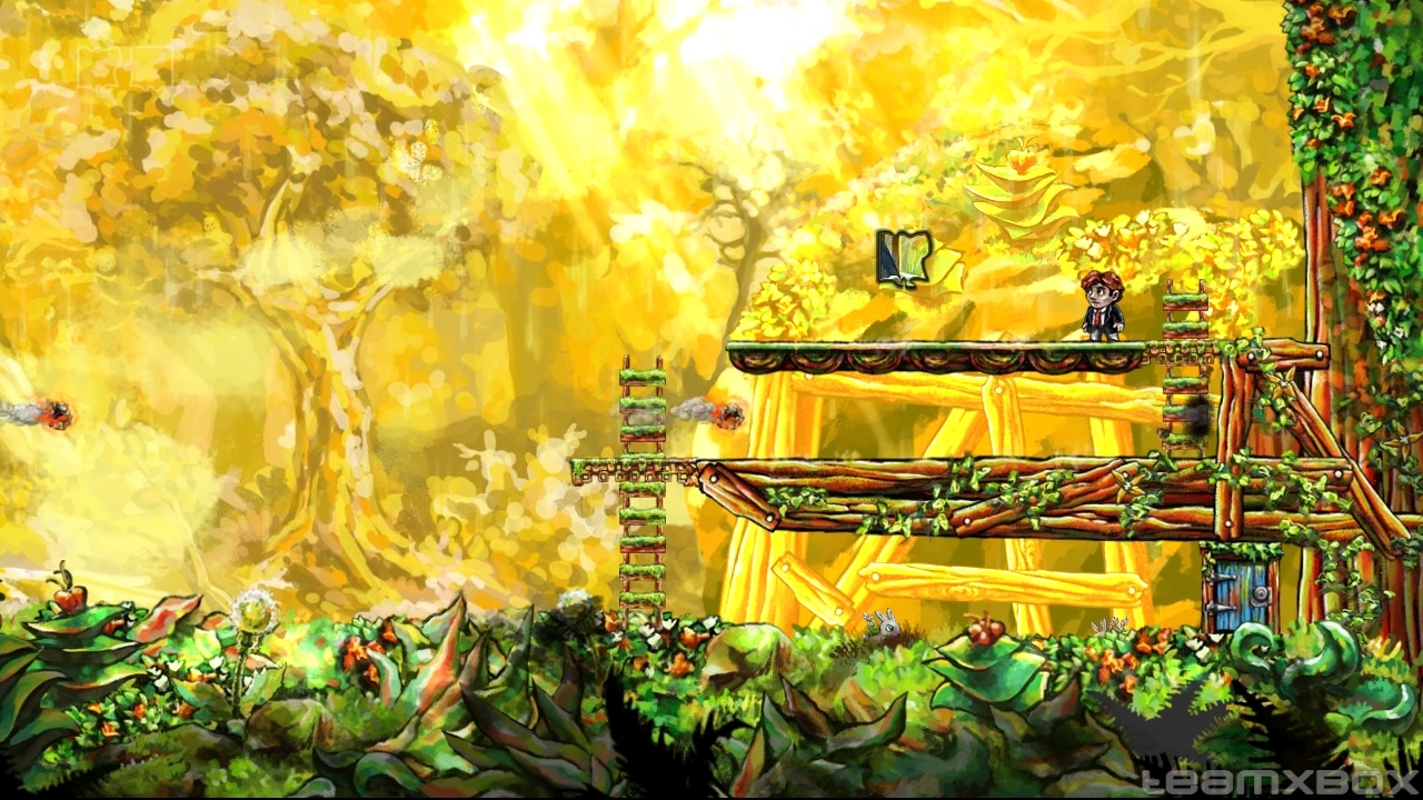
The game's graphics (courtesy of David Hellman) are incredible though; I think I spent the first 20 minutes of the game just looking at the backdrops. Scenes that would look amazing as flattened artwork scroll with depth unimaginable, and everything in the foreground is gorgeous to boot. So much effort was put into making Braid a visual feast, it's almost impossible to imagine that time was spent to ensure the game was enjoyable as well. The soundtrack, licensed from some very talented people at Magnatune, is equally as good as the graphics, and wraps the game in an enchanting veil that lends credibility to the story and completes the presentation in a satisfying way.

I've been playing Braid over the last few days, taking small bites at a time, and trying to complete each puzzle I come across. Everything about the game is incredible, and though I've gotten to the point where some of the puzzles seem a bit on the hard side (or maybe I'm just not trying to do things the right way), I'm having a blast. The $15 price tag sounded steep before I tried the demo, but after only a few minutes of playing, I made the choice to buy.

Braid is the collective work of many people who obviously care about their craft, and this shows at every turn. I hope that the Braid team goes on to do create more unique games. This should serve as a lesson to the nay-sayers who cry that indie games don't have a place in the highly commercial world of video games. They do, and Braid proves it without missing a step.

If you've got an Xbox 360 (or if you can hold out for the PC version), buy Braid. It's an amazing game that deserves to be experienced by everyone.

993 97 6

This weekend I tried my hand at 6 Xbox Live Arcade games, and here's the lowdown on each one. Are any of them worth your time, or for that matter, your money? Read on to find out!

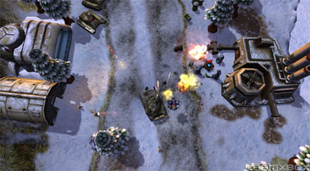
Assault Heroes 2 [Link]

I kicked off my game demo bonanza with Assault Heroes - a top-down shooter that throws waves and waves of enemies at you as you progress from one place to another. As the name implies, this is the second game in the series, and this time the assault heroes are given a new locale, a few new vehicles to drive around in, and new enemies to dispose of.

For anyone who's played Geometry Wars (or the first Assault Heroes, for that matter), the controls will be easy to pick up. The left stick moves your character around while the right stick fires your weapon. You're given a single button for switching weapons, and a single button for entering and exiting vehicles. Play is a simple matter - fill your enemies with bullets while avoiding being filled with bullets yourself.

Visually, Assault Heroes 2 is a treat. There's oodles of bad guys, tanks, buggies, helicopters, explosions, and collapsing buildings, all on an exotic background of snow-covered mountains, rain forests, space, and more. Though it was, at times, slightly hard to follow all the action on my SDTV (and sitting about 10 feet away), I could usually follow my character and all the bullet tracers well enough. I don't think I would have had any troubles with this if I had been playing the game on my computer monitor.

I always kind of wanted to buy Assault Heroes, but since the game is best enjoyed with multiple players, and none of my friends seem to own it, I never did. I'm afraid that the same fate will befall Assault Heroes 2, but if you've got interested friends, I'd definitely recommend it.

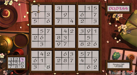
Buku Sudoku [Link]

Though I wouldn't call myself a Sudoku master yet, I do enjoy the logical challenge presented by the typical Sudoku puzzle, both on paper and in games. For those of you who haven't really gotten into the whole thing, here's a brief explanation.

A typical Sudoku puzzle is a grid of 9 squares by 9 squares, broken into 3 rows and 3 columns of 3 by 3 grids. Each 3 by 3 group and each row and column in the the overall puzzle can contain the numbers 1 through 9 only once. The puzzle has a few numbers inside it when you start, and from those, you use logic to determine where all the other numbers should go. It might sound a bit confusing at first, but it's easy to get into, and hard to quit!

Like most other games of the casual persuasion, Buku Sudoku is big on bling. The presentation, while not the greatest I've seen, is mostly strong. The game comes dressed in a variety of themes, and plays soft background music in the menus and while you play. In my first game, I found the song that the game defaulted to (a kind of Asian-ish thing) somewhat annoying, but the second wasn't so bad. The few themes I saw looked good, though you're probably going to be looking at Sudoku grid most of the time anyway.

Gameplay was just as you'd expect - you put numbers on the grid, and the game tells you if your input is correct. The controls in the game were passable, though I would have preferred a different way to change / enter numbers. I think I might just be spoiled by the touch-screen implementation in Brain Age (DS), though.

Overall, Buku Sudoku would be a good buy for someone looking for thousands of puzzles (and who really likes Sudoku). The demo didn't seem to have any major flaws, except a few flubs in presentation and control. I might purchase this someday when I've got nothing else to do, but for now, I'll continue working on the puzzles in Brain Age.

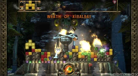
TiQal [Link]

The best way I can describe TiQal is by likening it to Lumines - the two are essentially the same game. Puzzle pieces of various colors rise from the floor, and your job is to counter this by dropping similarly colored pieces to make groups of 4 (2 by 2), which are then wiped from the play field after a certain amount of time. You can score combos by adding to the stack of squares that are already marked for demolition, and the game is over if you let the stack get too high. The few differences between this game and Lumines include a more forgiving failure system, puzzle pieces that don't come in duo-colored squares, and a Mayan theme.

I liked TiQal's graphics, mostly. Some of the transitions between story and play areas were a bit dull (I don't really care for sliding large graphics on and off the screen), but the backdrops were vibrant and I liked the effects. My only squabbles were that block colors are sometimes a little too similar, resulting in a few accidental missed combos, and that the backgrounds are a little bright in some places, making it hard to discern what's going on in the play area. These problems may have been related to my viewing arrangement, but for a puzzle game, it's important to consider these things.

As a minor fan of Lumines, I felt TiQal was a decent enough game to borrow so heavily from the game. If I didn't own Lumines already, I might have been more interested in purchasing TiQal, as I liked the gameplay and the presentation (despite how over-done the whole Mayan theme thing is with casual games).

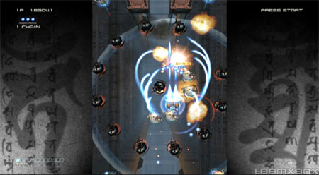
Ikaruga [Link]

Probably the most stylish game I tried out on my Xbox Live Arcade trial weekend, Ikaruga is the anticipated shoot 'em up (SHMUP) direct from the Japanese arcade scene. This game is a great example of what you can get when you cross tried-and-true play mechanics with "next-gen" hardware, and like many current SHMUPS on the PC, you'll find yourself (and probably others) mesmerized by the action as you blast your way through the waves.

Ikaruga is cinematic and stylish at once, and everything has a very sharp, clean look to it. The backgrounds you fly over as you battle are breathtaking, and enemy ships will weave in and out of elements below you before making their way to the foreground. Ships and bullets are fun to look at and easy to distinguish. Even in playing the trial game, you really get the sense that the developers of Ikargua truly cared about making sure every last bit of the game was as polished as possible.

One unique twist that Ikaruga carries over similar games is the polarity system Treasure Co., Ltd. have employed. Each enemy you face, and all the bullets they fire, are of either red or blue polarity. You can change your ship's polarity at will, which allows you to absorb bullets of the same polarity and do extra damage to enemy ships of the opposite. This adds a very interesting depth to the game, whereas an impossibly navigable array of bullets can turn into a field of super-weapon in the blink of an eye. As would be expected, this also ads a bit to the learning curve, but once you get used to it, you're good to go.

I enjoyed the feel of the game, and the simple controls made it easy to get into. Controlling the ship with an analog joystick is a little strange after using a keyboard on PC SHMUPS, but I think I will get used to it.

I've not yet bought Ikaruga, but once I give the trial game a few more plays, I might just throw the MS points down and take the plunge. Ikaruga is one of the best (and only) Japanese shooter experiences you can find on the 360, and for fans of SHMUPS, it simply shouldn't be passed up.

Penny Arcade Adventures: On the Rain-Slick Precipice of Darkness: Episode One [Link]

Out of all the games I tried out this weekend, Penny Arcade Adventures is probably the one I spent the most amount of time with. It's also one of the larger games available on Xbox Live Arcade, as well as one of the most expensive (1600 MS Points, or $20). For those not deterred by the price, however, there's plenty of good fun to be had.

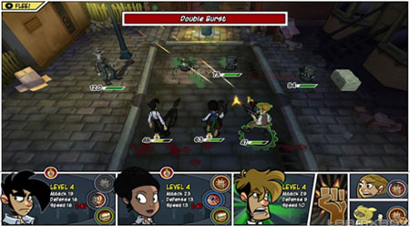
PAA follows the hijinks of the Penny Arcade web comic protagonists, Tycho and Gabe, as they romp through a 1920's era city named New Arcadia, kick robot butt, and attempt to solve the mystery behind the destruction of the town. The game employs a simple RPG style of play, where you move around the world via entering and exiting different panels (like a comic book), fights begin when you encounter monsters, and each character waits for action meters to fill up before he can attack, use items, or use a special ability. When you're in the overworld, you can smash garbage cans and chest to pick up special items, and as you play you collected experience points, which level your character and make him (or her) stronger.

Fans of the comic and newcomers to the series alike will find a lot to enjoy in PAA. The graphics are done in a comic-outlined style very reminiscent of the Penny Arcade comic (and other web comics in general, I'd say), the audio is good, the RPG elements are light, but still interesting, and the humor is great. It's really fun game to look at overall, and the production values that go into a more expensive Xbox live Arcade title are evident.

Right now I've got a few more games on deck than I like, so I'm holding off, but I'll definitely buy Penny Arcade Adventures at some point in the future. I like the RPG play, as well as the presentation of the game itself, with the cartoon graphics, comic-panel level design, etc. Though I'm not a regular Penny Arcade reader, I usually find the comics funny, and the humor Hothead Games has injected into the game is similar, which is definitely a plus.

It's slightly disappointing that, as harsh critics of the video game industry, the guys behind Penny Arcade couldn't have come up with a better overall game, but what's here seems solid enough to warrant a buy for me. If the episodic adventures get better as they progress, we should be in for some great times ahead with the PAA crew.

Wits & Wagers [Link]

In an attempt to round out the multiplayer trivia options found on Xbox Live Arcade, Hidden Path Entertainment has unleashed Wits & Wagers, a game-show type game where you and a group of other players take a stab at answering questions, and then vote on the answer which seems closest to the truth. Expectedly, it's a test of both your wits and your wagering skills.

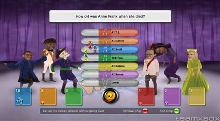
To be fair, I didn't spend as much time with Wits & Wagers as I probably should have to give it a decent write-up, but what I did get the chance to see was fun, though slightly dull. In order to make answers to trivia questions all conform to one type of answer (to make them easier to compare for wagering), each answer is numeric. Once the question is posed, players are given a short time to dial in a number by pressing up or down on the left stick, to indicate all sorts of data, from years, miles, weight, and more, all depending on the nature of the question. Answers are ordered from high to low, players place their bets, and the real answer is revealed. Points are awarded to the player who came closest to the correct answer without going over, and to the players who wagered wisely.

I was distracted by my girlfriend at the time (she was trying to get me to get up off the couch and go outside, I believe), so I wasn't able to concentrate much on the questions... I did have some fun with the avatar system though. Using one of the analog sticks, you can make your on-screen avatar throw it's arms and body around to dance, wilt, cheer, etc. Simple, and stupid - but fun, even with a group of computer players moving spastic around with me. I imagine this, along with the rest of the game, is a lot more fun playing online, with a group of friends.

Like Assault Heroes 2, I don't think I'd purchase Wits & Wagers unless I had a small throng of friends ready to buy and play along with me. It's got some neat quirks, but it all seems just a little too simple for me, unfortunately.

Final Thoughts

History has taught me to expect less from the offerings on Xbox Live Arcade, so even though there were a few games in this stack that didn't quite fit the bill, I'd say that overall, I was pleasantly surprised. There's definitely some good stuff up there (and they'll be easier to find once Microsoft starts de-listing underperforming games).

I'm not sure when I'll be doing another Arcade roundup, but I enjoyed this one and hope the next few weeks of games raise the bar in quality like these games have. Thanks for reading, and don't forget to try out some new games yourself!

Screenshots courtesy of TeamXBox.com

Just about every day, I find a little time in my busy day to sit down with my Nintendo DS and get a some quality hand-held gaming in. And while I've yet to finish Phantom Hourglass from Christmas, I recently picked up a used copy of Phoenix Wright: Ace Attorney, in order to see what all the fuss was about, and further diversify my library of DS games. Turns out that there's not a lot to object to - public defender Wright's got a pretty fun game on his hands.

The game plays much like you'd expect from a defense attorney pseudo-simulation; you are presented with a series of trials in which you help Phoenix carry out his duties and have the defendant found not guilty. This is accomplished via a combination of pre-trial detective work and courtroom shenanigans. There is a lot of reading to be done as you work your way through interviews, witness testimonies, and the courtroom process. Those who take the time to actually read all the text are rewarded, though - sifting through the details carries the obvious benefit of helping you solve the cases, and you'll enjoy the game more, as it is very well written.

The presentation of Ace Attorney is excellent, and the graphics and music really fit the game's writing style well. All the characters in the game, important or not, are brought to life in a sharp anime-like style, with a sprinkle of animation here and there. The backgrounds all have a painted quality to them as well. I especially enjoyed the courtroom / lawyer segments. The mix of the written drama with the expressions of Phoenix and company are great, and had me laughing and booing at all the right points. The musical score, while slightly repetitive at points, is also very well done, and help move along the story at the appropriate times.

I'd estimate that at the time of this writing, I am about 95% finished with the game, and though I found most of the game fairly easy, I did stumble on a few sections. In my opinion, this is where Phoenix Wright truly shines, though. Throughout each trial, you're asked to present key evidence or to answer important questions at certain points. Each correct answer moves the story forward, and inches your client closer to vindication, while each wrong answer results in a penalty from the judge, which can only happen five times before the trial is over and the defendant is declared guilty. Sometimes the solutions are obvious, and sometimes they take a lot of thought, but I appreciate that Capcom actually tried to make you think and use logic to solve the crimes... it's something that more studios could afford to do these days.

Once I'm done with Ace Attorney, I'll probably try to find a copy of the second installment of the series, or maybe even jump to the third. I've really liked this game so far, and if you're not afraid of doing a little bit of reading on your DS, I highly recommend it. Phoenix Wright is a quality game, and aside from the Mario and Zelda staples, it's probably some of the best gaming I've done on my DS.

And now, for one last law-themed promotion: It'd be a crime not to play this game!

Oh, and in completely unrelated news, I've been interviewed by Complete Indie Gamers... check it out!

As promised, here's my take on GTA4. As you've probably gleaned from the title, I think GTA4 is pretty damn sexy - but we'll get to that in a minute or two. In order to set the mood, I thought I'd start with a bit of history on the franchise, and how GTA4 came to be the epic adventure that it is.

When I played Grand Theft Auto for the first time, way back in 1999, I felt like a kid who'd just found his dad's secret stash of pornography. The game was already garnering negative attention from the media, lending it all the qualities of an exotic forbidden fruit, and once I got it running with hardware acceleration on my 3DFX VooDoo 2, gaming bliss reached epic proportions.

The style of play seemed new at the time. You're a guy in the middle of a huge city, and you've got a bunch of missions to do - but you don't have to do them if you don't want to. Instead, you can just run around the city causing as much havoc as possible, or hop online and do the same thing with your friends. 'Sandbox' gameplay had finally arrived to the action genre, and the concept was brilliant. If you're not up on your gaming history, you can play the original GTA and its sequel, the aptly named GTA2, at Rockstar Classics.

In 2002, Grand Theft Auto 3 was finally released for the PC (I've never owned a PlayStation, so it was my only option). I pre-ordered the game and received it on the day it came out, but wasn't able to play it for a week... It turned out that my clunky old 3DFX VooDoo 3 video card just wouldn't cut it. After a minor hardware upgrade, I was jacking cars in full 3D, and loving every second of it. GTA3 was to GTA as Super Mario 64 was to Super Mario Bros. The action was successfully ported to 3D, and it was amazingly fun. GTA3 was the second coming of the sandbox game.

Subsequent releases in the GTA franchise were similarly excellent. Vice City and San Andreas were both beautiful, worthy successors to GTA3, with each game taking the good concepts from the last, and leaving the rest behind. Despite how great these two sequels were however, the RenderWare engine Rockstar had been using since GTA3 was starting to show it's age. It was obvious (to me, at least), that Grand Theft Auto needed something new. It needed a new engine, which would take advantage of current-gen hardware. It needed a face lift.

Enter Grand Theft Auto 4.

Grand Theft Auto 4 is a masterpiece. Almost every aspect of the Grand Theft Auto gameplay has been revamped, each with the skill, style, and expertise that only a veteran of the genre like Rockstar could deliver. If you've been looking for a reason to pick up a "next-gen" video game system, GTA4 is probably the best excuse you'll get.

At this point I should probably mention that at the time of this writing, I'm only about 20% through the game. This is both a testament to how large the game is, and a warning that I'm not anywhere near finishing the game. Judging from the quality of my first 10 hours of play though, I think it's safe to say that my opinions won't change too much.

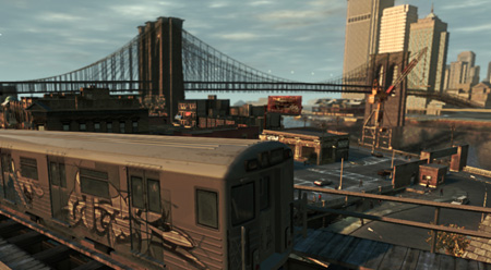
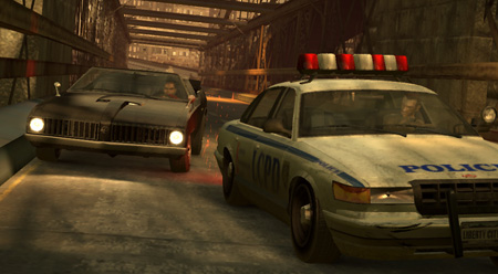
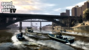
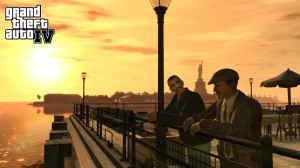
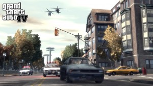
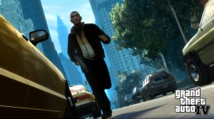
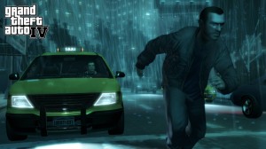
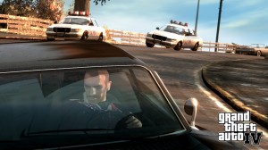
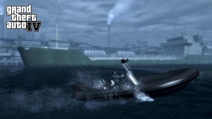
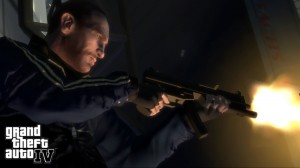
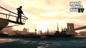
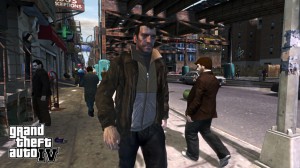
The first thing everyone inevitably notices about GTA4 (and rightfully so) is the graphics. Gone are the boxy cars, cartoon people, and goofy animations of the past. In their place is a re-imagination of Liberty City, modeled from the real-world city of New York, and complete with realistic physics, incredibly detailed vehicles, and more life-like people. Everything casts a shadow, cars rock and bounce as if they have a real suspension system, trees sway in the wind, the ocean ripples gently, the weather / atmospheric effects are practically photo-realistic... The number of graphical improvements between GTA4 and GTA: San Andreas is so great that it would be impossible to mention them all here; I'll let the game's screenshots speak for themselves. And through all the changes (in graphics and beyond) however, you'll notice that Rockstar has still managed to retain their usual style, so while you're busy exploring the new world, you'll often have a nice feeling of familiarity, no matter how lost you might get.

The soundscape in GTA4 is as equally impressive as the visuals. Everywhere you go, the ambient sounds of urban life are present. The inhabitants of Liberty City have a seemingly limitless number of oral blurbs, and the main characters of the game banter along with each other as good as any actors in a movie. There's a ridiculous amount of radio stations in GTA4, each with their own unique set of music and oft-hilarious commercials. You can buy new ringtones for your in-game phone with in-game dollars. And you know that little "bzzt bzzt" noise your car radio makes right before you get a cell phone call? That's in there too. GTA4 is simply a treat to listen to, and the sounds of Liberty City are just as convincingly realistic as the visuals.

Once you're done gawking at the virtual city Rockstar has put together, you'll delve further into the game itself, and you won't be disappointed there either. This is where the familiarity of past GTA games comes to fruition in a more tangible form than other places; anyone who's played a GTA game before will be instantly familiar with the style of play. As you progress through the game, the city map will become populated with icons representing all the different activities you can do, and you'll have to visit these key locations to advance the story. Each visit to a mission-giving character triggers a cut-scene, after which you're tasked with whatever deed suits the whim of that person. Each completed mission pushes the narrative forward. This simple flow of events is how every version of GTA has operated, and Rockstar was smart not to fiddle with it too much. The only major changes to this formula are that you now can receive (and launch) side-missions on your cell phone, and you can retry failed missions quickly, without having to drive to the target location again. Oh, and the game automatically saves your progress, so you don't have to worry about getting killed on the way back to your safe house after each mission.

The game controls similarly to before, but with the added realism of the game world comes the added realism of not being able to run at super-human speeds or jump over cars. It may take GTA veterans a while to get used to this, but as you grow to appreciate the life-like qualities of the game world, you'll find that you won't miss these things at all.

As with past GTA titles, particularly Vice City and San Andreas, the list of extra activities included in the game is quite long. Around the city you will find various locations to buy clothes, entertainment, play games like pool, bowling, and dart, or just grab a bite to eat. You're free to use your cell phone (or one of the local internet cafes) to contact various people in the game, to hang out or to date. You can, of course, just go driving around and exploring, if you like. And if you get bored with all that, then there's the multiplayer.

Being anxious to play through the single player campaign, I've not had as much time as I'd like with GTA4's multiplayer, but I have put in a few hours and from what I have seen, it's a blast. Jumping online via Xbox Live is a cinch, and it didn't take too long to party up with a friend and find a game. There are a ton of different modes, but I've yet to try hardly any of them. Team deathmatch is my favorite of the few that I have played, and I'm sure that once I get more time to play, I'll be participating in more online hijinks.

By now I think it's obvious that I highly recommend you get Grand Theft Auto 4. It's one of the most complete games I've had the privilege to play in the last few months, and beats out just about everything that rushed into the holidays last year. Even if you're one of those people who's written GTA off as a "murder simulator," I suggest you at least give GTA4 a shot. I think you'll be surprised at just how much humanity Rockstar has managed put into the game.

In closing, Grand Theft Auto 4 isn't a perfect game on every level, but the franchise has come a long way from its roots, and even if you object to some of the content, there's more than a few things here that you can't help but like. GTA4 is a masterfully conceived game and is probably one of the best games you're going to play on Xbox 360, PS3, and eventually (hopefully) PC.

Screenshots courtesy of Rockstar Games.