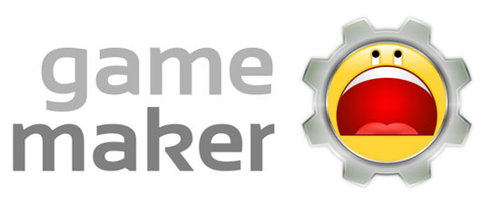
I'm really disappointed with the new Game Maker 8 logo.
Let me preface this entire post by saying up front that I am not mad that I lost, since I had a logo in the running. I'm really just dismayed over the logo that did win, which I felt was one of the worst of the four runners up.

I also want to say that as a runner-up, I will be receiving a free copy of Game Maker 8, and I am grateful for that. I am glad that since YoYo Games has taken over the Game Maker project, they have kept the community involved as much as possible. I think that hearkens back to the days when it was still only Mark Overmars working on the project, and if you'll pardon the pun, it keeps a friendly face on the company.
Since YYG's inception, I've been a supporter of theirs. When questionable decisions have been made, I've tried to see things from their side of the aisle, and most of the time, I've ended up agreeing with what they have done. I've defended them many, many times on the GMC, in some cases above and beyond what I would consider what is "required" of the forum staff.
But this time, for the new Game Maker 8 logo, I strongly disagree with their choice. As both a professional graphic designer and a Game Maker user.
When I was brainstorming for my own logo ideas, I considered using a gear or cog in the image. In the beginning, it seemed a fitting and iconic thing to use in a new logo for game construction software, but as I played around with various other ideas, I began to feel that the gear was too cliched. I also felt that too many other users would enter graphics with gears in them, so I was not surprised to see that half of the runners-up had done so.

Not only does the winning logo contain the over-used cog, but it also makes use of a giant smiley face - which is, at best, a rip-off of other iconic images (Yahoo Messenger's logo, the 4chan C&H smiley), and at worst, a childish and shallow attempt to bring in a young crowd of indie game developers.
Also, it looks like it's crying.
The designer in me cringes every time I see it; every part of the logo is covered with gradients. This ensures that reproducing the logo in print will be difficult, and it makes the design look unprofessional. Not that Game Maker is a professional program, but this point doesn't have to be hammered home at every facet.
And that's the other problem I have with this decision - I understand that Game Maker isn't a professional tool by any means, and I know that YYG wants to convey this to potential users. And maybe they want the program to appeal to a younger demographic as well. But the bottom line is that nobody, new and old users alike, wants to feel like they're using a program that is gimpy or for children. And that's the vibe this logo emanates.

I suppose it's oddly appropriate that a tool for amateur game developers employs a logo that looks like it was created by an amateur designer. I just really feel that YYG took this idea and ran a bit too far with it.

Carl the Cog, from Conker's Bad Fur Day.
I've always said the power in a tool lies in the hands of the person who wields it, and not solely in the tool itself. And while I still believe this to be true, I also think it's important that the tool isn't made to look completely stupid by its manufacturer. Perhaps the many people who claim to be leaving the GM scene over this are over-reacting, but when a decision is made that so negatively affects the nature of this tool in the eyes of others, I can't blame people for being upset about it.
Ultimately, this logo was a piss-poor choice, and that's all there is to it. I leave you with this quote from the logo's creator, Albert Zak (courtesy of Game Maker Blog):
I’m however still kind of puzzled why only 8% picked this as their favorite, but I’m glad Sandy and a few others realized what’s really behind this logo.

Is this what's behind the logo? Maybe that's why the big face is laughing so hard.
26 Comments
Holy fish sticks. I wish that final image was the new logo.
Hehe, yeah that’d be kinda funny… although it looks a little bit like someone’s butt from The Simpsons, too.
To be honest, though, I have to say that I’m really somewhat sorry for berating Albert Zak’s work so much. I’m sure he put a lot of effort into his logo… probably more than I did in mine.
But I just don’t think his logo is appropriate for Game Maker, and I really didn’t appreciate his rude remarks about the other logos in his GMB interview. There’s a certain respect and diplomacy one should have for other peoples’ work in contests like this, and in my opinion, he crossed the line.
Excellent article Martin. I agree with pretty much everything you said, and appreciate your intelligent comments. It’s a nice contrast to most of what I’ve been seeing on the YoYo Glog.
My design is the third one shown there (the CD-Cog). In my opinion it’s a decent design. I tried to go with something pretty conservative to have mass appeal. I must say the actual quality of the image is pretty low but my attention was mostly towards the smaller icon format so I figured much detail for a larger size wouldn’t be necessary. Honestly I don’t mind my design not being picked, my goal was just to snatch one of those free copies up for grabs, and I am a bit offended at those that are saying we are only upset because we lost.
Martin I say, out of all of the finalists, as far as logos go, yours is the most professional. You actually understand the qualities of a logo. Not to be disrespectful or rude but I’d say the main fault with yours is that it incorporates too much YoYo Games branding which I realize is what they asked for but I personally believe that companies shouldn’t plaster their own company name/symbols on their product’s logos.
Hopefully all of this will soon be revealed as some sort of a joke, but unfortunately it likely will not.
Best of luck to you if they (basically just Sandy) do decide to listen to the masses requesting to change it. Your posts on the various sites covering this logo fiasco have been a refreshing taste of intelligence.
Thanks for the kind words, Beneibe!
It’s a fine line to walk, making objective / constructive comments about the competition while trying not to sound like a sore loser. I see it this way though: we entered the contest because we wanted to win, but also because we care about how Game Maker turns out moving into the future. This is why we put our ideas forth for YYG to use as a potential logo, and this is why we are so against the idea of Game Maker being represented by something as ridiculous as the winning logo.
I don’t consider it disrespectful for you to have criticism for my logo, though. It definitely had its faults, and in my opinion, was not the best when it came to many areas of the design, compared to the others. From the start, I did not expect to win, and I am proud to at least have it selected as one of the runners-up.
Apparently Sandy has stated that he will accept and possibly implement suggestions to the winning logo, and that is a good start for fixing this mess. I don’t believe he will be willing to remove either the cog or the smiley face, which is a shame, but perhaps he’ll come around eventually. Part of being responsible is having the guts to admit when you are wrong and being prepared to fix a problem you’ve created, and I hope that YYG can put this behind them and move forward with a logo stronger than the one that was selected from this contest.
Agreed 100%. I don’t blame the creator of the logo, seeing as it was just a kid trying to make a buck (and who could blame him?), but YYG are the ones that made the choice, so it is with them I place my blame for this. I’m embarrassed to admit I use GM to someone who hasn’t heard of it before – after seeing a logo like this you would only assume it was for children. D:
I think this whole logo thing has gone entirely too far. In the words of Mark Twain:
“The stories of GM’s death have been greatly exaggerated” (or something like that).
This is one of those things that, one year from now (given that the discussion has finally fizzled out by then), we will all look back on and firmly plant our palms on our foreheads.
Besides, it only has to last for 1 GM version, 1-2 years. I think we’ll all survive. With all of this mess I don’t expect YoYo to keep the logo any longer than is necessary, and they are pretty well committed to at least the lifecycle of one GM iteration.
Let it be known, I DO NOT like the winning logo. But the argument has gone to far.
P.S. Kudos to you Fred for actually giving a (mostly) objective assessment that I’ve been so strongly advocating.
I agree that it has gone too far. For the record, it’s obviously not going to stop me from using Game Maker (especially if I haven’t upset YYG so much that they don’t give me my free copy of GM8).
I’m honestly not trying to cause trouble for anyone. I just think it’s a great shame that such a nice piece of software might be marred by such a crummy logo.
I’m not sure if they’ll want to change the logo so quickly for the next version of Game Maker, but who knows. I just hope that at the very least, they tweak the new logo enough to make it something less embarrassing than what we have now.
I posted on the Glog to tell Sandy some of the constructive criticisms I had for the logo. He’s already committed to a smiley in a gear so I suggested
A – dumb down the expression. Right no it’s overly expressive. The mouth takes up over 50% (litterally) of the face’s surface. The beady little eyes are also a little too exaggerated. If the face was toned down it could still be “fun” without being “childish”.
B – simplify. Compositionally it has everything you DO NOT want in a logo – gradients, many colors, and fine details. By simplifying the logo to something that looks good as a vector image, preferable as a monotone image, it will get more respect for being a logo, not a pretty picture.
However, there’s no way anyone of any importance saw my comment on the Glog (there have been at least a hundred replies since mine without word from Sandy). And posting it on the GMC is out of the question, it won’t make any more headway there.
What can you do.
Looks like Yourself chose a good time to get out of the Moderating industry.
Heh, heh, tell me about it… I’ve been deleting useless posts when I can, but the discussion is moving too fast for anyone to grab anything useful from it without reading over the whole thing.
It’s slowing down a tiny bit though, so hopefully people are getting done venting and we can get some really helpful comments in a more prominent place soon.
Hey Martin,
Really well thought out and written post. I’m tired of the crap on the GMC and you pretty much hit the nail on the head for most of us “I don’t like it, but I’m not insane about it” kinda Joes stuck in the middle. If only we had a stronger voice on the GMC. It’s either “You hate it” or “You love it” (Or so it seems the members there are trying to make it)
As with most of your calm, educated opinions, it only does more to add my respect towards you as the great GameMaker user you are.
-Rob
Oh btw, love your avatar on this blog.
“Hehehe! Cream Gravy!”
“Spah’s sappin’ mah logo!”
Thank you! I was getting tired of trying to run through pages of posts that were being created faster than I could read them. Good to hear some serious, honest criticism of the logo.
I wish there was something original I could say about this whole fiasco, but I really think everything’s been said a million times over so I’ll leave it at that.
Yeah, I’m also a bit tired of arguing with people about it. It sucks that so many immature people are posting hundreds of hate messages that only serve to drown out the constructive comments, in the end. Hopefully some of the good posts make it to YYG / Sandy.
That logo is the cancer that is killing Game Maker! Now that pointless drivel is over with, my real opinion.
Disappointed? Yes. Shocked, really, at the selection. First, I don’t understand Sandy’s pathological hate for the classic GM hammer that many of us know and love. Second, for someone as internet savvy as he is, I can’t believe he’d be attracted to something so incredibly banal and generic looking. I’m not saying its a bad logo, it’s actually pretty well crafted, it just not a good Game Maker logo. Although it makes a strong effort to illustrate “fun” and “building” with very simple forms, there is nothing memorable about it because the giant emote is so overused. When I see the winning logo it makes me think of those scam emoticon banner ads I’ve been programmed to immediately ignore. I suspect I’m not the only one who has that reaction, and that’s potential very damaging to the Game Maker brand.
Personally, I think Marty’s yo-yo has the most potential. Sure, it’s not a shiny as the others, but at least it represents something specifically fun and puts the word yo-yo in your head. Still, I do have to agree with Beneibe in the sense that it makes a better “YoYo Games” logo rather than a Game Maker one.
I’d love to see all of the other entries. Given Sandy’s anti-hammer bias, I’m sure there were many nice logos completely ignored.
I’m as baffled as you are, Xot. Your reasoning is excellent, and you touched on a few things that I didn’t.
You know, it’d be great if some of the more professional, seasoned, and rational members of the community could open up a line of communication with Sandy / YYG and try to get this sorted out in a way that gets everybody what they want, and in the least public way possible. Unfortunately, I’m afraid that any chances for truly fixing this have passed, with the flurry of negative comments on the Glog and GMC. It’s a real shame because underneath all of the vitriol, there is legitimate criticism and concern over the new logo. I think all the negativity pushed Sandy / YYG into a corner though, so now they don’t want to make any large changes just to save face.
It’d also be great to see the other entries as well, though. I’m sure there are a ton of ball / hammer logos in there, and I’m sure there were many other decent entries that were tossed aside due to the mostly arbitrary rules imposed.
I’d love to hear what Sandy thinks about all this as well, without being defensive about the logo choice. Knowing his reasoning behind choosing such a… different logo would be a good step towards understanding what kind of changes would be acceptable to make to it, and possibly what an alternative logo would look like in his eyes.
Great post; totally agree.
Can’t believe yours didn’t win. Stunned. Joke.
This is the first time I’ve really doubted YoYo.
Many, many, people have commented on the desire to change GM’s logo once it’s released. I have every intention, in the near future, to open a topic – if I have the mod’s permission – of alternate icons, where artists can post icon’s they have created that users can use as alternates.
Per my typical style, AFTER the competition was over I had a brilliant idea I’d like to produce.
Anyway, if done right it would relieve some of the pressure, giving users other options while letting the scorned creators a place to show off their attempts. Maybe in a couple weeks when all this hullabaloo has calmed down and I’ve removed my self-imposed ban of the GMC. I’m getting way to personally attached to the stupid topics.
Also, I’m glad to see you opened a topic about suggestions to fix the logo. I’ve seen some much nicer versions of the facecog in that topic. I very nearly requested you make that topic in my previous post last night, but decided against it.
OH! One more thing. Fred, don’t you have a red phone hidden under that bust of Mark Overmars in the corner of your library that patches you through directly to Sandy? An open discussion between Sandy and some of the respectable users might actually get us somewhere. Quite obviously the facecog is here to stay, but he might make it better.
I think the topic that I created (at Smarty’s prompting) has turned out well so far. I’m not sure if I’m crazy about the results as of yet, but it’s a lot better than what was delivered by the logo contest, and I’m glad that Sandy has been positive towards it so far. Overall, I think it’s better that the community has more say in the final design, and I think it was a good decision on Sandy’s / YYG’s behalf to remain open to suggestions even after the flurry of negativity in the wake of the contest results.
So once all the bad comments were weeded out, I think the new suggestion topic has turned into essentially what I was talking about here – a way for calm, rational GM community members to get their ideas out there without being drowned out by a bunch of idiots. Once the emotional element is removed, a lot more can get done, it seems.
Hopefully it all continues to work out well, and I won’t have to dust off my little, red, dial-less, direct line to Sandy / YYG. ;)
Lol. That noob posting in the FIRST comment so that you could reprimand him helps too I’m sure. If you hadn’t gotten a chance to show your muscle until later in the topic no one would have seen it, but topic #2 kinda stands out.
In fact, that almost seemed too good of a coincidence
<..>
It was perfect timing, I will admit. I almost wiped out his entire post, so he wouldn’t have the pleasure of defying the rules right in the first topic, but then I thought better of it and used him as an example instead. It was a good “fly trap” because it let me put the people who would constantly disrupt things on mod preview right from the start, and had the added benefit of serving as a very visible warning for the rest of the trouble makers.
And no, I don’t have a one-way phone that puts me in contact with said trouble makers. Like, one where I pretend to be a fellow trouble maker, and I give them tips on how they can cause problems. Nope, no such thing as that.
You shouldn’t be sorry for Albert Zak. I read an interview with him and he was cocky, arrogant and big-headed. Not the type of person you would want to feel sorry for.
I read that interview. I didn’t see cockiness. I saw a young kid who was proud of the good work he did, was tired of getting spammed hate mail, and probably has a little bit of a ego deficiency if anything, thus the need to state he’s always confident and that he felt he would win. BTW, he’s from the netherlands (I think) I am willing to bet that conversation was translated, and I think something was lost in translation.
@T-Bird – I don’t know, when I emailed him he seemed to have excellent english.
Im hungry