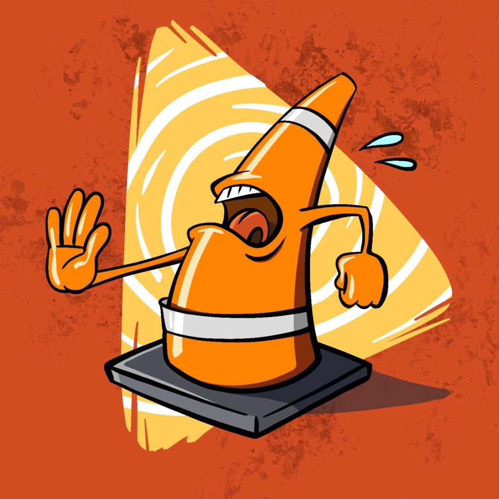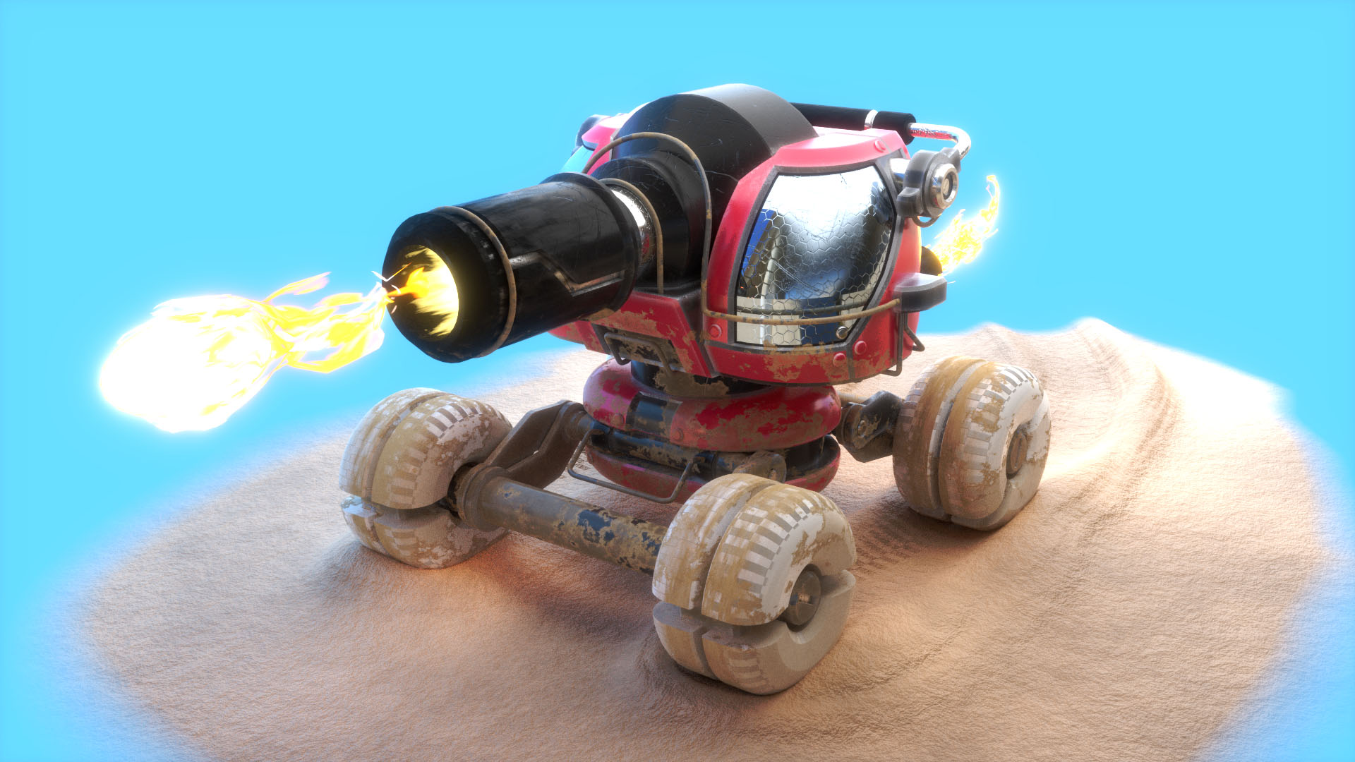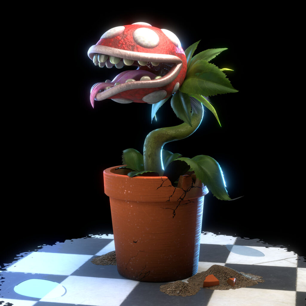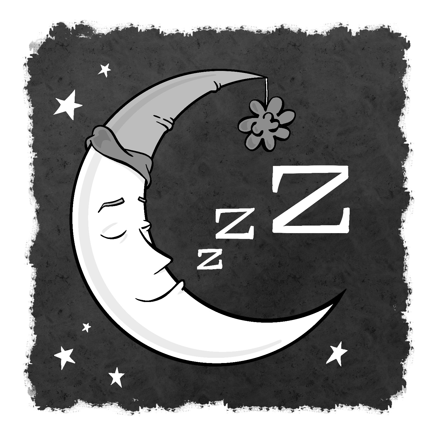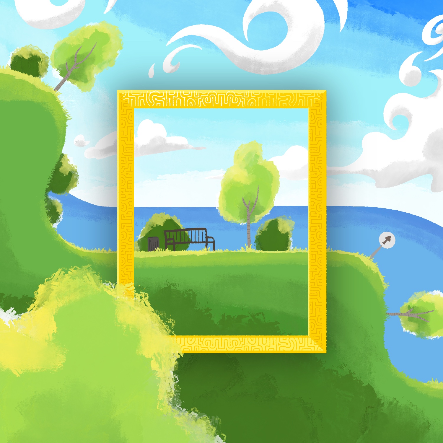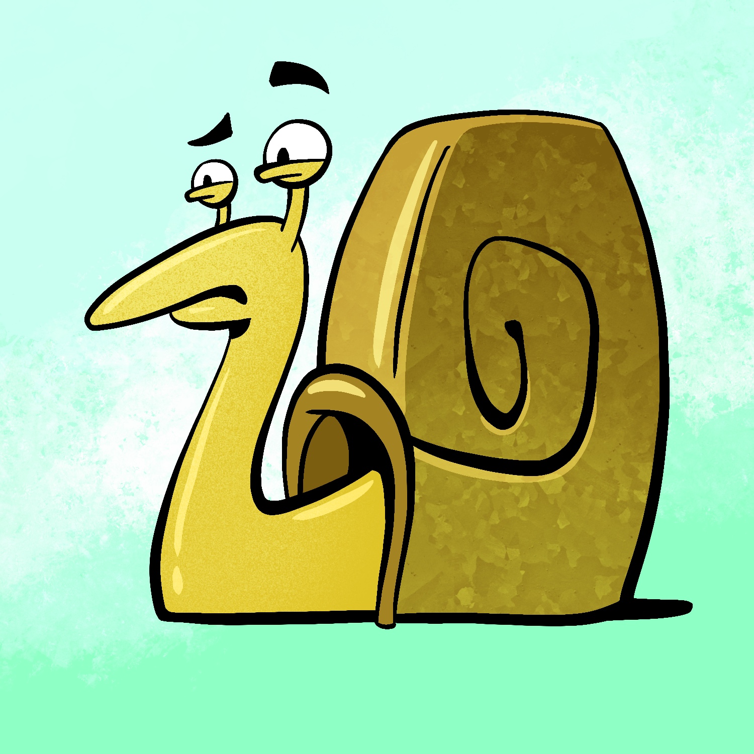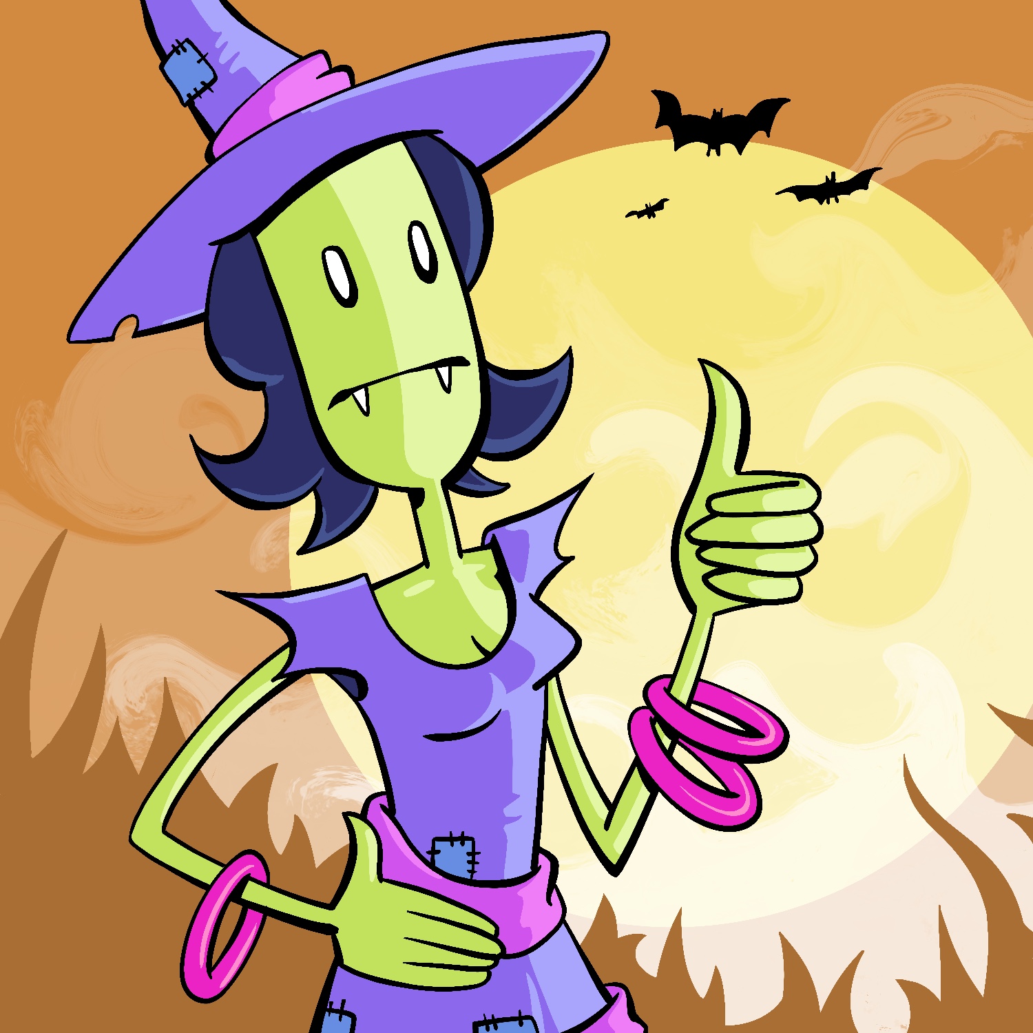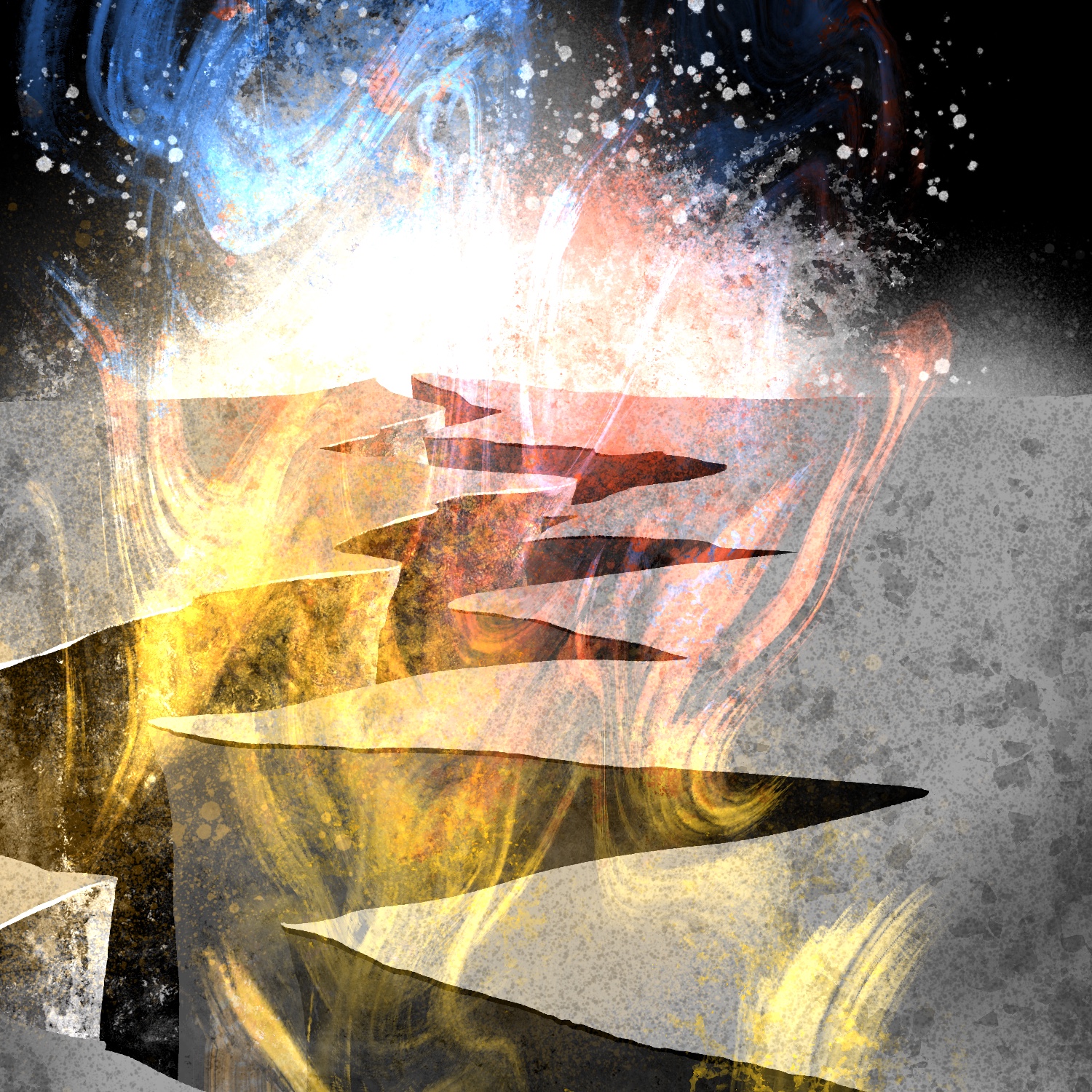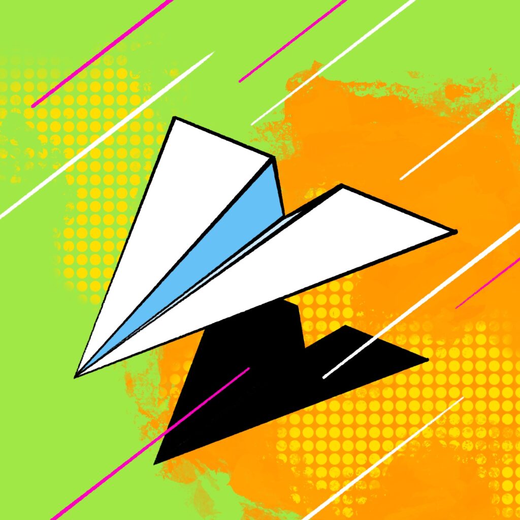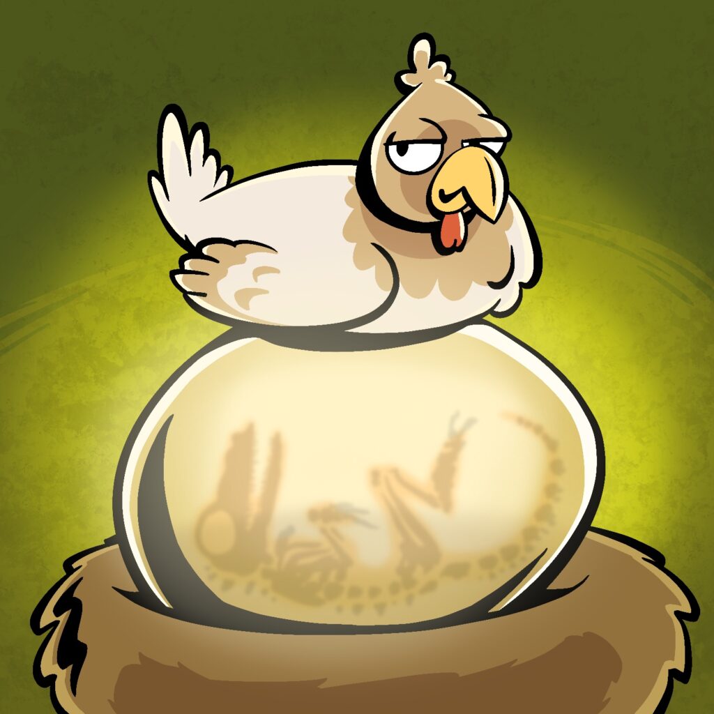
This is my fifth illustration for Drawrch - almost done with the first week, whew!
For this one, I used a tapered pen, but instead of the Baskerville pen I used one called the Studio Pen. I didn't really like how thick it got with so little pressure, but it wasn't too hard to control.
I also utilized Procreate's ability to do bilateral symmetry, so filling out the two sides of the drawing was pretty easy, and I only had to add a few asymmetrical details here and there, mostly at the end.
I'm not super happy with the colors now that I see the image on my computer, but that's what I get for working on my iPad in the dark, I guess. It looks kinda like a character portrait from a C-list video game.
Anyway, if you want to see how this one was made, here's the video:
I've always loved the art style of playing cards, and so I thought I'd do a less conventional view of one of the queens - having a beer!
I draw this while looking at a playing card, but the profile view is entirely my own. It's not perfect, but the proportions are decent. I went with tapered lines again too, though it's a bit less obvious than the last drawing. It actually caused a few issues with the geometry of the bottle and the finer details on the bottle's neck label - I will have to find (or make) a brush to use that can handle those types of details without breaking too hard from the sharp edges of the main brush.
For my third Drawrch illustration, I wanted to try something a little different from my normal cartoons.
Usually, I don't draw with tapered lines. I love it when artists use them, but I haven't practiced it much myself, so I have a hard time controlling the width of the lines as I draw. Concentrating on regulating the pen pressure isn't something that comes naturally to me; when I work with physical materials, I almost always use a gel ink pen, and I press uniformly hard.
My lack of experience with tapered lines also means that I often have to spend a lot of time thinking about where lines should begin/end, where they should taper off, where I can get away with splitting broad strokes in two, etc.
So I thought I'd give myself a small challenge today and draw with tapered lines. I used a brush called Baskerville, which creates very sharp edges. It also has some extreme stroke smoothing that took a little getting used to.
I'm pretty happy with how it turned out, and I'm looking forward to spending more time with this brush. It may become a part of my standard brushes.
As always, here's a time-lapse of my progress creating this illustration:
I am not going to do many drawings with this level of detail for Drawrch! But I have to do one every now and then just for practice.
I'm not particularly good at rendering lifelike faces, and I draw this one without a reference. It's not meant to have realistic proportions, but it is meant to look more real than, say, my first Drawrch illustration.
Here's the time-lapse of this one, which is probably one of the longest time-lapses I've made in Procreate so far!
I've been kind of wanting to do another month-long art project for a while, but every time I start one it immediately begins feeling like a burden every day.
It's weird, because when I'm actually doing the work, I'm in the creative zone and genuinely enjoying myself. But the brainstorming leading up to each piece - especially on days that are busy - can give me low-level anxiety.
So March begins tomorrow and I might just start a new project. We'll see how I'm feeling then, I guess!
This is my final illustration for Inktober 2021! This one was for the prompt "risk", although I think the real title ought to be "I hate drawing hands".
If you watch the time-lapse below, you'll see a couple of misfires in my sketches before I finally settle on what to draw.
First, I thought I'd draw someone playing Risk (the board game). I thought it would be cool to see the thrown dice tumbling toward the viewer and the board below. After getting started on the sketch though, I just didn't like the way it was looking.
Next, I thought I'd draw a baby reaching up and trying to stand. I don't really like drawing babies though, because the proportions are difficult to get right, so I scrapped that one quickly.
Finally, I settled on the sketch for the finished drawing, but not before considering another idea my wife had about a creature taking off their human mask, revealing a werewolf, vampire, or some other monster underneath (it's Halloween today, after all). I liked that idea a lot, but I didn't feel like doing something so complicated, so I pushed ahead with the hands.
The idea behind this is the risk one takes whenever they express their true feelings towards someone else. It makes me think of my wife - we've been together much longer than when we got married, and it always amazes me how a relationship like that starts with such simple but powerfully charged gestures.
Anyway - there's a time-lapse of this drawing's creation below. If you've been following along with me as I make these each day, I appreciate it, and hope you've been enjoying them!
This is my thirtieth illustration for Inktober 2021, for the prompt "slither".
When I started making this one, I wanted to add a bit more texture to the walls and the tentacle, but as I added each layer of light/shadow, I started to embrace the simplicity of it. In the end, just a little bit of airbrushing was all it needed.
Just one more to go and this year's Inktober project is officially complete! Time-lapse below:
Here's my twenty-eighth illustration for Inktober 2021, for the prompt "crispy".
Being a fan of Rice Krispie Treats, my mind immediately gravitated toward drawing a batch of those for this prompt. It seemed boring to draw a bunch of lumpy squares though, so instead I dipped into what seems like another one of my trends for these types of projects, and drew a bucket of fried chicken.
I made a batch of Rice Krispie Treats tonight for dessert, and they were yummy.