Looking back on 2016, there are a lot of things that I'd rather just not remember at all - but games are not one of those things. As a matter of fact, I've played a lot of really great games in (and from) 2016, and so I thought I'd do what everyone else is doing this time of year, and compile a list of my favorites to share.
One thing that caught my eye as I look over this page is that 2016's games seem a lot more colorful than in years' past. I guess a lot of developers took all those complaints of drab, brownish-gray post-apocalyptic worlds to heart!
Anyway, here they are, in alphabetical order:
Deus Ex: Mankind Divided
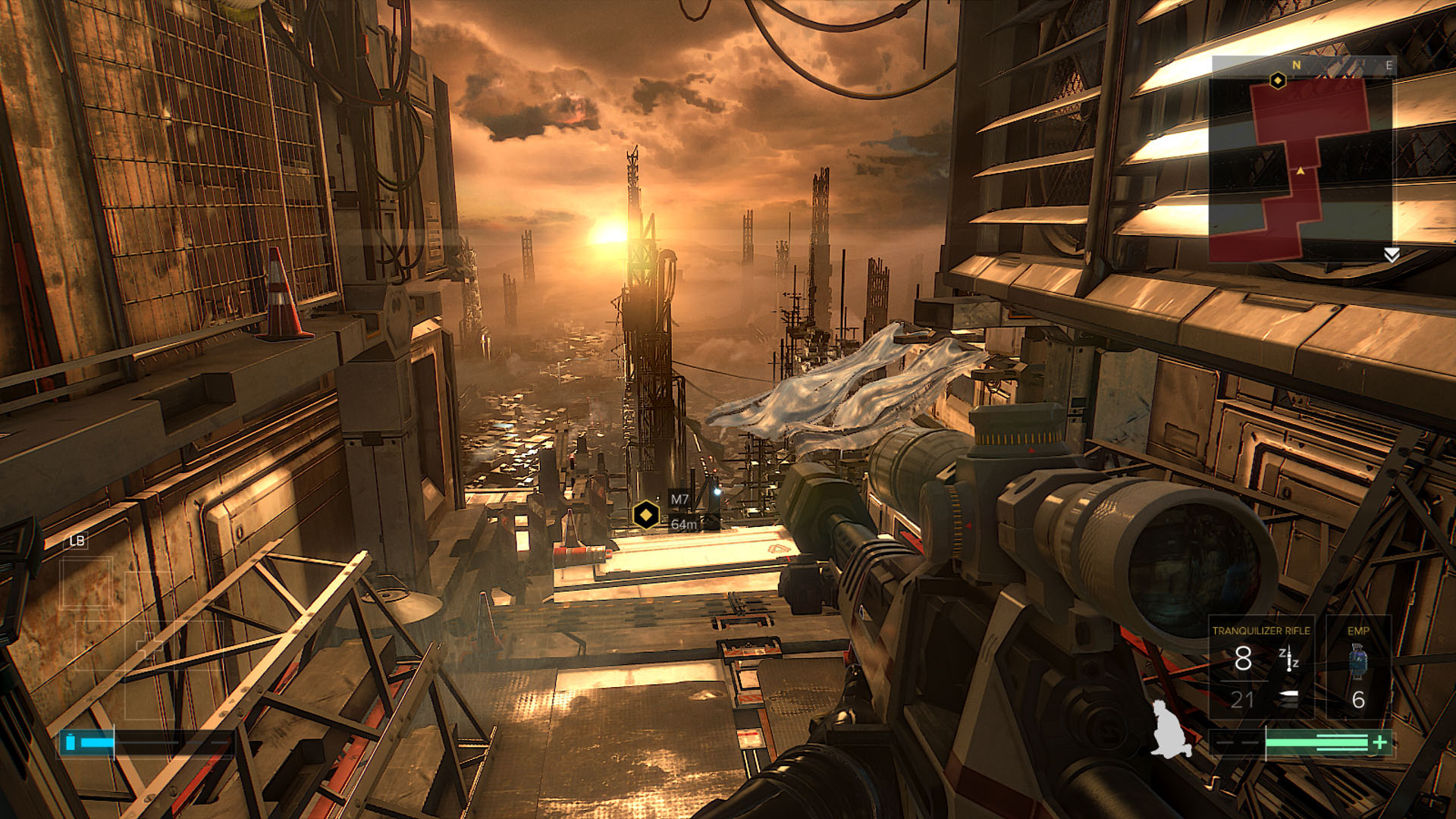
The sequel to Deus Ex: Human Revolution, this new game made a lot of smart improvements, with the addition of a more open world to explore in between missions, a revamped skill tree, what felt like the inclusion of many more paths-to-completion, and more. Augmentations feel powerful and useful, and as you play, you can build Adam Jensen (the game's protagonist) into whatever sort of superman you like.
Being a completionist and wanting to see the best ending to the story, I played the game without killing anyone and doing as many side-missions as I could find. Subsequently, Mankind Divided took me some time to complete (between 30-40 hours, I'd say), and I still didn't find everything. I had a great time exploring Prague and submerging myself in the game's fiction throughout.
Dishonored 2
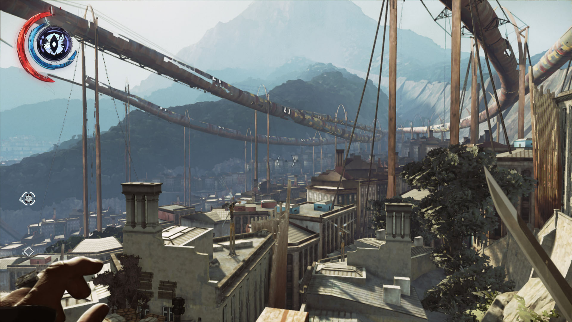
Dishonored 2 is another of those games in which I truly love the world the developers have crafted. So much of the world seems alive and real because of the fantastic architecture and the extra details sprinkled throughout levels, and zipping around as a magical assassin is intuitive and fun. The quick-save feature is also greatly appreciated, and if you try to get through this game without killing any enemies, as I did, you will make great use of it.
If you've not played the original Dishonored, I'd highly recommend playing that game first, though it's not required to understand or enjoy what's happening in Dishonored 2 - but it's such a good game, I'd hate for anyone to miss it. A remastered version was released to celebrate the arrival of the sequel, so there's no excuse not to play both.
Final Fantasy XV
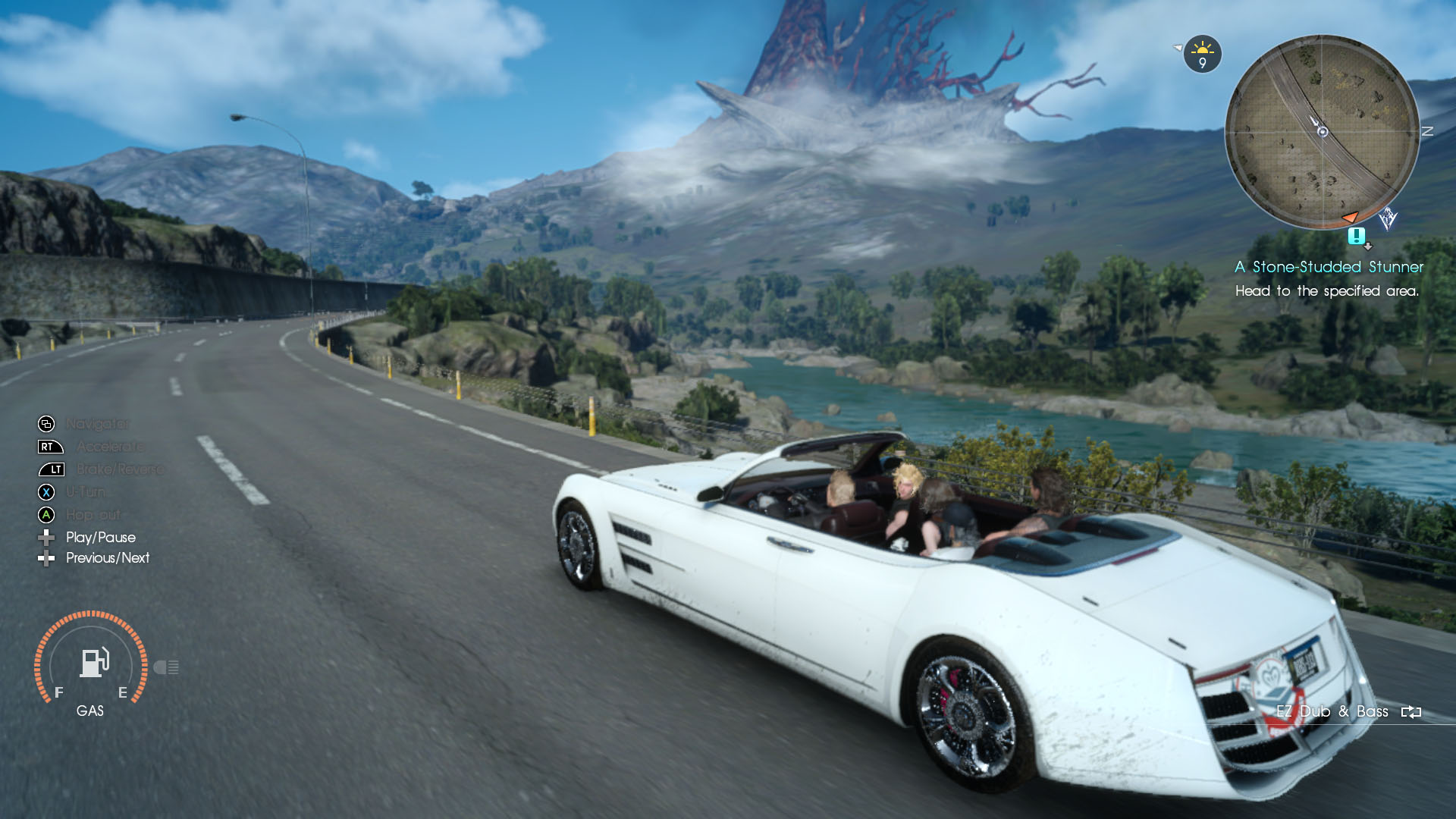
I haven't actually finished Final Fantasy XV yet, but I've been really enjoying it - it feels like the first "real" RPG I've played in a long time, and that's not meant to disparage games like Dragon Age: Inquisition or Fallout 4. It's just that while those games take the RPG recipe and extrapolate something new from it, games like Final Fantasy XV feel more like a pure, old-school RPG experience, while still adding layers of new and fun stuff.
This is actually the first Final Fantasy game I've really dug into outside of a brief stint with Final Fantasy III on Nintendo DS, so I'm kind of a noob to the series. XV has inspired me to consider picking up the other games set in the same mythos, time permitting.
The Flame in the Flood
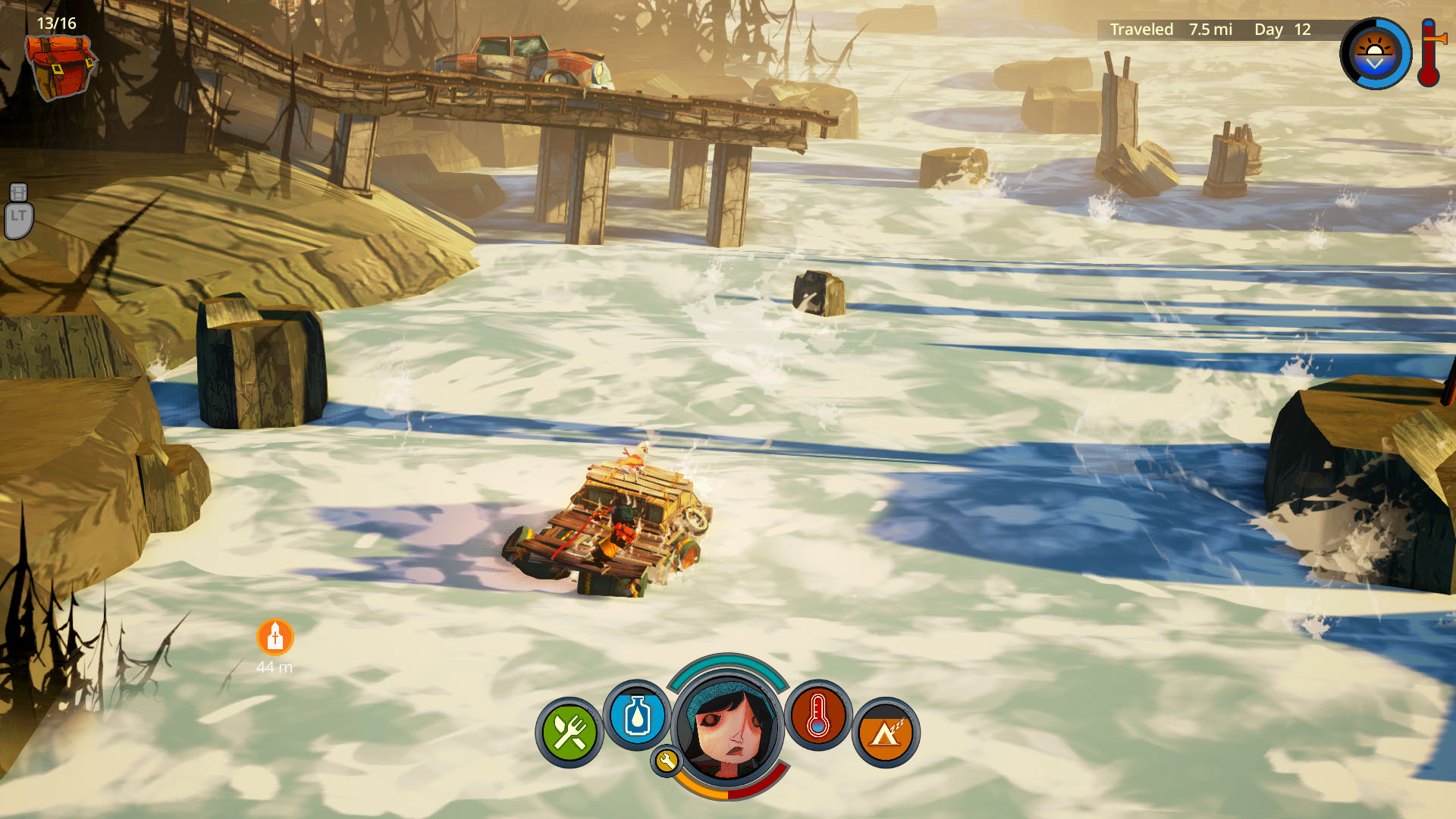
The Flame in the Flood is a smaller, "rogue-lite" game where you play as an unnamed girl traveling down the waters of a flooded, post-societal America with her dog, Aesop. I've never actually beaten it, but traveling down the river and exploring all the locations along the way, while managing hunger, cold, and other afflictions is quite fun once you get the hang of it. It reminds me of a more focused version of Don't Starve, and it's easy to get caught up and spend a few hours trying to survive the wilderness.
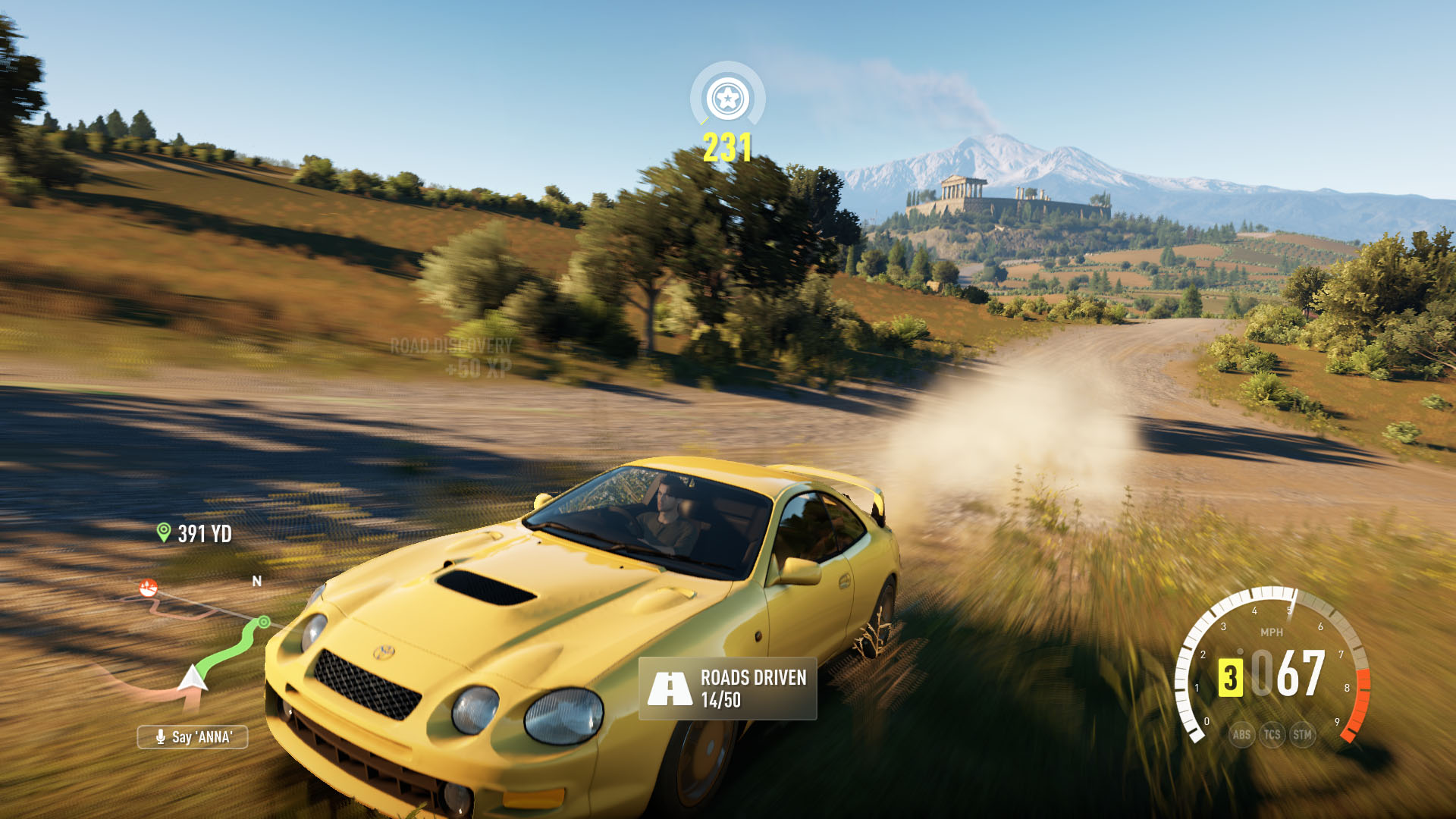
Forza Horizon 3
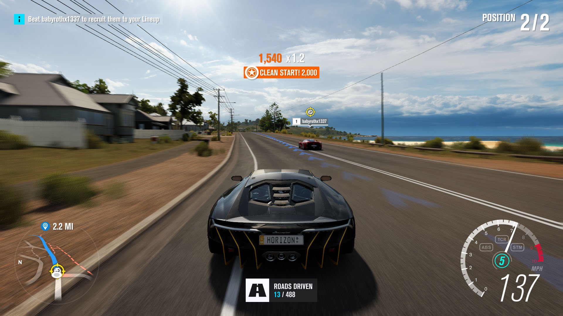
Easily the best racing game on Xbox One (and maybe even PC in recent years), Forza Horizon 3 is an excellent melding of racing sim and arcade racer. The visuals are colorful and clean, the soundtrack is bumping, and most importantly, the racing is fun and accessible. If you're hankering for a good racing game, look no further.
As a bonus, Forza Horizon 3 is also a PC/Xbox One Play Anywhere title, so you can buy it for either platform and get it for free on the other.
Gears of War 4
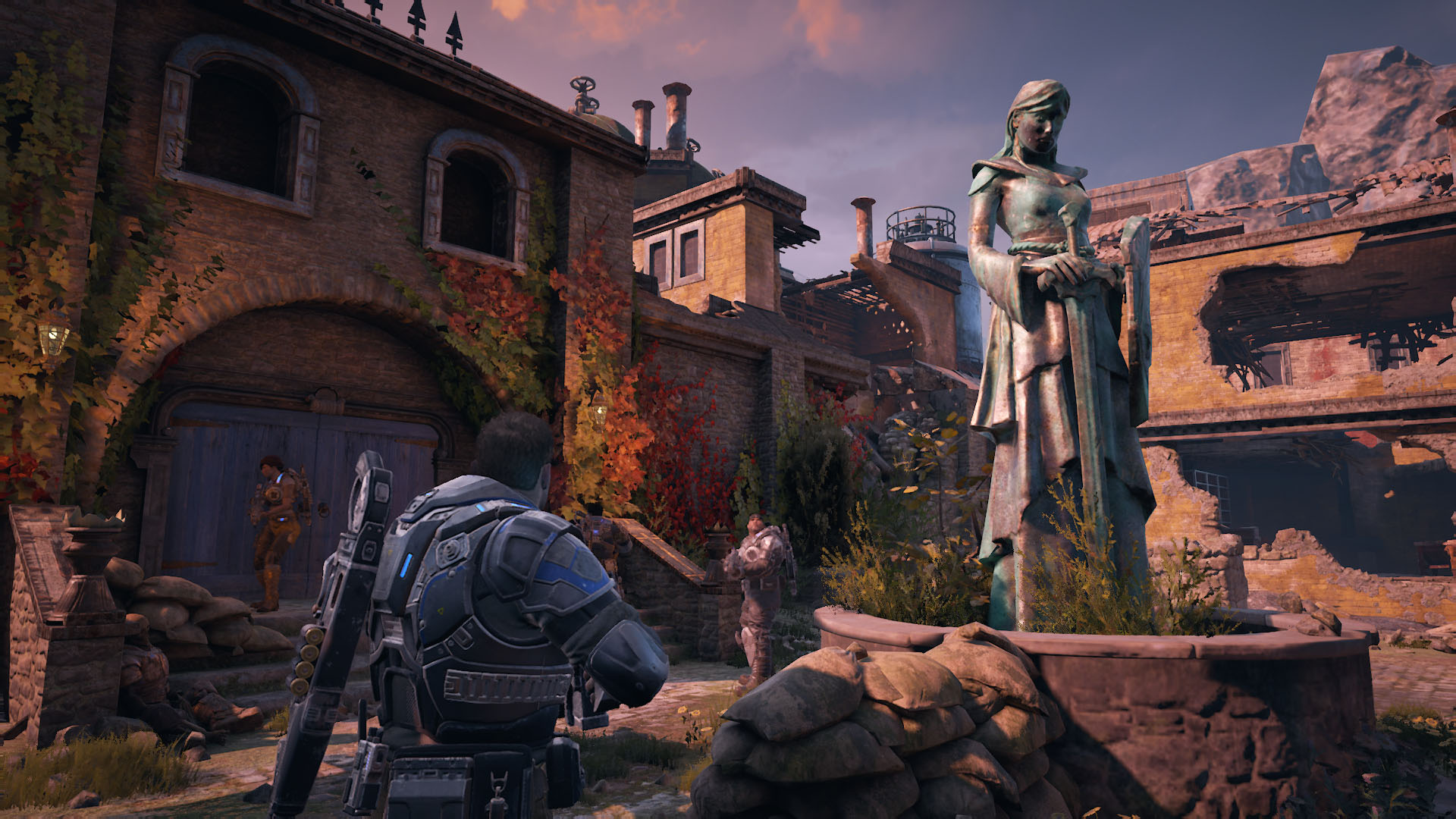
I loved the Gears of War series on Xbox 360, so I was very excited to get the next installment this year in Gears of War 4 on Xbox One and PC. This newest game has all of the thrills of the original series, with smoother gameplay and many modern improvements over the original games.
This game is another Play Anywhere title, and it also supports cross-play in certain modes, so you can play on your PC with players on Xbox, and the reverse.
Inside
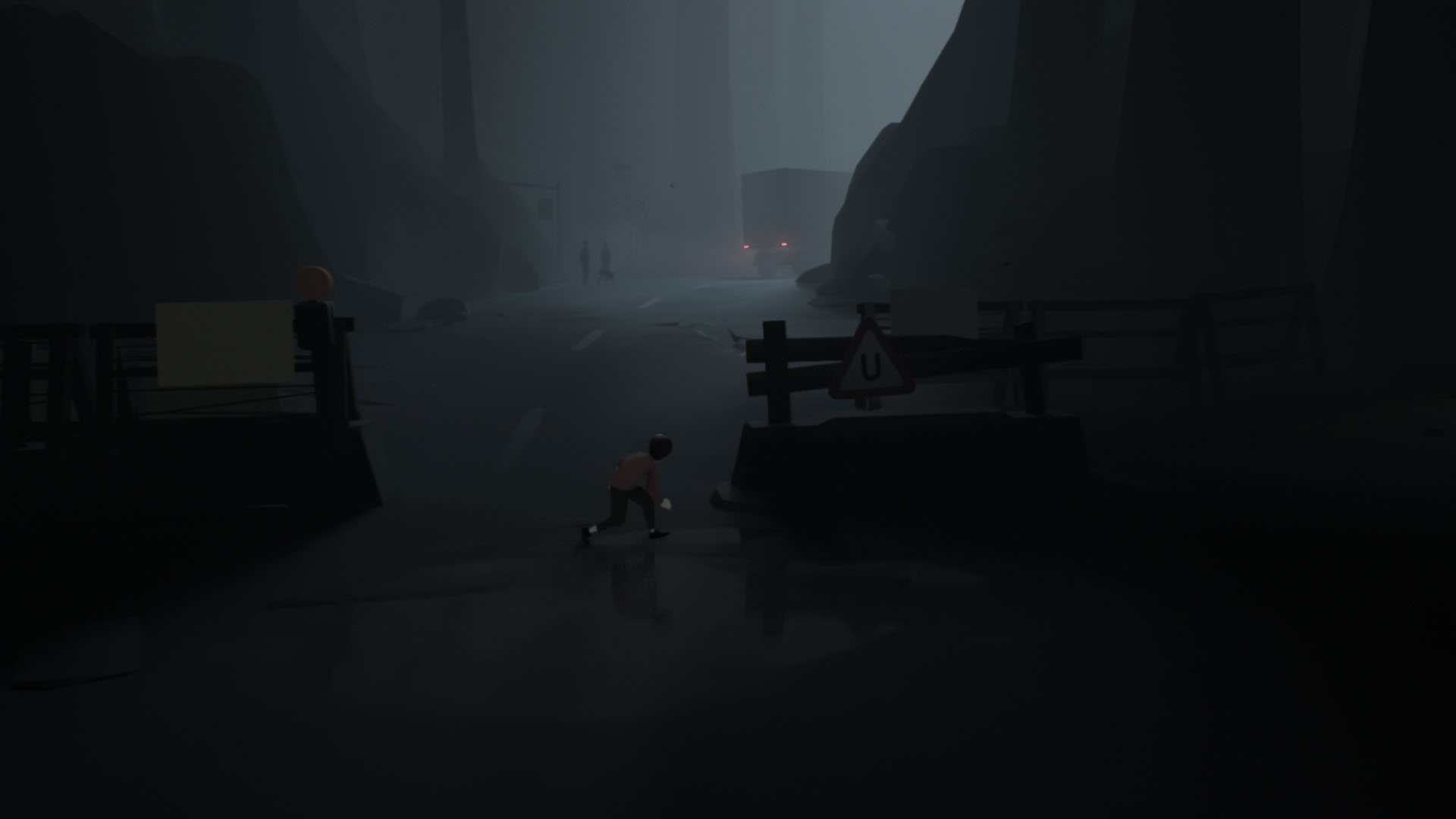
Inside is a pseudo-sequel to Limbo, featuring the same sort of gameplay, but with a more defined narrative and improved visuals. The game is a very atmospheric and the world is a neat place to explore. It's not a long game, but solving the puzzles feels rewarding and the story, while bizarre, is interesting.
Overwatch
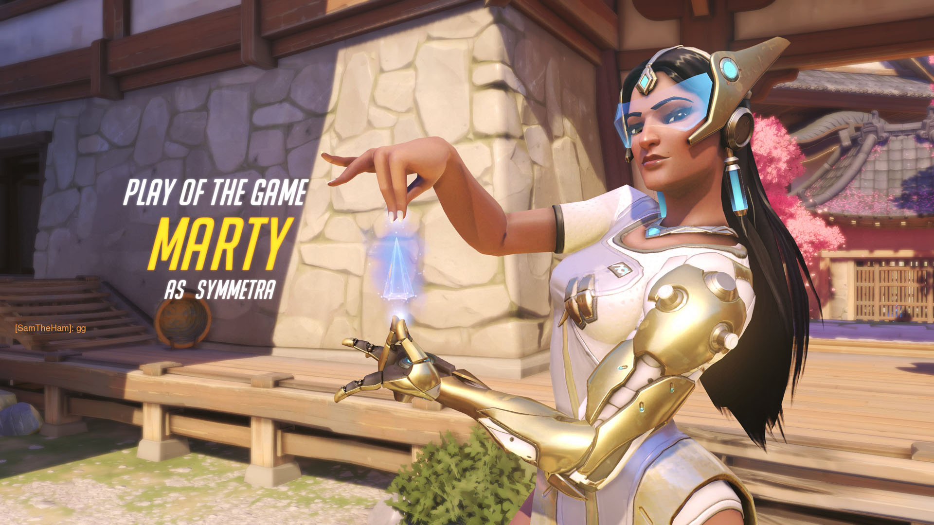
You probably already know this, but Overwatch is a competitive first person shooter from Blizzard, featuring a large cast of heroes to play, each with unique abilities and play style.
The biggest endorsement I can give this game is that it was the game that finally pulled me away from Team Fortress 2.
Sid Meier's Civilization VI
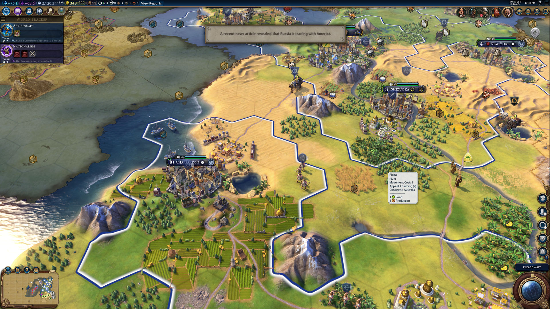
We've all heard the phrase "just one more turn", and the same applies to this newest installment of Civilization. Many aspects of the game have been streamlined, while others have been improved and expanded, such as the world leader AI and the religious aspects of the game. My favorite thing so far has been establishing my own religion, Martyism, and watch it spread across the world.
Tom Clancy's The Division
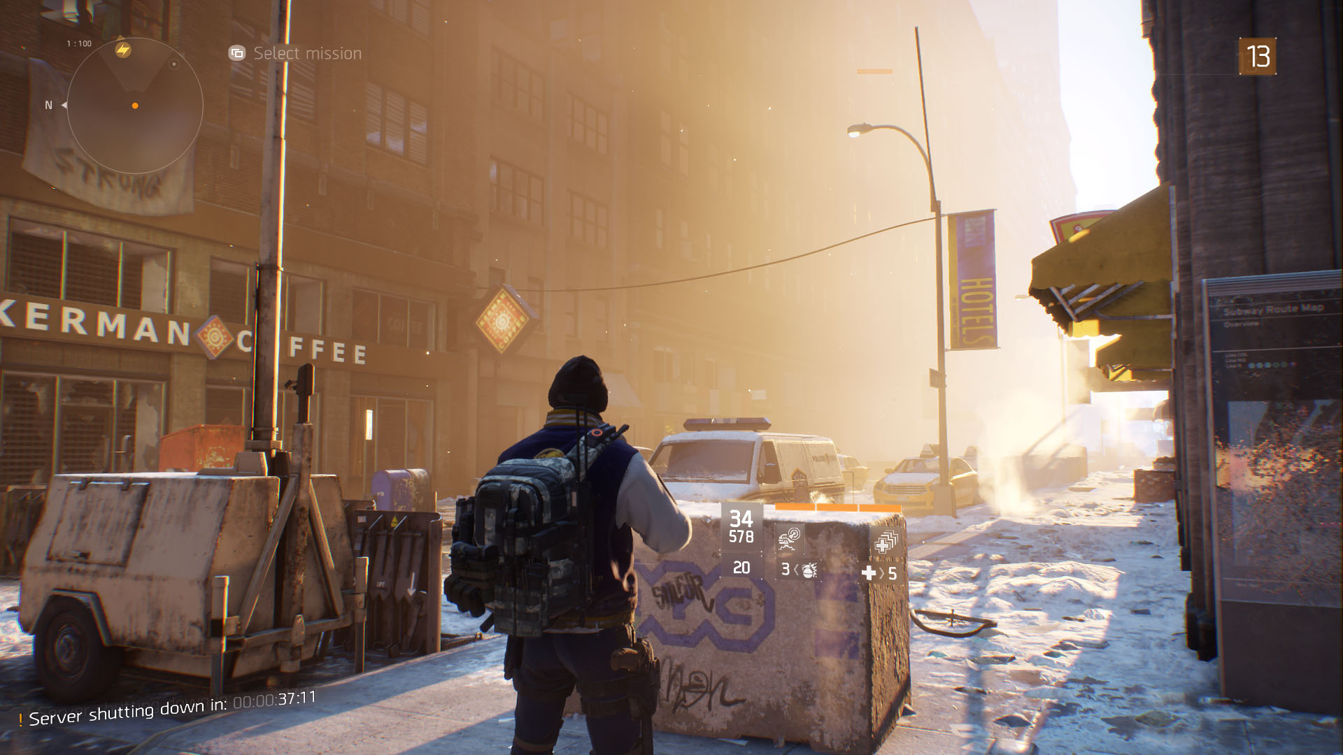
I started playing The Division on PC, and ended up moving over to the Xbox for more couch-oriented gameage. The story for this game is grim, but interesting, and the gameplay is solid and fun.
The Witness
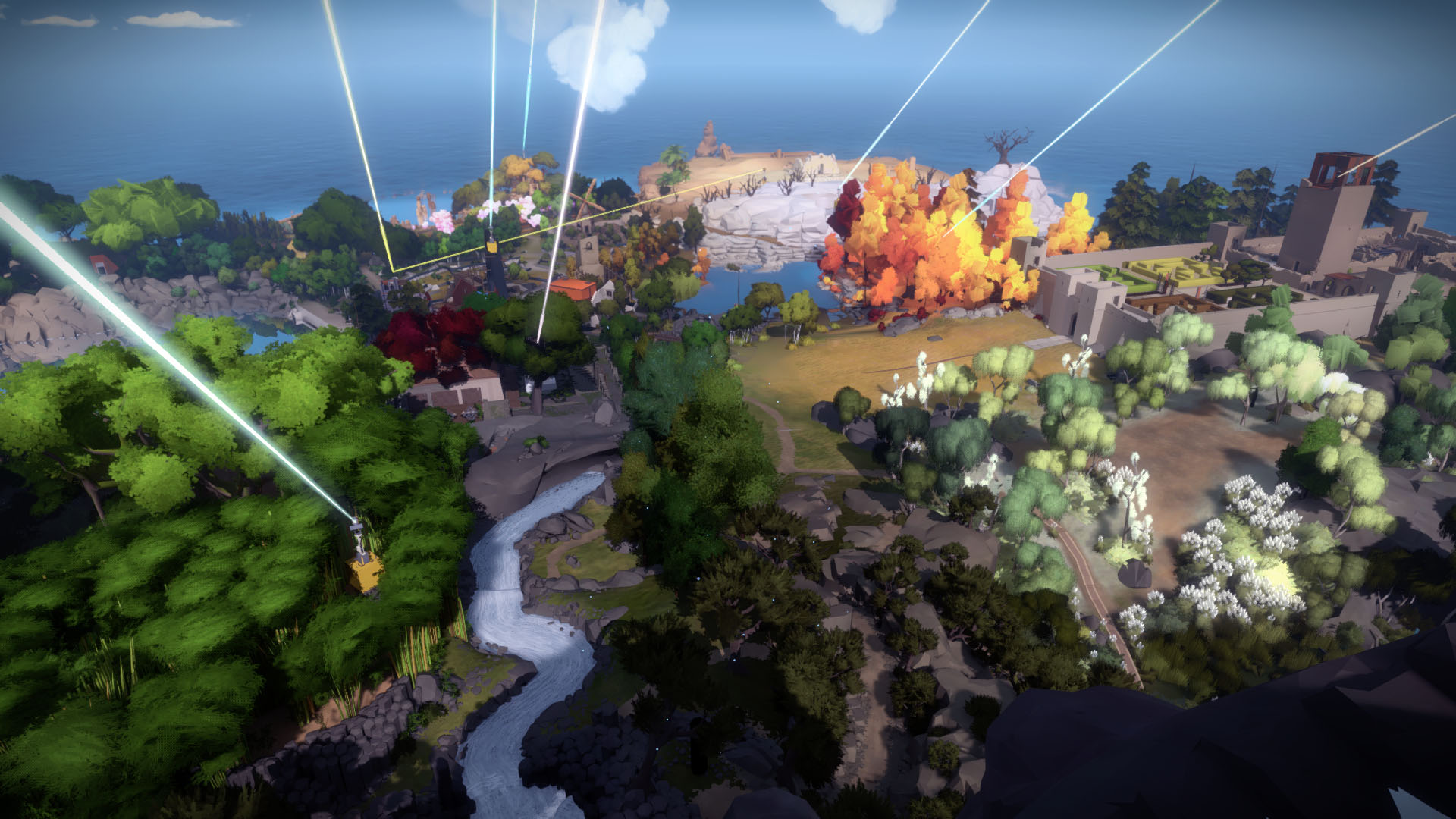
The Witness is another game I played (and beat!) on PC, and then re-bought on Xbox One so I could experience it all over again from the comfort of my couch.
This game is one of the best puzzle games I've played in years. The puzzles look deceptively simple, but the rules you learn as you go show how these supposedly simple puzzles have a range of depth you would never expect at the start, all while remaining accessible (and solvable!) with just a little intuition and perseverance. The story is smart and the world is wonderful. Highly recommended.
And here's a few other games I enjoyed this year, but which weren't released in 2016:
The Banner Saga
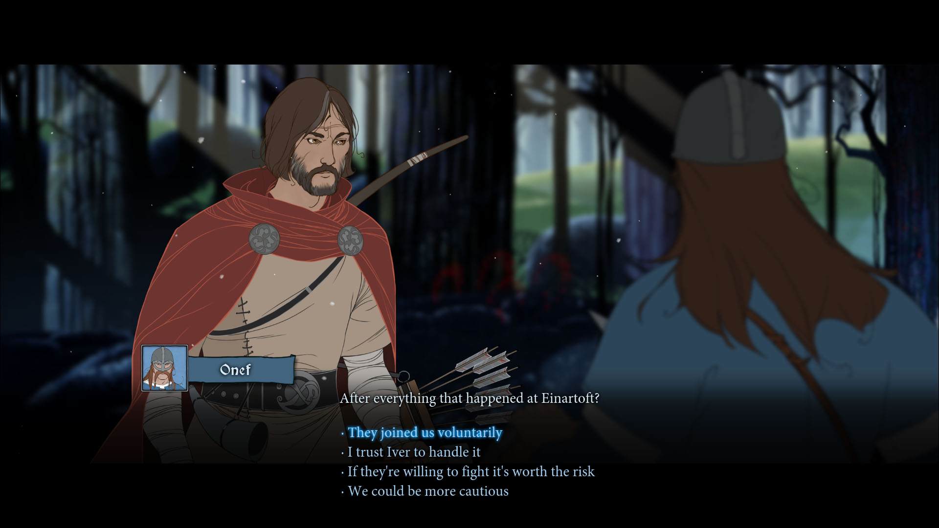
The Banner Saga is basically Oregon Trail, but with some RPG elements, vikings, and giants. The artwork is amazing.
Dear Esther: Landmark Edition
The first time I played Dear Esther, I was a little less enthused about so-called "walking simulators" - but no longer. The story Dear Esther tells and the exposition by which it is told is just great. It's not a long game, and there's not a lot of interactivity, but it's still a story worth experiencing. The soundtrack is also phenomenal.
Forza Horizon 2
I loved playing through Forza Horizon 2 for the same reasons I enjoyed its sequel, which I wrote about above. It's just a fun game with excellent racing mechanics, smooth visuals, and an amazing soundtrack.
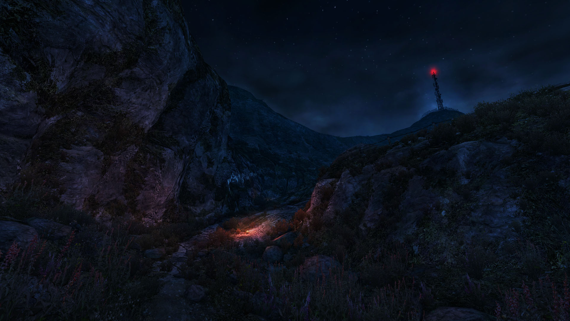
Submerged
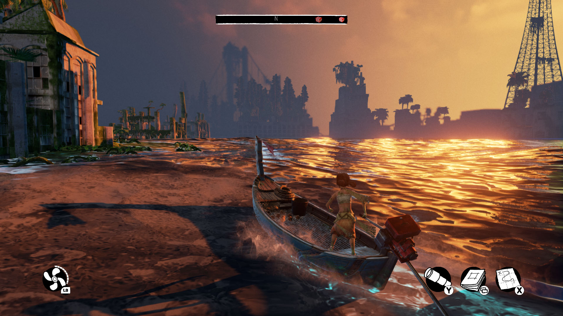
I was a bit surprised about Submerged. At first glance it looked like a somewhat shallow clone of The Legend of Zelda: Wind Waker, but I ended up really digging the story. The gameplay isn't anything particularly new or groundbreaking, but I appreciate the narrative the developers crafted, and in the end I was happy to support their creativity.
If you're looking for a unique adventure game that won't take too long to complete, but still comes with an interesting story and functional/decent gameplay, Submerged is your ticket.
Honorable mention:
Quantum Break
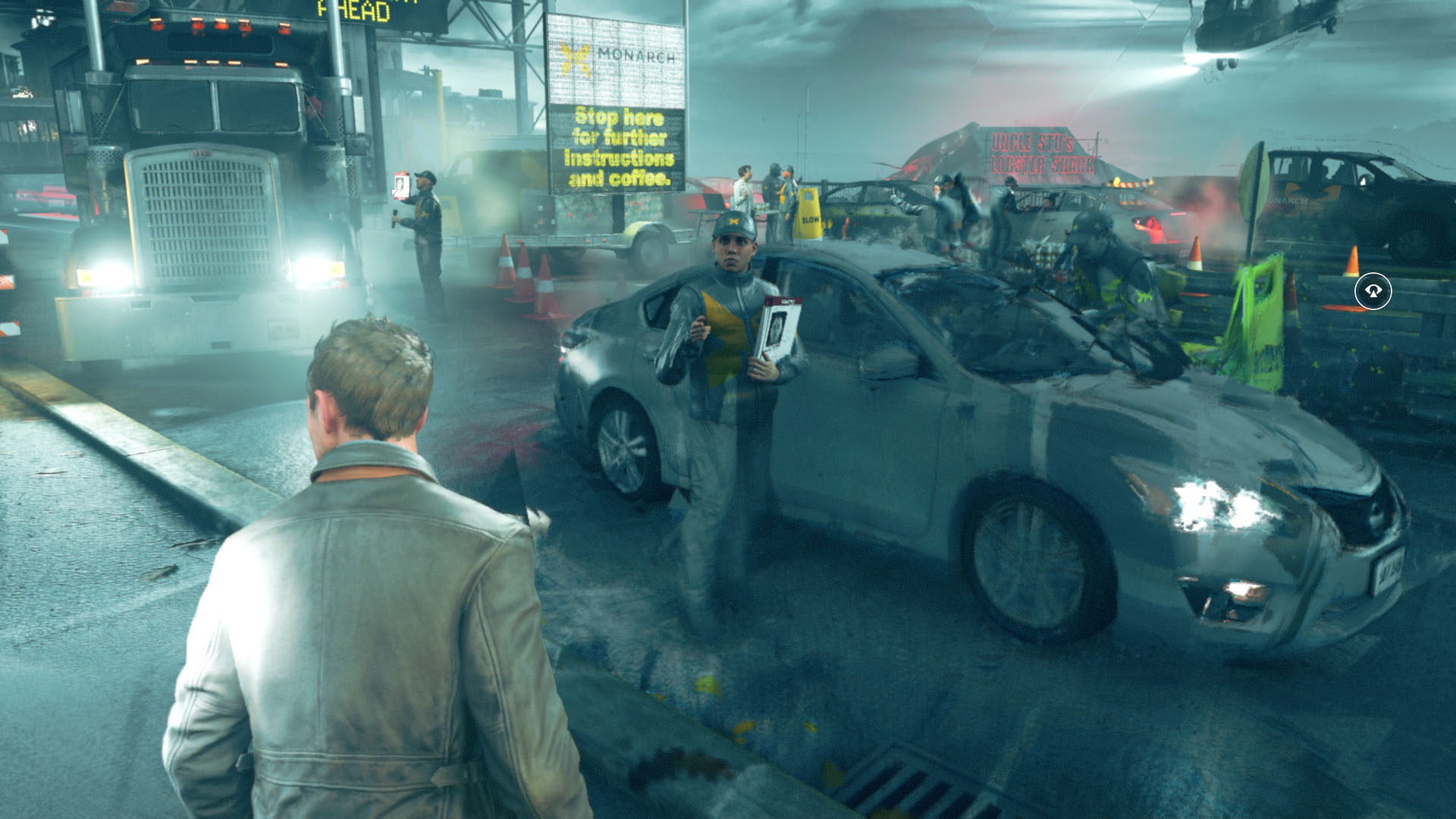
I hated not to include Quantum Break in my favorite games of 2016, but despite the fact that it's unique and fun, it didn't stand up to the same level of excellence as the other titles mentioned above.
It is a neat experience though, and it's another Play Anywhere title, so if you're looking for something off the beaten path, Quantum Break could be it.